An Abyss Admiral is a highly specialized role for a
software engineer who is a dedicated member of a product delivery team.
The most basic and essential function of an Admiral is to act as a bridge
between the core Abyss ecosystem and the product team leveraging the
framework.
Acting as representatives or ambassadors for their products, Admirals
enable the adoption of a{' '}
scalable, federated software development model by sharing
the Abyss community's best practices with their teams. As subject matter
experts for Abyss, Admirals are encouraged to guide and mentor their
engineering teams, empowering them to take advantage of the benefits of
working in a collaborative enterprise environment.
 Diagram from React Native Documentation
 Diagram from React Native Documentation
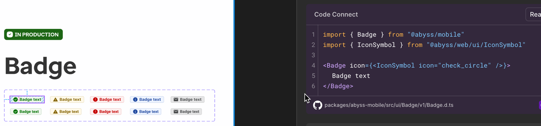 ```
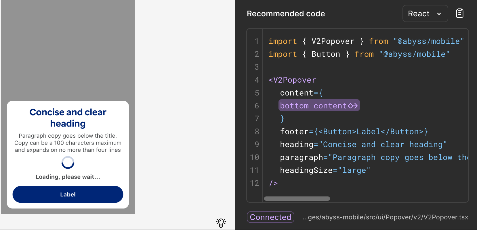
#### Slot limitations
At this time, code connect does not support slots. If you need to use a slot, you will need to manually add it to the code after copying it from Code Connect.
The reccomended code section does not show the actual slot element's code.
```jsx render
```
#### Slot limitations
At this time, code connect does not support slots. If you need to use a slot, you will need to manually add it to the code after copying it from Code Connect.
The reccomended code section does not show the actual slot element's code.
```jsx render
 ```
### Supported Components
```jsx render
```
### Supported Components
```jsx render

 ---
id: use-style-sheet
category: Styling
title: useStyleSheet
description: Used to parse styles from a StyleSheet
---
```jsx
import { useStyleSheet } from '@uhg-abyss/mobile';
```
The `useStyleSheet` hook helps to parse the additional functionality from the Abyss [StyleSheet](/mobile/ui/style-sheet).
## Usage
```tsx
useStyleSheet(styles: object): object
```
Take a look at StyleSheet below:
```jsx
const styles = StyleSheet.create({
container: {
padding: '$xs * 4px',
margin: '$fontScale',
},
label: {
color: '$gray4',
fontWeight: '$bold',
fontSize: '$lg',
marginVertical: '$md * 2',
fontFamily: '$heading',
},
box: {
backgroundColor: '$interactive1',
borderColor: '$error1',
borderRadius: '$md * $sm',
borderWidth: 4,
width: '6rem',
height: '48px * 3',
marginBottom: '32px - 0.75rem',
'@media (min-width: 767px)': {
width: '12rem',
},
},
});
```
There's a lot of code that is unfamiliar to the normal StyleSheet. Above, there are _**media queries**_,
_**tokens**_, _**operations**_, _**rem values**_, and _**pixel values**_, which normally would not be able to be parsed by React
Native core component. This is where the `useStyleSheet` hook comes in. By using the hook, we can parse these
value into value that the core component can understand.
```jsx live
const themedStyles = StyleSheet.create({
container: {
padding: '$xs * 4px',
margin: '$fontScale',
},
label: {
color: '$gray4',
fontWeight: '$bold',
fontSize: '$lg',
marginVertical: '$md * 2',
fontFamily: '$heading',
},
box: {
backgroundColor: '$interactive1',
borderColor: '$error1',
borderRadius: '$md * $sm',
borderWidth: 4,
width: '6rem',
height: '48px * 3',
marginBottom: '32px - 0.75rem',
'@media (min-width: 767px)': {
width: '12rem',
},
},
});
render(() => {
const styles = useStyleSheet(themedStyles);
return (
---
id: use-style-sheet
category: Styling
title: useStyleSheet
description: Used to parse styles from a StyleSheet
---
```jsx
import { useStyleSheet } from '@uhg-abyss/mobile';
```
The `useStyleSheet` hook helps to parse the additional functionality from the Abyss [StyleSheet](/mobile/ui/style-sheet).
## Usage
```tsx
useStyleSheet(styles: object): object
```
Take a look at StyleSheet below:
```jsx
const styles = StyleSheet.create({
container: {
padding: '$xs * 4px',
margin: '$fontScale',
},
label: {
color: '$gray4',
fontWeight: '$bold',
fontSize: '$lg',
marginVertical: '$md * 2',
fontFamily: '$heading',
},
box: {
backgroundColor: '$interactive1',
borderColor: '$error1',
borderRadius: '$md * $sm',
borderWidth: 4,
width: '6rem',
height: '48px * 3',
marginBottom: '32px - 0.75rem',
'@media (min-width: 767px)': {
width: '12rem',
},
},
});
```
There's a lot of code that is unfamiliar to the normal StyleSheet. Above, there are _**media queries**_,
_**tokens**_, _**operations**_, _**rem values**_, and _**pixel values**_, which normally would not be able to be parsed by React
Native core component. This is where the `useStyleSheet` hook comes in. By using the hook, we can parse these
value into value that the core component can understand.
```jsx live
const themedStyles = StyleSheet.create({
container: {
padding: '$xs * 4px',
margin: '$fontScale',
},
label: {
color: '$gray4',
fontWeight: '$bold',
fontSize: '$lg',
marginVertical: '$md * 2',
fontFamily: '$heading',
},
box: {
backgroundColor: '$interactive1',
borderColor: '$error1',
borderRadius: '$md * $sm',
borderWidth: 4,
width: '6rem',
height: '48px * 3',
marginBottom: '32px - 0.75rem',
'@media (min-width: 767px)': {
width: '12rem',
},
},
});
render(() => {
const styles = useStyleSheet(themedStyles);
return (
 }
footer={
}
>
In this example the header has no padding or margin on the top and
sides, and reduced margin on the bottom. This allows for full fill
images.
}
footer={
}
>
In this example the header has no padding or margin on the top and
sides, and reduced margin on the bottom. This allows for full fill
images.


 ## Subtitles/CC
Be sure to add closed captions to your video via the `textTrack` prop.
Closed Captions are required for accessibility. You can provide multiple text tracks, and select the default one using the `selectedTextTrack` prop.
```jsx
## Subtitles/CC
Be sure to add closed captions to your video via the `textTrack` prop.
Closed Captions are required for accessibility. You can provide multiple text tracks, and select the default one using the `selectedTextTrack` prop.
```jsx