/>
);
};
```
## Pagination
Use the `showPagination` prop to enable default pagination for the data table. Use the `additionalPaginationText` prop to display custom text under the pagination results container. Use the `paginationResultsLabel` prop to change the default 'Results' label. The default value for `showPagination` is `true`.
```jsx live-in-view
() => {
const { data, columns } = utils.useDocDataTable(500);
const dataTablePropsPagination = useDataTable({
showPagination: true,
initialData: data,
initialColumns: columns,
additionalPaginationText: 'Custom Text For Pagination',
paginationResultsLabel: 'Custom Results Label',
});
return ;
};
```
### Default page
Use the `defaultPage` prop to set the initial page index the data table will load on. The table uses zero-based indexing, so `defaultPage: 2` means the table begins on the third page. If the `defaultPage` is not within the range of total pages, it will reset to the very first page.
**Note:** When using the `defaultPage` prop in conjunction with `setData` or `setColumns`, you need to ensure you are passing the second parameter as `true`: `setData(newData, true)`.
```jsx live-in-view
() => {
const { data, columns } = utils.useDocDataTable(500);
const dataTablePropsDefaultPage = useDataTable({
showPagination: true,
defaultPage: 2,
initialData: data,
initialColumns: columns,
});
return (
);
};
```
### Page size options
Use the `pageSizeOptions` prop to pass in various page size options the user can select from. The first option will be the initial page size by default. To change the default page size, pass the `pageSizeDefault` prop to the `useDataTable` hook.
```jsx live-in-view
() => {
const { data, columns } = utils.useDocDataTable(500);
const dataTablePropsTop = useDataTable({
showPagination: true,
pageSizeOptions: [6, 8, 10],
pageSizeDefault: 8,
initialData: data,
initialColumns: columns,
});
return ;
};
```
### Hide top pagination
Use the `showTopPagination` prop to enable or disable the top pagination components (when `showPagination` is true). The default value is `true`.
```jsx live-in-view
() => {
const { data, columns } = utils.useDocDataTable(500);
const dataTablePropsTop = useDataTable({
showPagination: true,
showTopPagination: false,
initialData: data,
initialColumns: columns,
});
return (
);
};
```
### Compact bottom pagination
Use the `paginationBottomCompact` prop to enable the compact variant of bottom pagination. The compact variant will also trigger if the page size is small enough.
```jsx live-in-view
() => {
const { data, columns } = utils.useDocDataTable(500);
const dataTablePropsCompact = useDataTable({
showPagination: true,
showTopPagination: false,
initialData: data,
initialColumns: columns,
paginationBottomCompact: true,
});
return (
<>
);
};
```
### Hide bottom pagination
Use the `showBottomPagination` prop to enable or disable the bottom pagination components (when `showPagination` is true). The default value is `true`.
```jsx live-in-view
() => {
const { data, columns } = utils.useDocDataTable(500);
const dataTablePropsBottom = useDataTable({
showPagination: true,
showBottomPagination: false,
initialData: data,
initialColumns: columns,
});
return (
);
};
```
### Pagination result count override
Use the `paginationResultsTotalCount` prop to display a different total count value than the number of items in the table.
```jsx live-in-view
() => {
const { data, columns } = utils.useDocDataTable(500);
const dataTablePropsPagination = useDataTable({
showPagination: true,
initialData: data,
initialColumns: columns,
additionalPaginationText: 'Custom Text For Pagination',
paginationResultsTotalCount: 3000,
});
return ;
};
```
### Programmatic page navigation
Programmatic page navigation can be accomplished through use of methods contained in the `pagination` property returned through `useDataTable`. Below are examples for navigating forwards, backwards, or to a specific page.
```jsx live-in-view
() => {
const { data, columns } = utils.useDocDataTable(500);
const dataTablePropsPagination = useDataTable({
showPagination: true,
initialData: data,
initialColumns: columns,
});
const handleNextClick = () => {
dataTablePropsPagination.pagination.nextPage();
};
const handleBackClick = () => {
dataTablePropsPagination.pagination.previousPage();
};
const handleRandomClick = () => {
const randomPage =
Math.floor(
Math.random() * dataTablePropsPagination.pagination.pageCount
) + 1;
dataTablePropsPagination.pagination.gotoPage(randomPage);
};
return (
<>
);
};
```
## Server-side pagination
Instead of supplying the table's entire dataset at once, you can hook up the table to an API and load the data page-by-page as needed. To use server-side pagination:
- Pass in an `apiPaginationCall` function that will call the API and return the relevant page data
There are additional props to modify the server-side pagination: `apiQueryOptions`, `manualSortBy`, `customGetRowId` and `disableApiCallOnLoad` - however, these props are not required.
```jsx live-in-view
() => {
const getMockData = utils.useDataTableApiMock();
const bulkActions = [
{
onClick: ({ deleteRows, getSelectedRowIds, clearCache }) => {
deleteRows();
const selectedRowIds = getSelectedRowIds();
// Add something to hit the API here with selectedRowIds to update the database
if (selectedRowIds.length > 0) {
clearCache();
}
},
icon: ,
label: 'Delete Rows',
isSeparated: true,
},
{
onClick: ({ modifyRows, getSelectedRowIds, clearCache }) => {
modifyRows({ name: 'Modified Cell' });
const selectedRowIds = getSelectedRowIds();
// Add something to hit the API here with selectedRowIds to update the database
if (selectedRowIds.length > 0) {
clearCache();
}
},
label: 'Modify Cells',
},
{
onClick: ({ modifyRows, getSelectedRowIds, clearCache }) => {
modifyRows({
name: `Modified Name`,
sortOrder: `Modified Sort Order`,
});
const selectedRowIds = getSelectedRowIds();
// Add something to hit the API here with selectedRowIds to update the database
if (selectedRowIds.length > 0) {
clearCache();
}
},
label: 'Modify Rows',
icon: ,
isSingle: true,
},
];
const individualActions = [
{
onClick: ({ deleteRow, row, clearCache }) => {
deleteRow(row);
clearCache();
},
checkDisabled: (row) => {
return row.values.sortOrder % 2 === 0;
},
icon: ,
label: 'Delete Row',
isSeparated: true,
},
{
onClick: ({ modifyRow, row, clearCache }) => {
modifyRow(row, { name: 'Modified Cell' });
clearCache();
},
label: 'Modify Cell',
},
{
onClick: ({ modifyRow, row, clearCache }) => {
modifyRow(row, {
name: `Modified Name`,
sortOrder: `Modified Sort Order`,
});
clearCache();
},
label: 'Modify Row',
icon: ,
},
];
const columns = React.useMemo(
() => [
{
Header: 'Name',
accessor: 'name',
},
{
Header: 'Sort Order',
accessor: 'sortOrder',
},
],
[]
);
const dataTableProps = useDataTable({
initialColumns: columns,
showSelection: true,
bulkActions,
individualActions,
showPagination: true,
showColumnVisibilityConfig: true,
pageSizeDefault: 5,
pageSizeOptions: [5, 10],
defaultSelectedRows: {
1: true,
},
uniqueStorageId: 'server-side',
apiPaginationCall: getMockData,
manualSortBy: true,
onColumnVisibilityClose: (columns) =>
console.log('columns', columns, dataTableProps.columnMgmt.allColumns),
});
return (
);
};
```
### API pagination call
Use the `apiPaginationCall` prop to use an API to handle fetching data for the table. `apiPaginationCall` must be a function that takes five parameters, `page`, `pageSize`, `sortBy`, `globalFilter`, and `columnFilters`, and it must return an object with `results` and `count` fields, for the returned data and total number of results respectively. See the example function below.
By default this function will be called on page load. To override this default behavior add the `disableApiCallOnLoad` prop and set to `true`. From there you'll need to use [reloadTableData](#triggering-data-refresh) to make the initial call and initiate server-side pagination functionality.
```jsx
const apiPaginationCall = (page, pageSize, sortBy, globalFilter, columnFilters) => {
// You only need to handle global filtering at the API level like this if you also pass the manualGlobalFilter prop as `true` into useDataTable
const globalFilterStr = `&globalFilter=${globalFilter}`;
// You only need to handle column filtering at the API level like this if you also pass the manualColumnFilter prop as `true` into useDataTable
const columnFiltersStr = `&columnFilters=${JSON.stringify(columnFilters)}`;
// You only need to handle sorting at the API level like this if you also pass the manualSortBy prop as `true` into useDataTable
const orderByStr =
sortBy && sortBy.length > 0 ? `&order_by=${sortBy[0].id}` : '';
const sortDirection =
sortBy && sortBy.length > 0
? `&sort=${sortBy[0].desc ? 'desc' : 'asc'}`
: '';
return fetch(
`${Your API Endpoint link}?page=${page}&limit=${pageSize}${orderByStr}${sortDirection}${globalFilterStr}${columnFiltersStr}`
)
.then((res) => res.json())
.then((res) => {
return {
results: res.data, // The data returned from the API
count: res.total // The total number of results (for the entire dataset, not the current page)
};
});
}
```
Other than these requirements, you are free to do whatever API calls, etc. are necessary within the function to return the data. `apiPaginationCall` will be called every time the data for a page will be fetched. When the data for a page has already been cached, `apiPaginationCall` will not be called, as the cached data will be used to minimize unnecessary API calls. For more information about caching and prefetching, see the [API Query Options](#api-query-options) section.
### API query options
Use the `apiQueryOptions` prop to specify additional options for the API queries. This prop is an object with three possible properties that can be contained in it:
- `onCalled`: a function that is triggered every time a query is called. This function receives no parameters.
- `onCompleted`: a function that is triggered every time a query is completed. This function receives one parameter, the response from the query.
- `requestPolicy`: pass this prop with the value 'no-cache' to disable the caching and prefetching of data. Otherwise, by default, every time a page is queried, the pages directly before and after it will also be queried to fetch the data before it is needed. Additionally by default, each page will be cached when it is fetched so that going back to a previously visited page will use the cached data rather than calling the API again.
- `disablePrefetching`: a boolean that disables prefetching behavior when true. DataTable prefetches data by default to minimize the time end users see the "loading" icon. You may want to disable prefetching if you are loading large amounts of data on your initial page.
```jsx live-in-view
() => {
const getMockData = utils.useDataTableApiMock();
const columns = React.useMemo(
() => [
{
Header: 'Name',
accessor: 'name',
},
{
Header: 'Sort Order',
accessor: 'sortOrder',
},
],
[]
);
const dataTableProps = useDataTable({
showSelection: false,
initialColumns: columns,
showPagination: true,
showColumnVisibilityConfig: true,
additionalPaginationText:
'No caching here; see Console for onCalled and onCompleted logs',
pageSizeOptions: [5, 10],
uniqueStorageId: 'apiQueryOptions',
apiPaginationCall: getMockData,
apiQueryOptions: {
onCalled: () => {
console.log('onCalled');
},
onCompleted: (response) => {
console.log('onCompleted', response);
},
requestPolicy: 'no-cache',
},
onColumnVisibilityClose: (columns) =>
console.log('columns', columns, dataTableProps.columnMgmt.allColumns),
});
return ;
};
```
### Manual global filter
Use the `manualGlobalFilter` prop to specify whether the table will handle global filtering (when `showGlobalFilter` is `true`), or if the API will handle it.
- When `manualGlobalFilter` is `false`, setting a global filter will filter on only the current page. (This will not cause any additional API calls.)
- When `manualGlobalFilter` is `true`, setting a global filter will call the API again, which is responsible for returning the filtered data. A `globalFilter` string will be passed to `apiPaginationCall`, which will contain the value of the global filter.
With `manualGlobalFilter` as `true`:
```jsx live-in-view
() => {
const getMockData = utils.useDataTableApiMock();
const columns = React.useMemo(
() => [
{
Header: 'Name',
accessor: 'name',
},
{
Header: 'Sort Order',
accessor: 'sortOrder',
},
],
[]
);
const dataTableProps = useDataTable({
showSelection: false,
initialColumns: columns,
showPagination: true,
showColumnVisibilityConfig: true,
pageSizeOptions: [5, 10],
uniqueStorageId: 'manualGlobalFilter-true',
apiPaginationCall: getMockData,
showGlobalFilter: true,
initialGlobalFilter: '1',
manualGlobalFilter: true,
onColumnVisibilityClose: (columns) =>
console.log('columns', columns, dataTableProps.columnMgmt.allColumns),
});
return ;
};
```
With `manualGlobalFilter` as `false`:
```jsx live-in-view
() => {
const getMockData = utils.useDataTableApiMock();
const columns = React.useMemo(
() => [
{
Header: 'Name',
accessor: 'name',
},
{
Header: 'Sort Order',
accessor: 'sortOrder',
},
],
[]
);
const dataTableProps = useDataTable({
showSelection: false,
initialColumns: columns,
showPagination: true,
showColumnVisibilityConfig: true,
pageSizeOptions: [5, 10],
uniqueStorageId: 'manualGlobalFilter-false',
apiPaginationCall: getMockData,
showGlobalFilter: true,
initialGlobalFilter: 'Test Datapoint A',
onColumnVisibilityClose: (columns) =>
console.log('columns', columns, dataTableProps.columnMgmt.allColumns),
});
return (
);
};
```
### Manual column filters
Use the `manualColumnFilters` prop to specify whether the table will handle column filtering (when `showFilterDataset` is `true`), or if the API will handle it.
- When `manualColumnFilters` is `false`, setting a column filter will filter on only the current page. (This will not cause any additional API calls.)
- When `manualColumnFilters` is `true`, setting a column filter will call the API again, which is responsible for returning the filtered data. A `columnFilters` array will be passed to `apiPaginationCall`, which will contain the active filters. The `columnFilters` array will have the format:
```jsx
const columnFilters = [
{
id: ${columnId1}, // Column ID
value: [
{
condition: 'contains', // The condition of the filter
filterValue: '2' // The value of the filter
},
{
condition: 'less-equal', // The condition of the filter
filterValue: '100' // The value of the filter
},
... // More filters on the same column
]
},
{
id: ${columnId2}, // Column ID
value: [
{
condition: 'equals', // The condition of the filter
filterValue: 'test' // The value of the filter
},
... // More filters on the same column
]
},
... // More filters on different columns
]
```
With `manualColumnFilters` as `true`:
```jsx live-in-view
() => {
const getMockData = utils.useDataTableApiMock();
const columns = React.useMemo(
() => [
{
Header: 'Name',
accessor: 'name',
},
{
Header: 'Sort Order',
accessor: 'sortOrder',
},
],
[]
);
const dataTableProps = useDataTable({
showSelection: false,
initialColumns: columns,
showPagination: true,
showColumnVisibilityConfig: true,
pageSizeOptions: [5, 10],
uniqueStorageId: 'manualColumnFilters-true',
apiPaginationCall: getMockData,
showFilterDataset: true,
initialFilters: [
{
columnId: 'sortOrder',
filters: [{ condition: 'greater-equal', filterValue: '10' }],
},
],
manualColumnFilters: true,
onColumnVisibilityClose: (columns) =>
console.log('columns', columns, dataTableProps.columnMgmt.allColumns),
});
return (
);
};
```
With `manualColumnFilters` as `false`:
```jsx live-in-view
() => {
const getMockData = utils.useDataTableApiMock();
const columns = React.useMemo(
() => [
{
Header: 'Name',
accessor: 'name',
},
{
Header: 'Sort Order',
accessor: 'sortOrder',
},
],
[]
);
const dataTableProps = useDataTable({
showSelection: false,
initialColumns: columns,
showPagination: true,
showColumnVisibilityConfig: true,
pageSizeOptions: [5, 10],
uniqueStorageId: 'manualColumnFilters-false',
apiPaginationCall: getMockData,
showFilterDataset: true,
initialFilters: [
{
columnId: 'sortOrder',
filters: [{ condition: 'greater-equal', filterValue: '10' }],
},
],
onColumnVisibilityClose: (columns) =>
console.log('columns', columns, dataTableProps.columnMgmt.allColumns),
});
return (
);
};
```
### Manual sort by
Use the `manualSortBy` prop to specify whether the table will handle column sorting, or if the API will handle it.
- When `manualSortBy` is `false`, sorting a column will sort on only the current page. (This will not cause any additional API calls.)
- When `manualSortBy` is `true`, sorting a column will call the API again, which is responsible for returning the sorted data. A `sortBy` array will be passed to `apiPaginationCall`, which will contain the IDs of the columns being sorted on, as well as whether the sort order is ascending or descending. The `sortBy` array will have the format:
```jsx
const sortBy = [{
id: ${columnId1},
desc: false // ascending order
},
{
id: ${columnId2},
desc: true, // descending order
},
...]
```
With `manualSortBy` as `true`:
```jsx live-in-view
() => {
const getMockData = utils.useDataTableApiMock();
const columns = React.useMemo(
() => [
{
Header: 'Name',
accessor: 'name',
},
{
Header: 'Sort Order',
accessor: 'sortOrder',
},
],
[]
);
const dataTableProps = useDataTable({
showSelection: false,
initialColumns: columns,
showPagination: true,
showColumnVisibilityConfig: true,
pageSizeOptions: [5, 10],
uniqueStorageId: 'manualSortBy-true',
apiPaginationCall: getMockData,
manualSortBy: true,
onColumnVisibilityClose: (columns) =>
console.log('columns', columns, dataTableProps.columnMgmt.allColumns),
});
return ;
};
```
With `manualSortBy` as `false`:
```jsx live-in-view
() => {
const getMockData = utils.useDataTableApiMock();
const columns = React.useMemo(
() => [
{
Header: 'Name',
accessor: 'name',
},
{
Header: 'Sort Order',
accessor: 'sortOrder',
},
],
[]
);
const dataTableProps = useDataTable({
showSelection: false,
initialColumns: columns,
showPagination: true,
showColumnVisibilityConfig: true,
pageSizeOptions: [5, 10],
uniqueStorageId: 'manualSortBy-false',
apiPaginationCall: getMockData,
onColumnVisibilityClose: (columns) =>
console.log('columns', columns, dataTableProps.columnMgmt.allColumns),
});
return ;
};
```
### Custom row IDs
Use the `customGetRowId` prop to pass a function that will override how row IDs are set. By default, a row's ID will be equal to its index in the dataset (ex. the third row on the second page of a dataset with 10 rows per page will have an ID of 12). Overriding this function would be useful if are using row selection and want to make a call to your API when users update data in the table. (See the [Bulk Actions](#bulk-actions) section for more details on performing actions on selected data.)
The `customGetRowId` function will be called on each row, and will receive three parameters: `row`, `relativeIndex`, and `parent`. Its return value must be the ID for each row. (Make sure each row's ID is unique.)
- `row` is the current row, so you can use its fields to form the ID (ex. if each row has an `id` field, you can return `row.id` for the custom row ID).
- `relativeIndex` is the row's index relative to the current page, not its absolute index in the overall dataset. (So if the current row is the first row on the tenth page, its `relativeIndex` will be `0`.)
- `parent` is the row's parent, if it has one.
```jsx live-in-view
() => {
const getMockData = utils.useDataTableApiMock();
const columns = React.useMemo(
() => [
{
Header: 'Name',
accessor: 'name',
},
{
Header: 'Sort Order',
accessor: 'sortOrder',
},
],
[]
);
const dataTableProps = useDataTable({
initialColumns: columns,
showSelection: true,
showPagination: true,
showColumnVisibilityConfig: true,
pageSizeOptions: [5, 10],
defaultSelectedRows: {
'Test Datapoint A': true,
'Test Datapoint C': true,
},
uniqueStorageId: 'customRowId',
apiPaginationCall: getMockData,
customGetRowId: (row, relativeIndex, parent) => {
return row.name;
},
onColumnVisibilityClose: (columns) =>
console.log('columns', columns, dataTableProps.columnMgmt.allColumns),
});
return (
          Selected Row IDs (Custom):
          {JSON.stringify(dataTableProps.state.selectedRowIds, null, 2)}
);
};
```
```jsx live-in-view
() => {
const getMockData = utils.useDataTableApiMock();
const columns = React.useMemo(
() => [
{
Header: 'Name',
accessor: 'name',
},
{
Header: 'Sort Order',
accessor: 'sortOrder',
},
],
[]
);
const dataTableProps = useDataTable({
showSelection: false,
initialColumns: columns,
showSelection: true,
showPagination: true,
showColumnVisibilityConfig: true,
pageSizeOptions: [5, 10],
defaultSelectedRows: {
0: true,
2: true,
},
uniqueStorageId: 'defaultRowId',
apiPaginationCall: getMockData,
onColumnVisibilityClose: (columns) =>
console.log('columns', columns, dataTableProps.columnMgmt.allColumns),
});
return (
          Selected Row IDs (Default):
          {JSON.stringify(dataTableProps.state.selectedRowIds, null, 2)}
);
};
```
### Triggering data refresh
When using server-side pagination, you can re-trigger the apiPaginationCall function by calling the `reloadTableData` method returned from the `useDataTable` hook. This should also be used to trigger the initial call to apiPaginationCall whenever `disableApiCallOnLoad` is applied, as seen in the [Disable On Load](#disable-on-load) example below. When `reloadTableData` is called, it will utilize the current page, sort and filter state settings.
```jsx live-in-view
() => {
const getMockData = utils.useDataTableApiMock();
const columns = React.useMemo(
() => [
{
Header: 'Name',
accessor: 'name',
},
{
Header: 'Sort Order',
accessor: 'sortOrder',
},
],
[]
);
const tableState = useDataTable({
showSelection: false,
initialColumns: columns,
showPagination: true,
apiPaginationCall: getMockData,
apiQueryOptions: {
onCalled: () => {
console.log('onCalled');
},
onCompleted: (response) => {
console.log('onCompleted', response);
},
requestPolicy: 'no-cache',
},
});
const handleRefreshClick = () => {
tableState.reloadTableData();
};
return (
);
};
```
#### Disable on load
```jsx live-in-view
() => {
const getMockData = utils.useDataTableApiMock();
const columns = React.useMemo(
() => [
{
Header: 'Name',
accessor: 'name',
},
{
Header: 'Sort Order',
accessor: 'sortOrder',
},
],
[]
);
const [disabledState, setDisabledState] = useState(true);
const tableState = useDataTable({
showSelection: false,
initialColumns: columns,
showPagination: true,
apiPaginationCall: getMockData,
apiQueryOptions: {
onCalled: () => {
console.log('onCalled');
},
onCompleted: (response) => {
console.log('onCompleted', response);
},
requestPolicy: 'no-cache',
},
disableApiCallOnLoad: true,
});
const handleLoadOnClick = () => {
tableState.reloadTableData();
};
return (
);
};
```
## Custom messaging
### No data message
To override the default no data message use the `noDataMessage` prop to pass a custom message into the `useDataTable` hook.
```jsx live-in-view
() => {
const { data } = utils.useDocDataTable(5);
const columns = React.useMemo(
() => [
{
Header: 'Column 1',
accessor: 'col1',
canToggleVisibilty: false,
},
{
Header: 'Column 2',
accessor: 'col2',
canToggleVisibilty: false,
},
{
Header: 'Column 3',
accessor: 'col3',
canToggleVisibilty: false,
},
],
[]
);
const dataTableProps = useDataTable({
initialData: [],
initialColumns: columns,
noDataMessage: 'Custom No Data Message',
});
return ;
};
```
### Error message
Use the `errorMessage` prop to pass a custom error message into the `useDataTable` hook. If `errorMessage` contains a value it will display and override any present data. If no `errorMessage` is added a default message will display whenever `apiPaginationCall` is used and an error occurs during the api call.
```jsx live-in-view
() => {
const getMockData = utils.useDataTableApiMock({ throwError: true });
const [errorMessage, setErrorMessage] = useState(null);
const columns = React.useMemo(
() => [
{
Header: 'Name',
accessor: 'name',
},
{
Header: 'Sort Order',
accessor: 'sortOrder',
},
],
[]
);
const dataTableProps = useDataTable({
initialColumns: columns,
showPagination: true,
errorMessage,
apiPaginationCall: getMockData,
apiQueryOptions: {
onCalled: () => {
console.log('onCalled');
},
onCompleted: (response) => {
console.log('onCompleted', response);
},
onError: (err) => {
console.log('onError', err);
setErrorMessage(err);
},
},
});
return ;
};
```
## Data test ID
To include a `data-testid` attribute within the included DataTable features like selection, expansion rows, etc. you must pass the `data-testid` prop into the `useDataTable` hook as well as the `DataTable` component itself. For reference, please view the code in the example below. For more information on usage of the `data-testid` attribute, visit the [Component Testing page](/web/developers/testing/component-testing/#data-testid).
```jsx live-in-view
() => {
const { columns } = utils.useDocDataTable(1000);
const data = [
{
col1: `Col 1/Row 1`,
col2: `Col 2/Row 1`,
expandedByDefault: true,
},
{
col1: `Col 1/Row 2`,
col2: `Col 2/Row 2`,
},
{
col1: `Col 1/Row 3`,
col2: `Col 2/Row 3`,
},
{
col1: `Col 1/Row 4`,
col2: `Col 2/Row 4`,
},
];
const renderRowSubComponent = React.useCallback((row) => {
return (
{JSON.stringify({ values: row.values }, null, 2)}
);
}, []);
const dataTablePropsPagination = useDataTable({
renderSubComponent: renderRowSubComponent,
initialData: data,
initialColumns: columns,
'data-testid': 'expansion-test-id',
});
return (
);
};
```
```jsx render
```
```jsx render
```
```jsx render
```
In addition to the above classes, DataTable also uses the classes from the [Table](/web/ui/Table?tab=integration) component.
The data table headers accurately describe the data contained in the rows and columns.
If the data table has a labels it should be clear and concise.
Resources
W3C WAI-ARIA Authoring Practices Table Design Pattern covers the usage of ARIA names, state and roles, as well as the expected keyboard interactions.
W3C Tutorial - Table Concepts covers the usage of various tables, headers, and captions.
IBM Accessibility Requirements:
- 1.3.1 Info and Relationships (WCAG Success Criteria 1.3.1)
- 1.3.2 Meaningful Sequence (WCAG Success Criteria 1.3.2)
- 2.1.1 Keyboard (WCAG Success Criteria 2.1.1)
- 2.4.3 Focus Order (WCAG Success Criteria 2.4.3)
- 2.4.6 Headings and Labels (WCAG Success Criteria 2.4.6)
- 2.4.7 Focus Visible (WCAG Success Criteria 2.4.7)
- 4.1.2 Name, Role, Value (WCAG Success Criteria 4.1.2)
Turn a column into a row header by passing the `isRowHeader: true` prop to an individual column.
Reduced Motion
Animations and transitions that have been changed when a user has `prefers-reduced-motion` set to `reduced`:
- Table Settings `Drawer` has the transition removed
---
id: date-input-v2
category: Forms
title: V2DateInput
description: Capture date input from user.
design: https://www.figma.com/design/a8XbEI7AmNb94mOBgYUB7y/v1.72.0-Web-Abyss-Global%E2%80%A8Component-Library?node-id=4543-169
subDirectory: DateInput/v2
sourceIsTS: true
---
```jsx render
```
```jsx
import { V2DateInput } from '@uhg-abyss/web/ui/DateInput';
```
```jsx sandbox
{
component: 'V2DateInput',
inputs: [
{
prop: 'label',
type: 'string',
},
{
prop: 'subText',
type: 'string',
},
{
prop: 'errorMessage',
type: 'string',
},
{
prop: 'successMessage',
type: 'string',
},
{
prop: 'dateFormat',
type: 'string',
defaultValue: 'MM/DD/YYYY',
},
{
prop: 'hideLabel',
type: 'boolean',
},
{
prop: 'isClearable',
type: 'boolean',
},
{
prop: 'isDisabled',
type: 'boolean',
},
{
prop: 'highlighted',
type: 'boolean',
},
{
prop: 'matchAnchorWidth',
type: 'boolean',
defaultValue: true,
},
]
}
() => {
const [value, setValue] = useState();
return (
setValue(e.target.value)}
/>
);
};
```
## Day.js
`V2DateInput` relies on the Day.js library to handle date operations. Several inputs to the `V2DateInput` are `Dayjs` objects.
Abyss includes a [Day.js tool](/web/tools/dayjs), which includes a number of preset Day.js plugins, but you can also install Day.js separately.
```jsx
import { dayjs } from '@uhg-abyss/web/tools/dayjs';
```
## Variants
### Input with calendar
The default variant for `V2DateInput` is an input field with a button to open a calendar.
```jsx live
() => {
const form = useFormV2({
defaultValues: {
'input-with-calendar': dayjs().format('MM/DD/YYYY'),
},
});
return (
);
};
```
### Input only
Use the `inputOnly` prop when the date can be easily entered without a calendar; for example, when entering a birthday.
```jsx live
() => {
const form = useFormV2({
defaultValues: {
'input-only': dayjs().format('MM/DD/YYYY'),
},
});
return (
),
description: 'Schedule appointment',
}}
/>
);
};
```
## useFormV2 (recommended)
```jsx render
```
```jsx render
```
```jsx live
() => {
const form = useFormV2({
defaultValues: {
dateForm: dayjs().format('MM/DD/YYYY'),
},
});
const onSubmit = (data) => {
console.log('data', data);
};
return (
Submit
);
};
```
## useState
Using the `useState` hook gets values from the component state.
```jsx live
() => {
const [value, setValue] = useState(dayjs().format('MM/DD/YYYY'));
const onSubmit = () => {
console.log('value', value);
};
return (
{
console.log('onChange', e.target.value);
setValue(e.target.value);
}}
isClearable
/>
Submit
);
};
```
## Display properties
### Label
Use the `label` prop to display a label above the input. To hide the input label, set `hideLabel` to `true`.
Use `isRequired` and `isOptional` for further customization.
**Note:** If using `useForm`, do not use `isRequired`. The same functionality can be achieved with `required: true` in `validators`.
```jsx live
() => {
return (
);
};
```
### Helper
Use the `helper` prop to display a help icon next to the label. Simply passing a string value will render the default helper, a [Tooltip](/web/ui/tooltip-v2) containing that string. The helper can be customized by passing in a node. It is recommended to use either a [Tooltip](/web/ui/tooltip-v2) or a [Popover](/web/ui/popover-v2). See [When should I use a Tooltip vs. a Popover?](/web/ui/tooltip-v2/#when-should-i-use-a-tooltip-vs-a-popover) for more information on best practices regarding the two.
```jsx live
() => {
const form = useFormV2();
return (
}
model="helper-custom"
validators={{ required: true }}
/>
);
};
```
### Subtext
Use the `subText` prop to display helpful information related to the input field. The prop accepts either a string or an object of the form:
```ts
{
text: string;
position: 'above' | 'below';
}
```
The `position` property determines where the subtext will be displayed in relation to the input field. The default value is `'below'`.
```jsx live
() => {
const form = useFormV2();
return (
);
};
```
### Date format
Use the `dateFormat` prop to specify the format of the date displayed in the input field. The value given will also change the field's formatting hint and input mask. The default format is `'MM/DD/YYYY'`.
**Note**: The format must be compatible with the Day.js library. Due to the input mask used, `V2DateInput` does not support any substrings that would require non-numeric characters. Of the available formatting substrings, only the following are supported:
| Format | Description |
| :------- | :------------------------------------ |
| `'YY'` | Two-digit year |
| `'YYYY'` | Four-digit year |
| `'M'` | The month, beginning at 1 |
| `'MM'` | The month, 2-digits |
| `'D'` | The day of the month |
| `'DD'` | The day of the month, 2-digits |
| `'d'` | The day of the week, with Sunday as 0 |
**Note**: The initial/default value, provided either through `useFormV2` or `useState`, must also be in the specified date format.
```jsx live
() => {
const defaultDateFormat = 'MM/DD/YYYY';
const customDateFormat = 'DD.MM.YYYY';
const form = useFormV2({
defaultValues: {
'default-date-format': dayjs().format(defaultDateFormat),
'custom-date-format': dayjs().format(customDateFormat),
},
});
const onSubmit = (data) => {
console.log('data', data);
};
return (
Submit
);
};
```
### Hide placeholder
By default, the input will container a formatting placeholder that matches the specified [date format](#date-format). Use the `hidePlaceholder` prop to control the placeholder's visibility. The default value is `false`.
**Note**: The formatting mask is unaffected by this prop. The placeholder is only visible if there is no text in the input.
```jsx live
() => {
const form = useFormV2();
return (
);
};
```
### Width
Use the `width` prop to set the width of the input field.
```jsx live
() => {
const form = useFormV2();
return (
);
};
```
### Left element
Use the `inputLeftElement` prop to add an element inside of the text input field. The recommended usage is for inserting icons. The prop accepts an object with the following properties:
- `element`: The element to be displayed inside the input field.
- `description`: An optional string that describes the purpose of the element for screen readers.
These are considered decorative and do not need to be exposed to screen readers. That said, please note that icons should _not_ provide any information that is not also conveyed in a screen-readable way. For example, an exclamation mark (!) icon to indicate errors needs to be accompanied by `aria-invalid`.
If the icon is used to convey additional information, use the `inputLeftElement.description` prop to provide a description for screen readers.
**Note:** The recommended usage is when using the `inputOnly` prop.
```jsx live
() => {
const form = useFormV2({
defaultValues: {
'left-element': dayjs().format('MM/DD/YYYY'),
},
});
return (
),
description: 'Schedule appointment',
}}
/>
);
};
```
### Match anchor width
By default, the calendar will match the width of the input field. To disable this behavior, set the `matchAnchorWidth` prop to `false`. The calendar will then take up the minimum width required.
**Note**: If the input field width is less than the minimum width of the calendar (340px), the value of `matchAnchorWidth` will be ignored to prevent the calendar from overflowing the container.
```jsx live
() => {
const form = useFormV2();
return (
);
};
```
## Validation
### Validators (useFormV2)
```jsx render
```
Use the `validators` prop to set validation rules for the field when using `useFormV2`. See the examples below for implementation on various types of validation.
**Note:** The default error message when `required` is `true` is minimally acceptable for accessibility. It is highly recommended to customize it to be more specific to the use of the field and form.
```jsx live
() => {
const form = useFormV2();
return (
{
if (!value) {
return 'Select a date';
}
const date = dayjs(value, 'MM/DD/YYYY', true);
if (!date.isValid()) {
return 'Provide a valid date';
}
return date.date() % 2 === 0 || 'Date must be even';
},
},
}}
/>
Submit
);
};
```
### Error message (useState)
```jsx render
```
Use the `errorMessage` prop to display a custom error message below the input field when using `useState`.
```jsx live
() => {
const [value, setValue] = useState(dayjs().format('MM/DD/YYYY'));
return (
setValue(e.target.value)}
errorMessage="Custom error message"
/>
);
};
```
### Success message
```jsx render
```
Use the `successMessage` prop to display a custom success message below the input field.
To provide a single success message across all form input components using `useFormV2`/`V2FormProvider`, you can provide `successMessage` to `V2FormProvider` as shown [here](/web/ui/form-provider-v2#successmessage).
```jsx live
() => {
const form = useFormV2();
const onSubmit = (data) => {
console.log(data);
};
return (
{
const date = dayjs(value, 'MM/DD/YYYY', true);
if (!date.isValid()) {
return 'Provide a valid date';
}
return date.day() === 1 || 'Date must be a Monday';
},
},
}}
/>
Submit
);
};
```
```jsx live
() => {
const inputRef = useRef(null);
const [value, setValue] = useState('');
const [isSubmitted, setIsSubmitted] = useState(false);
const [errorMessage, setErrorMessage] = useState('');
const [successMessage, setSuccessMessage] = useState('');
const validateDate = () => {
if (!value) {
setErrorMessage('Select a date');
setSuccessMessage('');
inputRef.current.focus();
return;
}
const parsedValue = dayjs(value, 'MM/DD/YYYY', true);
if (!parsedValue.isValid()) {
setErrorMessage('Provide a valid date');
setSuccessMessage('');
inputRef.current.focus();
} else if (parsedValue.day() !== 1) {
setErrorMessage('Date must be a Monday');
setSuccessMessage('');
inputRef.current.focus();
} else {
setErrorMessage('');
setSuccessMessage('Date is valid!');
}
};
useEffect(() => {
if (isSubmitted) {
validateDate();
}
}, [value]);
const onSubmit = (e) => {
e.preventDefault();
validateDate();
setIsSubmitted(true);
};
return (
);
};
```
### Highlighted
```jsx render
```
Use the `highlighted` prop to enable a distinct background color when fields are required.
To supply this across all form input components using `useFormV2`/`V2FormProvider` you can provide `highlighted` to `V2FormProvider` as shown [here](/web/ui/form-provider-v2#highlighted).
```jsx live
() => {
const form = useFormV2();
return (
);
};
```
```jsx live
() => {
const [value, setValue] = useState('');
return (
setValue(e.target.value)}
isRequired
highlighted
/>
);
};
```
### Minimum and maximum dates
Use the `minDate` and `maxDate` props to only allow dates within a given range to be selected in the calendar. Both props accept a `Dayjs` object. These values are inclusive endpoints, meaning that the date(s) provided can be selected. Learn more about these values in the [V2Calendar documentation](/web/ui/calendar-V2#minimum-and-maximum-dates).
In the example below, only the dates from one month before today's date to one month after can be selected.
**Note**: The input field will still allow users to enter dates outside of the defined `minDate` and `maxDate` values, so manual validation is required.
```jsx live
() => {
const form = useFormV2();
const minDate = dayjs().subtract(1, 'month');
const maxDate = dayjs().add(1, 'month');
const message = `Select a date between ${minDate.format(
'MM/DD/YYYY'
)} and ${maxDate.format('MM/DD/YYYY')}`;
const onSubmit = (data) => {
console.log('data', data);
};
return (
{
const date = dayjs(value, 'MM/DD/YYYY', true);
if (!date.isValid()) {
return 'Provide a valid date';
}
return (
(date.isSameOrAfter(minDate) && date.isSameOrBefore(maxDate)) ||
message
);
},
},
}}
/>
Submit
);
};
```
### Exclude dates
Use the `excludeDate` prop to prevent certain dates from being selected in the calendar. `excludeDate` accepts a predicate function and checks each date in the current month against it. If the function returns `true`, the matching date will be disabled.
In the example below, the `excludeDate` function disables all Sundays and Saturdays.
**Note**: The input field will still allow users to enter dates that are excluded, so manual validation is required.
```jsx live
() => {
const form = useFormV2();
const message = 'Enter weekdays only';
const onSubmit = (data) => {
console.log('data', data);
};
return (
{
return date.day() === 0 || date.day() === 6;
}}
validators={{
validate: {
isValid: (value) => {
const date = dayjs(value, 'MM/DD/YYYY', true);
if (!date.isValid()) {
return 'Provide a valid date';
}
return (date.day() !== 0 && date.day() !== 6) || message;
},
},
}}
/>
Submit
);
};
```
### Validation below menu
```jsx render
```
Set the `validationBelowMenu` prop to `true` to relocate the error and success message validation to below the menu, when open.
The default is `false` and the validation message will always remain displayed below the selection container, even when the calendar is open.
```jsx live-in-view
() => {
const [value, setValue] = useState();
return (
setValue(e.target.value)}
isClearable
isRequired
errorMessage="Select a date"
validationBelowMenu
/>
);
};
```
## Interactivity
### Clearable
Set the `isClearable` prop to `true` to display a clear button in the input field. The optional `onClear` callback prop can be used to trigger additional actions when the clear button is clicked.
```jsx live
() => {
const form = useFormV2({
defaultValues: {
clearable: dayjs().format('MM/DD/YYYY'),
},
});
return (
console.log('input cleared')}
/>
);
};
```
### Disabled
Set the `isDisabled` prop to `true` to disable the input field, preventing user interaction. The input will still display the current value, but users cannot change it.
```jsx live
() => {
const form = useFormV2({
defaultValues: {
disabled: dayjs().format('MM/DD/YYYY'),
},
});
return (
);
};
```
### Enable outside scroll
Set the `enableOutsideScroll` prop to `true` to allow the page to be scrolled while the calendar is open. The default value is `false`.
```jsx live
() => {
const form = useFormV2({
defaultValues: {
outsideScroll: dayjs().format('MM/DD/YYYY'),
},
});
return (
);
};
```
### Confirm selection
By default, the clicking on a date in the calendar will set that date as the selected date and close the calendar. By setting the `confirmSelection` prop to `true`, the calendar will display "Apply" and "Cancel" buttons and the user will have to press the "Apply" button to confirm the selection and close the calendar.
Use the `onApply` and `onCancel` props to add extra behavior to execute when the "Apply" and "Cancel" buttons are clicked, respectively. `onApply` will receive the selected date as a `Dayjs` object.
```jsx live
() => {
const form = useFormV2({
defaultValues: {
dateForm: dayjs().format('MM/DD/YYYY'),
},
});
const onSubmit = (data) => {
console.log('data', data);
};
return (
{
console.log('Applied date:', selectedDate.format('MM/DD/YYYY'));
}}
onCancel={() => {
console.log('Selection cancelled');
}}
/>
Submit
);
};
```
## Responsiveness
On screens less than 360px wide, the calendar will be placed in a full-screen takeover instead of a popup. Resize the window and open the calendar to see the change!
```jsx live
() => {
const form = useFormV2({
defaultValues: {
dateForm: dayjs().format('MM/DD/YYYY'),
},
});
const onSubmit = (data) => {
console.log('data', data);
};
return (
Submit
);
};
```
```jsx render
```
```jsx render
```
Adheres to the Date Picker Dialog WAI-ARIA design pattern.
For calendar accessibility information, see: V2Calendar Accessibility documentation.
```jsx live
() => {
const form = useFormV2();
const minDate = dayjs().subtract(0, 'month');
const maxDate = dayjs().add(2, 'month');
const message = `Select weekday from ${minDate.format(
'MM/DD/YYYY'
)} to ${maxDate.format('MM/DD/YYYY')}`;
const onSubmit = (data) => {
console.log('data', data);
};
return (
}
model="helper-custom"
excludeDate={(date) => {
return date.day() === 0 || date.day() === 6;
}}
validators={{
required: true,
validate: {
isValid: (value) => {
const date = dayjs(value, 'MM/DD/YYYY', true);
if (!date.isValid()) {
return 'Select a weekday in the next two months';
}
if (date.day() == 0 || date.day() == 6) {
return 'Not a weekday';
}
return (
(date.isSameOrAfter(minDate) && date.isSameOrBefore(maxDate)) ||
'Date is not within next two months'
);
},
},
}}
/>
Select
);
};
```
Component Tokens
**Note:** Click on the token row to copy the token to your clipboard.
```jsx render
```
```jsx render
```
```jsx render
```
```jsx render
```
---
id: date-input
category: Forms
title: DateInput
description: Capture date input from user.
design: https://www.figma.com/design/tk08Md4NBBVUPNHQYthmqp/Abyss-Web-1.0?node-id=58425-7012
---
```jsx
import { DateInput } from '@uhg-abyss/web/ui/DateInput';
```
```jsx sandbox
{
component: 'DateInput',
inputs: [
{
prop: 'placeholder',
type: 'string',
},
{
prop: 'subText',
type: 'string',
},
{
prop: 'errorMessage',
type: 'string',
},
{
prop: 'hideLabel',
type: 'boolean',
},
{
prop: 'isDisabled',
type: 'boolean',
},
{
prop: 'highlighted',
type: 'boolean',
},
]
}
() => {
const [value, setValue] = useState('11/01/2023');
return (
);
};
```
## useForm (recommended)
Using the `useForm` hook for handling TextInput lets the DOM handle form data.
```jsx live
() => {
const form = useForm({
defaultValues: {
'test-date': '01/01/2022',
},
});
const onSubmit = (data) => {
console.log('data', data);
};
return (
);
};
```
## useState
Using the `useState` hook gets values from the component state.
```jsx live
() => {
const [value, setValue] = useState('01/10/2022');
console.log('useState Value', value);
return (
setValue('')}
/>
);
};
```
## Min/max date
Use the `minimumDate` and `maximumDate` props to set the min and max dates in the Calendar dropdown.
**Note:** The input fields will still allow users to enter dates outside of the defined `minimumDate` and `maximumDate` values, so you will need to provide validation.
See the example below for guidance on implementation. For usage of dayjs please visit [here](https://abyss.uhc.com/web/tools/dayjs/).
```jsx live
() => {
const form = useForm();
const minDateString = '01/05/2021';
const maxDateString = '02/05/2021';
const minDateObject = dayjs(minDateString);
const maxDateObject = dayjs(maxDateString);
const message = `Select a date within ${minDateString} to ${maxDateString}`;
const onSubmit = (data) => {
console.log('data', data);
};
return (
{
const dateObject = dayjs(v);
return (
(dateObject.isSameOrAfter(minDateObject) &&
dateObject.isSameOrBefore(maxDateObject)) ||
message
);
},
},
}}
/>
);
};
```
## Excluded dates
To exclude dates use the `excludeDates` prop. Set a function that receives date as an argument and returns true if date should be disabled. For example, to disable weekends, check if the day is 0 or 6.
**Note:** The input fields will still allow users to enter dates outside of the defined `excludeDates` value, so you will need to provide validation.
See the example below for guidance on implementation. For usage of dayjs please visit [here](https://abyss.uhc.com/web/tools/dayjs/).
```jsx live
() => {
const form = useForm();
const message = 'Enter week days only';
const onSubmit = (data) => {
console.log('data', data);
};
return (
{
return date.getDay() === 0 || date.getDay() === 6;
}}
descriptorsDisplay="column"
subText={message}
validators={{
validate: {
isValid: (v) => {
return (
(dayjs(v).get('day') != 0 && dayjs(v).get('day') != 6) ||
message
);
},
},
}}
/>
);
};
```
## Starting/ending year
Use the `startingYear` and `endingYear` props to set the min and max years in the Calendar dropdown.
**Note:** The input fields will still allow users to enter dates outside the defined `startingYear` and `endingYear` values, so you will need to provide validation.
See the example below for guidance on implementation. For usage of dayjs please visit [here](https://abyss.uhc.com/web/tools/dayjs/).
```jsx live
() => {
const form = useForm();
const startingYear = 1999;
const endingYear = 2021;
const message = `Select a date within the years ${startingYear} to ${endingYear}`;
const onSubmit = (data) => {
console.log('data', data);
};
return (
{
const dateObject = dayjs(v);
return (
(dateObject.isSameOrAfter(dayjs(`1/1/${startingYear}`)) &&
dateObject.isSameOrBefore(dayjs(`12/31/${endingYear}`))) ||
message
);
},
},
}}
/>
);
};
```
## Add elements inside input
Use the `inputLeftElement` and `inputRightElement` props to add elements to the inside of the date input field. The recommended usage is for inserting icons.
These are considered decorative and do not need to be exposed to screen readers. That said, please note that icons should _not_ provide any information that is not also conveyed in a screen-readable way. For example, an (!) icon to indicate errors needs to be accompanied by `aria-invalid`.
If icons are used to convey additional information, use the `inputLeftElementDescription` and `inputRightElementDescription` props to provide a description for screen readers.
See the [Validation](#validation) section below for an example on how to incorporate with validation and display error/success states with icons.
```jsx live
() => {
const form = useForm();
return (
}
inputRightElement={
}
inputLeftElementDescription="Clipboard Icon"
inputRightElementDescription="Checkmark Icon"
/>
);
};
```
## Placeholder
Use the `placeholder` prop to give users a short description in the input field before they enter a value.
```jsx live
() => {
const form = useForm();
const onSubmit = (data) => {
console.log('data', data);
};
return (
);
};
```
## Subtext
Use the `subText` prop to display helpful text below the date input field. By default it displays `Date Format: mm/dd/yyyy`.
```jsx live
() => {
const form = useForm();
const onSubmit = (data) => {
console.log('data', data);
};
return (
);
};
```
## Error message
Use the `errorMessage` prop to display a custom error message below the date input field.
**Note:** The errorMessage prop does not work with useForm and is only applicable within our form input components when useState is being utilized. See the [useForm Docs](/web/hooks/use-form#set-error) for example use cases with useForm.
```jsx live
() => {
const [value, setValue] = useState(null);
return (
);
};
```
## Descriptors display
Use the `descriptorsDisplay` prop to set the orientation of the error message and subtext descriptor content. Available variants include 'column' and 'row'. The default is set to 'row'.
Use the [FormProvider](/web/ui/form-provider#descriptors-display) and `descriptorsDisplay` to set the descriptors orientation across an entire form.
```jsx live
() => {
const [value, setValue] = useState(null);
return (
);
};
```
## Label
Use the `label` prop to display a label above the input. To hide the input label set `hideLabel` to `true`.
```jsx live
() => {
const form = useForm();
return (
);
};
```
## Helper
Use the `helper` prop to display a help icon next to the label. Simply passing a string value will render the default helper, a [Tooltip](/web/ui/tooltip) containing that string. The helper can be customized by passing in a node. It is recommended to use either a [Tooltip](/web/ui/tooltip) or a [Popover](/web/ui/popover). See [When should I use a Tooltip vs. a Popover?](/web/ui/tooltip/#when-should-i-use-a-tooltip-vs-a-popover) for more information on best practices regarding the two.
```jsx live
() => {
const form = useForm();
return (
}
model="helper-custom"
validators={{ required: true }}
/>
);
};
```
## Disabled
Set the `isDisabled` prop to `true` to disable the input field so users cannot enter a value.
```jsx live
() => {
const form = useForm();
const onSubmit = (data) => {
console.log('data', data);
};
return (
);
};
```
## Validation
Use the `validators` prop to set rules for the field to be valid.
```jsx live
() => {
const form = useForm();
const { errors, isSubmitted, isSubmitSuccessful } = form.formState;
const getIconProps = useCallback(
(model) => {
if (!isSubmitted) return null;
let iconProps = {};
if (!!errors[model]) {
iconProps = { icon: 'error', color: '$error1', size: '18px' };
}
if (isSubmitSuccessful) {
iconProps = { icon: 'check', color: '$success1', size: '18px' };
}
return { inputRightElement: };
},
[isSubmitted, isSubmitSuccessful]
);
return (
{
return (
dayjs(v, 'MM/DD/YYYY').isBefore(dayjs('01/01/2023')) ||
'Should be before 01/01/2023'
);
},
isAfter: (v) => {
return (
dayjs(v, 'MM/DD/YYYY').isAfter(dayjs('01/01/2021')) ||
'Should be after 01/01/2021'
);
},
},
}}
/>
);
};
```
## Highlighted
Use the `highlighted` prop to enable the background color for the input. You can use `FormProvider` and `highlighted` to enable the color to appear if validation is required.
```jsx live
() => {
const [value, setValue] = useState();
return (
);
};
```
```jsx live
() => {
const form = useForm();
const onSubmit = (data) => {
console.log('data', data);
};
return (
);
};
```
## Width
Use the `width` prop to set the width of the input field.
```jsx live
() => {
const form = useForm();
return (
);
};
```
## Enable outside scroll
Set the `enableOutsideScroll`prop to`true` to enable scroll outside of the date input component while the calendar is open. Default is set to `false`.
```jsx live
() => {
const [value, setValue] = useState('01/01/2022');
return (
);
};
```
## Clearable
Use the `isClearable` prop to include a clearable button for DateInput. By default, this is set to false. Note that if you are using `useState`, you will need to pass the `onClear` prop as well to handle clearing the data when the clear button is pressed.
```jsx live
() => {
const form = useForm({
defaultValues: {
'test-date': '01/01/2022',
},
});
return (
);
};
```
```jsx live
() => {
const [value, setValue] = useState('01/10/2022');
return (
setValue('')}
/>
);
};
```
## Open position
Use the `openPosition` prop to set where the calendar should open in relation to the date input field. By default, it will open above or below the input based on the available space.
To force a fixed position, set `openPosition` to `top` or `bottom`. It is recommended to use `enableOutsideScroll` as well so that users can adjust the position of the calendar on their screen after opening.
**Note:** If the calendar is opened to a position where there is not enough screen space available to accommodate the calendar, it will shift the entire component into view.
```jsx live
() => {
const [value, setValue] = useState('01/10/2022');
return (
);
};
```
```jsx render
```
```jsx render
```
The example below includes a date input field and a button that opens a date picker that implements the dialog design pattern. The dialog contains a calendar that uses the grid pattern to present buttons that enable the user to choose a day from the calendar. Choosing a date from the calendar closes the dialog and populates the date input field. When the dialog is opened, if the input field is empty, or does not contain a valid date, then the current date is focused in the calendar. Otherwise, the focus is placed on the day in the calendar that matches the value of the date input field.
Adheres to the Date Picker Dialog WAI-ARIA design pattern.
```jsx live
() => {
const form = useForm({
defaultValues: {
'test-date': '01/01/2022',
},
});
return (
);
};
```
```jsx render
```
```jsx render
```
```jsx render
```
```jsx render
```
---
id: date-input-range
category: Forms
title: DateInputRange
description: Capture date input from user.
design: https://www.figma.com/design/tk08Md4NBBVUPNHQYthmqp/Abyss-Web-1.0?node-id=58425-10048
---
```jsx
import { DateInputRange } from '@uhg-abyss/web/ui/DateInputRange';
```
```jsx sandbox
{
component: 'DateInputRange',
inputs: [
{
prop: 'startDateLabel',
type: 'string',
},
{
prop: 'endDateLabel',
type: 'string',
},
{
prop: 'width',
type: 'string',
},
{
prop: 'isDisabled',
type: 'boolean',
},
{
prop: 'highlighted',
type: 'boolean',
defaultValue: false,
},
]
}
() => {
const [values, setValues] = useState({ from: '07/11/2022', to: '07/15/2022' });
return (
);
};
```
## useForm (recommended)
Using the `useForm` hook for handling TextInput lets the DOM handle form data.
```jsx live
() => {
const form = useForm({
defaultValues: {
'test-form-date': { from: '06/04/2022', to: '06/30/2022' },
},
});
const onSubmit = (data) => {
console.log('data', data);
};
return (
);
};
```
## useState
Using the `useState` hook gets values from the component state.
```jsx live
() => {
const [values, setValues] = useState({
from: '01/01/2022',
to: '06/20/2022',
});
console.log('useState values', values);
return ;
};
```
## Min/max date
Use the `minimumDate` and `maximumDate` props to set the min and max dates in the Calendar dropdown.
**Note:** The input fields will still allow users to enter dates outside of the defined `minimumDate` and `maximumDate` values, so you will need to provide validation.
See the example below for guidance on implementation. For usage of dayjs please visit [here](https://abyss.uhc.com/web/tools/dayjs/).
```jsx live
() => {
const form = useForm();
const minDateString = '01/01/2021';
const maxDateString = '12/31/2022';
const minDateObject = dayjs(minDateString);
const maxDateObject = dayjs(maxDateString);
const validationMessage = `Select a date within ${minDateString} to ${maxDateString}`;
const onSubmit = (data) => {
console.log('data', data);
};
return (
{
const toDateObject = dayjs(v.to);
const fromDateObject = dayjs(v.from);
return (
(toDateObject.isSameOrAfter(minDateObject) &&
toDateObject.isSameOrBefore(maxDateObject) &&
fromDateObject.isSameOrAfter(minDateObject) &&
fromDateObject.isSameOrBefore(maxDateObject)) ||
validationMessage
);
},
isStartDateAfterEndDate: (v) => {
const toDateObject = dayjs(v.to);
const fromDateObject = dayjs(v.from);
return (
fromDateObject.isSameOrBefore(toDateObject) ||
'Start date should be less than or same as end date'
);
},
},
}}
/>
);
};
```
## Excluded dates
To exclude dates use the `excludeDate` prop. Set a function that receives date as an argument and returns true if date should be disabled. For example, to disable weekends, check if the day is 0 or 6.
**Note:** The input fields will still allow users to enter dates outside of the defined `excludeDate` value, so you will need to provide validation.
See the example below for guidance on implementation. For usage of dayjs please visit [here](https://abyss.uhc.com/web/tools/dayjs/).
```jsx live
() => {
const form = useForm();
const validationMessage = 'Enter week days only';
const onSubmit = (data) => {
console.log('data', data);
};
return (
{
return date.getDay() === 0 || date.getDay() === 6;
}}
subText={validationMessage}
descriptorsDisplay="column"
validators={{
validate: {
isValid: (v) => {
return (
(dayjs(v.to, 'MM/DD/YYYY').get('day') != 0 &&
dayjs(v.to, 'MM/DD/YYYY').get('day') != 6 &&
dayjs(v.from, 'MM/DD/YYYY').get('day') != 0 &&
dayjs(v.from, 'MM/DD/YYYY').get('day') != 6) ||
validationMessage
);
},
isStartDateAfterEndDate: (v) => {
const toDateObject = dayjs(v.to);
const fromDateObject = dayjs(v.from);
return (
fromDateObject.isSameOrBefore(toDateObject) ||
'Start date should be less than or same as end date'
);
},
},
}}
/>
);
};
```
## Starting/ending year
Use the `startingYear` and `endingYear` props to set the min and max years in the Calendar dropdown.
**Note:** The input fields will still allow users to enter dates outside the defined `startingYear` and `endingYear` values, so you will need to provide validation prop.
See the example below for guidance on implementation. For usage of dayjs please visit [here](https://abyss.uhc.com/web/tools/dayjs/).
```jsx live
() => {
const form = useForm();
const startingYear = 2021;
const endingYear = 2023;
const validationMessage = `Select a date within the years ${startingYear} to ${endingYear}`;
const onSubmit = (data) => {
console.log('data', data);
};
return (
{
const toDateObject = dayjs(v.to);
const fromDateObject = dayjs(v.from);
return (
(toDateObject.isSameOrAfter(dayjs(`1/1/${startingYear}`)) &&
toDateObject.isSameOrBefore(dayjs(`12/31/${endingYear}`)) &&
fromDateObject.isSameOrAfter(dayjs(`1/1/${startingYear}`)) &&
fromDateObject.isSameOrBefore(
dayjs(`12/31/${endingYear}`)
)) ||
validationMessage
);
},
isStartDateAfterEndDate: (v) => {
const toDateObject = dayjs(v.to);
const fromDateObject = dayjs(v.from);
return (
fromDateObject.isSameOrBefore(toDateObject) ||
'Start date should be less than or same as end date'
);
},
},
}}
/>
);
};
```
## Add elements inside input
Use the `inputLeftElement` and `inputRightElement` props to add elements to the inside of the start and end date input fields. Within each prop pass in a `start` and/or `end` property with the desired element node. The recommended usage is for inserting icons.
See the [Validation](#validation) section below for an example on how to incorporate with validation and display error/success states with icons.
**Note:**
It is suggested to NOT use icons for additional information that are not conveyed in other ways. For example, an (!) icon to indicate errors would be covered by aria-invalid settings. If icons are used to convey additional information, it's up to the user themselves to add off-screen content to aria-describedby.
```jsx live
() => {
const form = useForm();
return (
,
end: ,
}}
inputRightElement={{
start: ,
end: ,
}}
/>
);
};
```
## Placeholder
Use the `startDatePlaceholder` and `endDatePlaceholder` prop to give users a short description in the input field before they enter a value.
```jsx live
() => {
const form = useForm();
const onSubmit = (data) => {
console.log('data', data);
};
return (
);
};
```
## Subtext
Use the `subtext` prop to display helpful text below the date range input fields. By default it displays `Date Format: mm/dd/yyyy`.
```jsx live
() => {
const form = useForm();
const onSubmit = (data) => {
console.log('data', data);
};
return (
);
};
```
## Error message
Use the `errorMessage` prop to display a custom error message below the date range input fields.
To have specific errors under the start and end date inputs, instead use `startDateErrorMessage` and `endDateErrorMessage`. This can be useful if you have custom validation needs.
**Note:** The error message props do not work with useForm and is only applicable within our form input components when useState is being utilized. See the [useForm Docs](/web/hooks/use-form#set-error) for example use cases with useForm.
```jsx live
() => {
const [values, setValues] = useState(null);
return (
);
};
```
## Descriptors display
Use the `descriptorsDisplay` prop to set the orientation of the error message and subtext descriptor content. Available variants include 'column' and 'row'. The default is set to 'row'.
Use the [FormProvider](/web/ui/form-provider#descriptors-display) and `descriptorsDisplay` to set the descriptors orientation across an entire form.
```jsx live
() => {
const [values, setValues] = useState(null);
return (
);
};
```
## Label
Use the `startDateLabel` and `endDateLabel` props to display a label above the input. To hide the input label set `hideLabel` to `true`.
```jsx live
() => {
const form = useForm();
return (
);
};
```
### Hide label
To hide the input label set `hideLabel` to `true`.
```jsx live
() => {
const form = useForm();
return (
);
};
```
### Legend
Use `legend` to set a label above both inputs.
```jsx live
() => {
const form = useForm();
return (
);
};
```
## Helper
Use the `startDateHelper` and `endDateHelper` props to display a help icon next to the start date and end date labels, respectively. Simply passing a string value will render the default helper, a [Tooltip](/web/ui/tooltip) containing that string. The helper can be customized by passing in a node. It is recommended to use either a [Tooltip](/web/ui/tooltip) or a [Popover](/web/ui/popover). See [When should I use a Tooltip vs. a Popover?](/web/ui/tooltip/#when-should-i-use-a-tooltip-vs-a-popover) for more information on best practices regarding the two.
```jsx live
() => {
const form = useForm();
return (
}
model="helper-custom"
validators={{ required: true }}
/>
);
};
```
## Disabled
Set the `isDisabled` prop to `true` to disable the input fields so users cannot enter a value.
```jsx live
() => {
const form = useForm();
const onSubmit = (data) => {
console.log('data', data);
};
return (
);
};
```
## Validation
Use the `validators` prop to set rules for the field to be valid.
```jsx live
() => {
const form = useForm({
defaultValues: {
validate: { from: '07/07/2022', to: '07/01/2022' },
},
});
const { errors, isSubmitted, isSubmitSuccessful } = form.formState;
const getIconProps = useCallback(
(model) => {
if (!isSubmitted) return null;
let iconProps = {};
if (!!errors[model]) {
iconProps = { icon: 'error', color: '$error1', size: '18px' };
}
if (isSubmitSuccessful) {
iconProps = { icon: 'check', color: '$success1', size: '18px' };
}
const node = ;
return { inputRightElement: { start: node, end: node } };
},
[isSubmitted, isSubmitSuccessful]
);
return (
{
return (
dayjs(v.to, 'DD/MM/YYYY').isAfter(
dayjs(v.from, 'DD/MM/YYYY')
) || 'End date should be after start date'
);
},
},
}}
/>
);
};
```
## Highlighted
Use the `highlighted` prop to enable the background color for the input. You can use `FormProvider` and `highlighted` to enable the color to appear if validation is required.
```jsx live
() => {
const [values, setValues] = useState(null);
return (
);
};
```
```jsx live
() => {
const form = useForm();
const onSubmit = (data) => {
console.log('data', data);
};
return (
);
};
```
## Width
Use the `width` prop to set the width of both input fields.
```jsx live
() => {
const form = useForm();
return (
);
};
```
## Enable outside scroll
Set the `enableOutsideScroll` prop to `true` to enable scroll outside of the date input range component while the calendar is open. Default is set to `false`.
```jsx live
() => {
const [values, setValues] = useState({
from: '07/11/2022',
to: '07/15/2022',
});
return (
);
};
```
## Calendar clear button
The `hasClearButton` prop adds a button to the calendar allowing the user to clear current entries.
```jsx live
() => {
const form = useForm();
return (
);
};
```
## Clearable
Use the `isClearable` prop to include a clearable button for DateInputRange. By default, this is set to `false`.
**Note:**
If you are using `useState`, you will need to pass the `onStartClear` and `onEndClear` props to handle clearing the data when the clear button is pressed.
```jsx live
() => {
const form = useForm({
defaultValues: {
'test-form-date': { from: '06/04/2022', to: '06/30/2022' },
},
});
const onSubmit = (data) => {
console.log('data', data);
};
return (
);
};
```
```jsx live
() => {
const [values, setValues] = useState({
from: '07/11/2022',
to: '07/15/2022',
});
return (
{
setValues((prev) => ({ ...prev, from: null }));
}}
onEndClear={() => {
setValues((prev) => ({ ...prev, to: null }));
}}
/>
);
};
```
## Open position
Use the `openPosition` prop to set where the calendars should open in relation to the date input fields. By default, it will open above or below the input based on the available space.
To force a fixed position, set `openPosition` to `top` or `bottom`. It is recommended to use `enableOutsideScroll` as well so that users can adjust the position of the calendar on their screen after opening.
**Note:** If the calendar is opened to a position where there is not enough screen space available to accommodate the calendar, it will shift the entire component into view.
```jsx live
() => {
const form = useForm();
return (
);
};
```
```jsx render
```
```jsx render
```
The example below includes date input range field that open a date picker that implements the dialog design pattern. The dialog contains a calendar that uses the grid pattern to present buttons that enable the user to choose a day from the calendar. Choosing a date from the calendar closes the dialog and populates the date input field. When the dialog is opened, if the input field is empty, or does not contain a valid date, then the current date is focused in the calendar. Otherwise, the focus is placed on the day in the calendar that matches the value of the date input field. Opening the calendar from either the start date or end date button prompts the user to select the first day and then the last day.
Adheres to the Date Picker Dialog WAI-ARIA design pattern.
```jsx live
() => {
const form = useForm({
defaultValues: {
validate: { from: '07/01/2024', to: '07/08/2024' },
},
});
const { errors, isSubmitted, isSubmitSuccessful } = form.formState;
const getIconProps = useCallback(
(model) => {
if (!isSubmitted) return null;
let iconProps = {};
if (isSubmitSuccessful) {
iconProps = {
icon: 'check',
color: '$success1',
size: '18px',
isScreenReadable: '{true}',
title: 'Valid',
};
}
if (errors[model]) {
iconProps = { icon: 'error', color: '$error1', size: '18px' };
}
const node = ;
return { inputRightElement: { start: node, end: node } };
},
[isSubmitted, isSubmitSuccessful]
);
return (
{
return date.getDay() === 0 || date.getDay() === 6;
}}
startingYear={2023}
startDateLabel="From"
endDateLabel="Until"
startDateHelper="From date must be weekday"
hasClearButton
endDateHelper={
}
startDatePlaceholder=""
endDatePlaceholder=""
subtext="Date format: mm/dd/yyyy"
{...getIconProps('validate')}
validators={{
required: true,
validate: {
isAfter: (v) => {
return (
dayjs(v.to, 'DD/MM/YYYY').isAfter(
dayjs(v.from, 'DD/MM/YYYY')
) || 'Until date should be after From date'
);
},
},
}}
/>
);
};
```
```jsx render
```
```jsx render
```
```jsx render
```
```jsx render
```
---
id: default-props-provider-v2
category: Providers
title: V2DefaultPropsProvider
description: Used to provide default props to all V2 child components.
sourceIsTS: true
subDirectory: DefaultPropsProvider
---
```jsx
import { V2DefaultPropsProvider } from '@uhg-abyss/web/ui/DefaultPropsProvider';
```
## Usage
`V2DefaultPropsProvider` is a powerful context provider that enables teams to establish consistent default props for any V2 component throughout their application. Instead of repeatedly specifying the same props across multiple instances of a component, you can define these defaults once at a higher level in your component tree. This approach offers several benefits:
- **Consistency**: Enforce uniform styling and behavior across your application
- **Maintainability**: Update default props in one place rather than hunting for each component instance
- **Customization**: Create themed sections of your application by nesting providers with different defaults
- **Flexibility**: Override defaults when needed or opt out entirely with [`disableDefaultProviderProps`](#opting-out-of-defaults)
```jsx
{/* ...children */}
```
**Note:** This provider only applies to components from the V2 suite. It will not affect V1 or other non-V2 components.
## Opting out of defaults
To opt out of the defaults provided by `V2DefaultPropsProvider`, you can set the `disableDefaultProviderProps` prop to `true` on the component. This will prevent the component from inheriting any default props set by the provider.
## Examples
Here are some example use cases with different component configurations and default prop setups.
### V2Button
```jsx live-expanded
Provider defaults
Provider defaults with color override
Opt out of provider defaults
```
### V2Link
```jsx live-expanded
Provider defaults
Provider defaults with variant override
Opt out of provider defaults
```
### V2Accordion & V2Accordion.Header
```jsx live-expanded
Provider defaults
Provider defaults with icon override
Opt out of provider defaults
```
### V2Tabs & V2Tabs.Tab
```jsx live-expanded
Provider defaults
Provider defaults with subLabel override
Opt out of provider defaults
```
---
id: divider
category: Layout
title: Divider
description: Used to add visual or semantic separation between content.
design: https://www.figma.com/design/tk08Md4NBBVUPNHQYthmqp/Abyss-Web-1.0?node-id=19923-77152
---
```jsx
import { Divider } from '@uhg-abyss/web/ui/Divider';
```
```jsx sandbox
{
component: 'Divider',
inputs: [
{
prop: 'orientation',
type: 'select',
options: [
{ label: 'horizontal', value: 'horizontal' },
{ label: 'vertical', value: 'vertical' },
],
},
{
prop: 'margin',
type: 'string',
},
{
prop: 'height',
type: 'string',
},
{
prop: 'width',
type: 'string',
},
{
prop: 'color',
type: 'string',
},
]
}
```
## Usage
```jsx live
() => {
const VerticalDivider = () => (
);
return (
Abyss Divider component
Add visual separation between content
Orientation
Width
Height
Color
);
};
```
## Orientation
Use the `orientation` prop to adjust the orientation to either `horizontal` or `vertical`. The default setting is `horizontal`.
```jsx live
```
```jsx live
```
## Width and height
Use the `width` and `height` props to set the desired sizing dimensions.
When `horizontal` orientation is selected the settings are applied as follows:
- `width` : determines the left-to-right length of the of the divider; default setting is `100%`
- `height` : determines the thickness of the divider; default setting is `2px`
```jsx live
```
When `vertical` orientation is selected the settings are applied as follows:
- `width` : determines the thickness of the divider; default setting is `2px`
- `height` : determines the top-to-bottom length of the of the divider; default setting is `100%`
```jsx live
```
## Color
Use the `color` property to set the color of the divider. The default setting is `$gray4`.
```jsx live
```
```jsx render
```
```jsx render
```
---
id: donut
category: Data Visualization
title: Donut
slug: /web/ui/charts/donut
description: A graphical representation of data in a circular-shaped graph with a cutout.
design: https://www.figma.com/design/NnKHAtlU3Q0Xq3RzN9PJe1/Abyss-Data-Visualization?node-id=3-22730
---
**Note**: JPG and PNG download options are not compatible with Safari. As an alternative, please use
the PDF option or take a screenshot.
```jsx
import { Charts } from '@uhg-abyss/web/ui/Charts';
```
## Donut chart
Simple Donut chart with two data sets having `title` and `subtitle` props passed. `xAxisLabel` and `yAxisLabel` are required props for chart.
```jsx live
() => {
const labels = ['Promoters', 'Passives', 'Detractors'];
const data = {
labels,
datasets: [
{
label: 'Score',
data: [65, 59, 80],
backgroundColor: [
'$primaryDvz1',
Charts.pattern.draw('line', '$secondaryDvz1'),
Charts.pattern.draw('diagonal', '$purpleDvz1'),
],
borderColor: ['$primaryDvz1', '$secondaryDvz1', '$purpleDvz1'],
},
],
};
return (
);
};
```
## Donut options
Pass `cutout`, `rotation`, `circumference` values to options of the Donut chart to set the thickness of the arc, the start angle to draw the arc from, and the sweep to allow the arcs to cover. The default values are `50%`, `0`, `360`, respectively.
```jsx live
() => {
const labels = ['Promoters', 'Passives', 'Detractors'];
const data = {
labels,
datasets: [
{
label: 'Donut Options',
data: [65, 65, 65],
backgroundColor: [
'$primaryDvz1',
Charts.pattern.draw('line', '$secondaryDvz1'),
Charts.pattern.draw('diagonal', '$purpleDvz1'),
],
borderColor: ['$primaryDvz1', '$secondaryDvz1', '$purpleDvz1'],
},
],
};
return (
);
};
```
## Limitation
Limiting the number of data points to 6. If the data set is larger than 6 items or the donut segments are small in size , we recommend using a different chart type for better readability, such as Bar Chart.
```jsx live
() => {
const labels = [
'Promoters',
'Passives',
'Detractors',
'Buyers',
'Recruiters',
'Sellers',
];
const data = {
labels,
datasets: [
{
label: 'Dataset',
data: [65, 59, 80, 81, 56, 55],
backgroundColor: [
'$primaryDvz1',
Charts.pattern.draw('line', '$secondaryDvz1'),
Charts.pattern.draw('diagonal', '$purpleDvz1'),
Charts.pattern.draw('dot', '$tangerineDvz1'),
Charts.pattern.draw('dash', '$sapphireDvz1'),
Charts.pattern.draw('weave', '$gray6'),
],
borderColor: [
'$primaryDvz1',
'$secondaryDvz1',
'$purpleDvz1',
'$tangerineDvz1',
'$sapphireDvz1',
'$gray6',
],
},
],
};
return (
);
};
```
## Data structure
Data in the datasets can be different structures and can be found in the Data Structures docs. When using the Donut chart type, the parsing object should have a `key` item that points to the value to look at. In this example, the Donut chart will show two items with values 1500 and 500.
```jsx live
() => {
const labels = ['Sales', 'Purchases'];
const data = {
labels,
datasets: [
{
label: 'Dataset 1',
data: [
{ id: 'Sales', nested: { value: 1500 } },
{ id: 'Purchases', nested: { value: 500 } },
],
backgroundColor: ['$primaryDvz1', '$secondaryDvz1'],
borderColor: ['$primaryDvz1', '$secondaryDvz1'],
},
],
};
return (
);
};
```
## Options
Use `options` prop to customize the chart level and dataset level. Configuration for the options can be found in the Options docs.
```jsx live
() => {
const labels = ['Promoters', 'Passives', 'Detractors'];
const data = {
labels,
datasets: [
{
label: 'Dataset 1',
data: [65, 59, 80],
backgroundColor: [
'$tangerineDvz1',
Charts.pattern.draw('dot', '$sapphireDvz1'),
Charts.pattern.draw('dash', '$statusDvz1'),
],
borderColor: ['$tangerineDvz1', '$sapphireDvz1', '$statusDvz1'],
datalabels: {
labels: {
index: {
formatter: function (value, ctx) {
const total = ctx.dataset.data.reduce(
(previousValue, currentValue) => {
return previousValue + currentValue;
}
);
const percentage = Math.floor((value / total) * 100 + 0.5);
return [ctx.chart.data.labels[ctx.dataIndex], `${percentage}%`];
},
},
},
},
},
],
};
return (
{
return previousValue + currentValue;
}
);
const percentage = Math.floor(
(pointValue / total) * 100 + 0.5
);
return `${dataset.label}: ${percentage}%`;
},
},
},
},
}}
/>
);
};
```
## Chart description
Use `chartDescription` prop to describe the chart, which will be shown in the chart description accordion below the view data table accordion. The default value of `chartDescription` is `null`. Whether displayed or not, the chart description accordion, including its content, are announced as the “long description” for the chart.
```jsx live
() => {
const labels = ['Promoters', 'Passives', 'Detractors', 'Buyers'];
const data = {
labels,
datasets: [
{
label: 'NPS Visitors',
data: [22, 65, 75, 85],
backgroundColor: [
'$tangerineDvz1',
Charts.pattern.draw('dash', '$sapphireDvz1'),
Charts.pattern.draw('weave', '$redDvz1'),
Charts.pattern.draw('line', '$statusDvz1'),
],
borderColor: [
'$tangerineDvz1',
'$sapphireDvz1',
'$redDvz1',
'$statusDvz1',
],
},
],
};
return (
);
};
```
## Chart type
Use `chartType` prop to describe the type of Donut chart. The default value is `Donut Chart`.
```jsx live
() => {
const labels = ['Promoters', 'Passives'];
const data = {
labels,
datasets: [
{
label: 'Dataset 1',
data: [65, 50],
backgroundColor: [
'$primaryDvz1',
Charts.pattern.draw('dot', '$secondaryDvz1'),
],
borderColor: ['$primaryDvz1', '$secondaryDvz1'],
},
],
};
return (
);
};
```
## Pattern donut chart
Use `Charts.pattern` prop in dataset to make patterns in the Donut chart, which helps viewers with vision deficiencies. Refer to the Patternomaly library to generate patterns to fill datasets.
```jsx live
() => {
const labels = ['Promoters', 'Passives', 'Detractors', 'Buyers'];
const data = {
labels,
datasets: [
{
data: [45, 25, 20, 10],
backgroundColor: [
Charts.pattern.draw('square', '$primaryDvz1'),
Charts.pattern.draw('circle', '$secondaryDvz1'),
Charts.pattern.draw('diamond', '$purpleDvz1'),
Charts.pattern.draw('triangle', '$tangerineDvz1'),
],
borderColor: [
Charts.pattern.draw('square', '$primaryDvz1'),
Charts.pattern.draw('circle', '$secondaryDvz1'),
Charts.pattern.draw('diamond', '$purpleDvz1'),
Charts.pattern.draw('triangle', '$tangerineDvz1'),
],
},
],
};
return (
);
};
```
## Title offset
Use `titleOffset` prop to change the heading level of graph title in a page. The default value is `1`. You can use titleOffset={1|2|3|4|5}.
```jsx live
() => {
const labels = ['Promoters', 'Passives', 'Detractors'];
const data = {
labels,
datasets: [
{
label: 'Dataset',
data: [65, 59, 80],
backgroundColor: [
'$primaryDvz1',
Charts.pattern.draw('line', '$secondaryDvz1'),
Charts.pattern.draw('diagonal', '$purpleDvz1'),
],
borderColor: ['$primaryDvz1', '$secondaryDvz1', '$purpleDvz1'],
},
],
};
return (
);
};
```
## Data labels
Use `datalabels` plugins option to add custom labels to the Donut chart.`datalabels` can also be configured in dataset level, as shown below. More details for customizing datalabels can found here Datalabels
```jsx live
() => {
const labels = ['Promoters', 'Passives', 'Detractors'];
const data = {
labels,
datasets: [
{
label: 'Dataset',
data: [65, 59, 80],
backgroundColor: [
'$primaryDvz1',
Charts.pattern.draw('line', '$secondaryDvz1'),
Charts.pattern.draw('diagonal', '$purpleDvz1'),
],
borderColor: ['$primaryDvz1', '$secondaryDvz1', '$purpleDvz1'],
datalabels: {
labels: {
index: {
formatter: function (value, ctx) {
const total = ctx.dataset.data.reduce(
(previousValue, currentValue) => {
return previousValue + currentValue;
}
);
const percentage = Math.floor((value / total) * 100 + 0.5);
return [ctx.chart.data.labels[ctx.dataIndex], `${percentage}%`];
},
},
},
},
},
],
};
return (
{
return previousValue + currentValue;
}
);
const percentage = Math.floor(
(pointValue / total) * 100 + 0.5
);
return `${dataset.label}: ${percentage}%`;
},
},
},
},
}}
/>
);
};
```
## Hiding dropdowns
Use the `hideDataTable` prop to remove the "View Data Table" accordion dropdown below the chart.
Use the `hideDownloadDropdown` prop to remove the download options dropdown in the upper right corner of the chart.
The default setting for both options is `false`.
```jsx live
() => {
const labels = ['Promoters', 'Passives', 'Detractors'];
const data = {
labels,
datasets: [
{
label: 'Score',
data: [65, 59, 80],
backgroundColor: [
'$primaryDvz1',
Charts.pattern.draw('line', '$secondaryDvz1'),
Charts.pattern.draw('diagonal', '$purpleDvz1'),
],
borderColor: ['$primaryDvz1', '$secondaryDvz1', '$purpleDvz1'],
},
],
};
return (
);
};
```
## Showing dropdowns
Use the `openDataTable` prop to expand the "View Data Table" accordion dropdown below the chart by default.
The default is `false`. Setting to `true` expands the accordion by default, while setting it to `'always'` prevents the accordion from being collapsible, and is thus always open.
```jsx live
() => {
const labels = ['Promoters', 'Passives', 'Detractors'];
const data = {
labels,
datasets: [
{
label: 'Score',
data: [65, 59, 80],
backgroundColor: [
'$primaryDvz1',
Charts.pattern.draw('line', '$secondaryDvz1'),
Charts.pattern.draw('diagonal', '$purpleDvz1'),
],
borderColor: ['$primaryDvz1', '$secondaryDvz1', '$purpleDvz1'],
},
],
};
return (
);
};
```
**Note: Use `doughnut` for chart config overrides of chart.js defaults instead of `donut`**
```jsx render
```
```jsx render
```
Chart accessibility requirements
- Text contrast must be 4.5:1 or greater
- Single chart bar color contrast must be 3:1 or greater
- Donut segments must be more than a difference in color
- For donut charts: use patterns
Chart “long description”
- Whether displayed or not, the chart description accordion, including its content, are announced as the “long description” for the chart.
```jsx live
() => {
const labels = ['Promoters', 'Passives', 'Detractors'];
const data = {
labels,
datasets: [
{
label: 'Score',
data: [65, 59, 80],
backgroundColor: [
'$primaryDvz1',
Charts.pattern.draw('line', '$secondaryDvz1'),
Charts.pattern.draw('diagonal', '$purpleDvz1'),
],
borderColor: ['$primaryDvz1', '$secondaryDvz1', '$purpleDvz1'],
},
],
};
return (
);
};
```
Reduced Motion
Animations and transitions that have been changed when a user has `prefers-reduced-motion` set to `reduced` for all Data Visualizations:
- No inflation of bars, sections or lines upon initial data rendering
- Data point tooltip navigation has animation removed
- View Data Table Accordion has transitions removed
```jsx render
```
Known screen reader issues
NVDA and JAWS
Datapoint navigation announce tooltip content twice
- The second time includes chart name
---
id: drag-and-drop
category: Content
title: DragAndDrop
description: Used to create a dynamic set of data that can easily be moved by the user.
design: https://www.figma.com/design/tk08Md4NBBVUPNHQYthmqp/Abyss-Web-1.0?node-id=6830-24990
---
```jsx
import { DragAndDrop } from '@uhg-abyss/web/ui/DragAndDrop';
```
```jsx render
```
## Drag and drop
- The `id` prop must be unique for each item.
- The `columnContent` prop sets the content for a column
- The `columnItems` prop set the array of items for a column.
- The `isVisible` prop set the default icon's visibility.
- Note: Please cache content preferences at the API level.
```jsx live
() => {
state = [
{
id: 'col1',
columnContent: 'Section 1',
isVisible: true,
columnItems: [
{
id: 'task1',
content: 'content 1',
isVisible: true,
},
{ id: 'task2', content: 'content 2', isVisible: true },
{ id: 'task3', content: 'content 3', isVisible: true },
{ id: 'task4', content: 'content 4', isVisible: true },
],
},
{
id: 'col2',
columnContent: 'Section 2',
isVisible: true,
columnItems: [
{ id: 'task5', content: 'content 5', isVisible: true },
{ id: 'task6', content: 'content 6', isVisible: true },
{ id: 'task7', content: 'content 7', isVisible: true },
{
id: 'task8',
content: 'content 8',
isVisible: true,
},
],
},
{
id: 'col3',
columnContent: 'Section 3',
isVisible: true,
columnItems: [
{ id: 'task9', content: 'content 9', isVisible: true },
{ id: 'task10', content: 'content 10', isVisible: true },
],
},
];
const [data, setData] = useState(state);
return (
);
};
```
## Actions
Actions can be passed in the column or row levels of drag and drop using the `action` prop. Within the `action` prop an icon can be set using the `icon` prop and a method for the icon can be set using the `method` prop.
```jsx live
() => {
state = [
{
id: 'col1',
columnContent: 'Section 1',
isVisible: true,
action: {
icon: (
),
method: (column) => {
console.log('column clicked: ', column);
},
},
columnItems: [
{
id: 'task1',
content: 'content 1',
isVisible: true,
action: {
icon: (
),
method: (row, column) => {
console.log('row clicked: ', row, column);
},
},
},
{
id: 'task2',
content: 'content 2',
isVisible: true,
action: {
icon: (
),
method: (row, column) => {
console.log('row clicked: ', row, column);
},
},
},
{
id: 'task3',
content: 'content 3',
isVisible: true,
action: {
icon: (
),
method: () => {
console.log('Action clicked');
},
},
},
{
id: 'task4',
content: 'content 4',
isVisible: true,
action: {
icon: (
),
method: () => {
console.log('Action clicked');
},
},
},
],
},
];
const [data, setData] = useState(state);
return ;
};
```
## Hiding actions
Actions can be disabled by setting the `hideAction` prop to `false`. The default is set to `true`.
```jsx live
() => {
state = [
{
id: 'col1',
columnContent: 'Section 1',
isVisible: true,
hideAction: true,
columnItems: [
{
id: 'task1',
content: 'content 1',
isVisible: true,
hideAction: true,
},
{
id: 'task2',
content: 'content 2',
isVisible: true,
hideAction: true,
},
{
id: 'task3',
content: 'content 3',
isVisible: true,
hideAction: true,
},
{
id: 'task4',
content: 'content 4',
isVisible: true,
hideAction: true,
},
],
},
];
const [data, setData] = useState(state);
return ;
};
```
## Dynamic content
`columnContent` and row `content` can take in either a node or function. When passing a function to row `content` you have access to column, row, and setData. When passing a function to `columnContent` you have access to column and setData. The setData method is the set function returned from the `useState` hook.
```jsx live
() => {
const updateRow = (rowData, columnData, setData) => {
setData((prevData) =>
prevData.map((col) =>
col.id === columnData.id
? {
...col,
columnItems: col.columnItems.map((rowItem) =>
rowData.id === rowItem.id
? { ...rowItem, checked: !rowData.checked }
: rowItem
),
}
: col
)
);
};
const updateColumn = (columnData, setData) => {
setData((prevData) =>
prevData.map((col) =>
col.id === columnData.id
? {
...col,
checked: !columnData.checked,
}
: col
)
);
};
const state = [
{
id: 'col1',
checked: false,
hideAction: true,
columnContent: (columnData, setData) => {
return (
updateColumn(columnData, setData)}
/>
);
},
columnItems: [
{
id: 'task1',
hideAction: true,
content: (rowData, columnData, setData) => {
return (
updateRow(rowData, columnData, setData)}
/>
);
},
},
{
id: 'task2',
content: (rowData, columnData, setData) => {
return (
updateRow(rowData, columnData, setData)}
/>
);
},
hideAction: true,
},
],
},
];
const [data, setData] = useState(state);
return ;
};
```
## Disabling drag
Columns and rows can be locked and disabled causing them to not be draggable by using the `isDragDisabled` prop. Note: Please keep locked items at the top or bottom.
```jsx live
() => {
state = [
{
id: 'col1',
columnContent: 'Section 1',
isVisible: true,
columnItems: [
{
id: 'task1',
content: 'content 1',
isVisible: true,
},
{ id: 'task2', content: 'content 2', isVisible: true },
{
id: 'task3',
content: 'content 3',
isVisible: true,
props: { isDragDisabled: true },
},
{
id: 'task4',
content: 'content 4',
isVisible: true,
props: { isDragDisabled: true },
},
],
},
{
id: 'col2',
columnContent: 'Section 2',
isVisible: true,
columnItems: [
{
id: 'task5',
content: 'content 5',
isVisible: true,
},
{ id: 'task6', content: 'content 6', isVisible: true },
{
id: 'task7',
content: 'content 7',
isVisible: true,
props: { isDragDisabled: true },
},
{
id: 'task8',
content: 'content 8',
isVisible: true,
props: { isDragDisabled: true },
},
],
},
{
id: 'col3',
isDragDisabled: true, // Disables the entire column from being dragged
columnContent: 'Section 3',
isVisible: true,
columnItems: [
{
id: 'task9',
content: 'content 9',
isVisible: true,
},
{ id: 'task10', content: 'content 10', isVisible: true },
{
id: 'task11',
content: 'content 11',
isVisible: true,
props: { isDragDisabled: true },
},
{
id: 'task12',
content: 'content 12',
isVisible: true,
props: { isDragDisabled: true },
},
],
},
];
const [data, setData] = useState(state);
return ;
};
```
## Disable accordion
The accordion can be disabled using the `accordionDisabled` prop.
```jsx live
() => {
state = [
{
id: 'col1',
columnContent: 'Section 1',
isVisible: true,
columnItems: [
{
id: 'task1',
content: 'content 1',
isVisible: true,
},
{ id: 'task2', content: 'content 2', isVisible: true },
{ id: 'task3', content: 'content 3', isVisible: true },
{ id: 'task4', content: 'content 4', isVisible: true },
],
},
{
id: 'col2',
columnContent: 'Section 2',
isVisible: true,
columnItems: [
{ id: 'task5', content: 'content 5', isVisible: true },
{ id: 'task6', content: 'content 6', isVisible: true },
{ id: 'task7', content: 'content 7', isVisible: true },
{
id: 'task8',
content: 'content 8',
isVisible: true,
},
],
},
{
id: 'col3',
columnContent: 'Section 3',
isVisible: true,
columnItems: [
{ id: 'task9', content: 'content 9', isVisible: true },
{ id: 'task10', content: 'content 10', isVisible: true },
],
},
];
const [data, setData] = useState(state);
return ;
};
```
## Callbacks
### onSave, onCancel, onCustomize
- The `onSave` callback is fired when the drag and drop order is saved.
- The `onCancel` callback is fired when the drag and drop order customization is canceled.
- The `onCustomize` callback is fired when the "Customize Order" button is clicked.
`onSave` and `onCancel` can take two positional arguments. The first argument is the state of the data when the "Customize Order" button is clicked. The second argument is the state of the data when the save or cancel button is clicked.
`onCustomize` accepts one argument: the state of the data when the button was clicked.
```jsx live
() => {
const state = [
{
id: 'col1',
columnContent: 'Section 1',
isVisible: true,
columnItems: [
{
id: 'task1',
content: 'content 1',
isVisible: true,
},
{ id: 'task2', content: 'content 2', isVisible: true },
{ id: 'task3', content: 'content 3', isVisible: true },
{ id: 'task4', content: 'content 4', isVisible: true },
],
},
];
const [data, setData] = useState(state);
const onSave = (oldData, data) => {
console.log('onSave data:', data);
console.log('onSave oldData:', oldData);
};
const onCancel = (oldData, data) => {
console.log('onCancel data', data);
console.log('onCancel oldData:', oldData);
};
const onCustomize = (data) => {
console.log('onCustomize data:', data);
};
return (
);
};
```
### onDragEnd
Callback fired once a drag has ended. It is the responsibility of this responder to synchronously apply changes that has resulted from the drag.
```jsx live
() => {
state = [
{
id: 'col1',
columnContent: 'Section 1',
isVisible: true,
columnItems: [
{
id: 'task1',
content: 'content 1',
isVisible: true,
},
{ id: 'task2', content: 'content 2', isVisible: true },
{ id: 'task3', content: 'content 3', isVisible: true },
{ id: 'task4', content: 'content 4', isVisible: true },
],
},
];
const [data, setData] = useState(state);
onDragEnd = (result) => {
const { destination, source, draggableId } = result;
const findColumnIndex = (element) => {
return element.id === result.source.droppableId;
};
if (!destination) {
return;
}
if (
destination.droppableId === source.droppableId &&
destination.index === source.index
) {
return;
}
if (destination.droppableId !== source.droppableId) {
return;
}
if (result.type === 'column') {
const columns = Array.from(data);
const [reorderedItem] = columns.splice(result.source.index, 1);
columns.splice(result.destination.index, 0, reorderedItem);
setData(columns);
} else if (result.type === 'row') {
if (destination.droppableId === 'column') {
return;
}
const columns = Array.from(data);
const columnIndex = columns.findIndex(findColumnIndex);
const { columnItems } = columns[columnIndex];
const [reorderedItem] = columnItems.splice(result.source.index, 1);
columnItems.splice(result.destination.index, 0, reorderedItem);
setData(columns);
}
};
return ;
};
```
## Responders
Responders are top level application events that you can use to perform your own state updates, style updates, as well as to make screen reader announcements. More information about onBeforeCapture, onBeforeDragStart, onDragStart, onDragUpdate, and onDragEnd can be found on the beautiful Dnd docs.
```jsx render
```
```jsx render
```
No WAI-ARIA 1.1 standard
There is no WAI-ARIA 1.1 design pattern to follow for implementing DragAndDrop. Given the complexity of drag and drop coupled with the added visibility functionality, the implementation attempts to provide a fully accessible solution.
Keyboard and touch screen support
DragAndDrop should be fully functional using a keyboard and touchscreen. This includes meeting WCAG 2.2 SC2.5.7: Dragging Movements (Level AA) supplying up/down buttons to a support single pointer alternative to dragging.
Keyboard support works with both up/down buttons and drag controller (select then use up/down arrow keys). The downside of this is that it adds an additional 2 tab stops per row. Removing the up/down arrow from keyboard operations may be considered in the future.
Screen reader support (implementation)
Screen reader support attempts to meaningful description of the contents, features and status updates for collapsing sections and the repositioning and visibility functionality of all entries. Given the complexity of these and the underlying ARIA, significant variations in BrAT have been noted.
Screen reader feature support
- **NVDA**
- **Visibility:** Good
- **Custom Order:** Very good
- **JAWS**
- **Visibility:** Good, but verbose instructions
- **Custom Order:** Very good, but verbose instructions
- **VoiceOver**
- **Visibility:** Fair to Good, not as complete
- **Custom Order:** Fair to Good, not as complete
```jsx live
() => {
state = [
{
id: 'artist1',
columnContent: 'The Beatles',
isVisible: true,
columnItems: [
{ id: 'album1', content: 'Abbey Road', isVisible: true },
{ id: 'album2', content: 'The Beatles - White Album', isVisible: true },
{ id: 'album3', content: 'Let It Be', isVisible: true },
{
id: 'album4',
content: 'Sgt. Peppers Lonely Hearts Club Band',
isVisible: true,
},
],
},
{
id: 'artist2',
columnContent: 'Muse',
isVisible: true,
columnItems: [
{ id: 'album5', content: 'The 2nd Law', isVisible: true },
{ id: 'album6', content: 'Drones', isVisible: true },
{ id: 'album7', content: 'The Resistance', isVisible: true },
{ id: 'album8', content: 'Simulation Theory', isVisible: true },
],
},
{
id: 'artist3',
columnContent: 'The Rolling Stones',
isVisible: true,
columnItems: [
{ id: 'album9', content: 'Exile on Main Street', isVisible: true },
{ id: 'album10', content: 'Some Girls', isVisible: true },
],
},
];
const [data, setData] = useState(state);
return (
);
};
```
Reduced Motion
Animations and transitions that have been changed when a user has `prefers-reduced-motion` set to `reduced`:
- Section control "accordion" has transitions removed
- When using buttons to reorder elements, drag transition is removed
```jsx render
```
```jsx render
```
---
id: drawable-canvas
category: Forms
title: DrawableCanvas
description: Used to capture signatures.
design: https://www.figma.com/design/tk08Md4NBBVUPNHQYthmqp/Abyss-Web-1.0?node-id=43685-121609
---
```jsx
import { DrawableCanvas } from '@uhg-abyss/web/ui/DrawableCanvas';
```
```jsx render
```
## Usage
```jsx sandbox
{
component: 'DrawableCanvas',
inputs: [
{
prop: 'backgroundColor',
type: 'string',
},
{
prop: 'penColor',
type: 'string',
},
{
prop: 'minPenWidth',
type: 'number',
},
{
prop: 'maxPenWidth',
type: 'number',
},
{
prop: 'hideSignLine',
type: 'boolean',
},
{
prop: 'hideSave',
type: 'boolean',
},
],
}
() => {
return (
console.log(data)}
/>
);
}
```
## Canvas a11y
This component is NOT ACCESSIBLE for keyboard users and is limited to mouse interactions. For a canvas drawing tool to be accessible there are two aspects that need to be considered:
- Keyboard support to allow some form of rudimentary drawing capability, which is likely to be very difficult.
- Screen reader support to ensure the canvas can be navigated and exited intelligently.
### Keyboard support
Paint programs and canvases inherently assume the use of a mouse, touchscreen, or stylus. There is no WAI-ARIA or other standard interface for keyboard support.
### Screen reader support
Very few drawing applications for screen readers use the canvas method; instead, they opt for different techniques. They are more of a "drawing" (object entry) program where users define elements to put on the screen. See, for example, SVG Draw.
Even if the canvas does not work with a keyboard, screen reader users will likely encounter pages with them. These should provide some minimal information about what is displayed so they understand what is there. This must include some indication there is a canvas that users can draw on using a mouse, finger, or stylus. If canvas entry is required (like preparing a signature), there must be some indication somewhere on the page of how keyboard users (including those running screen readers) can enter equivalent content.
Instructions for any signature element must provide some alternative, accessible approach that supplies an equivalent such as:
- Keyboard entry of a signature alternative
- Upload a signature graphic
A detailed explanation of these approaches can be found on the [Accessibility Tab](/web/ui/drawable-canvas?tab=accessibility).
## Background color
Use the `backgroundColor` prop to change the background color of the canvas. The default value is `$white`.
```jsx live
() => {
return (
{
console.log('save btn click', data);
}}
/>
);
};
```
## Pen color
Use the `penColor` prop to change the color of the pen. The default value is `$black`.
```jsx live
() => {
return (
{
console.log('save btn click', data);
}}
/>
);
};
```
## Min and max width
Use the `minPenWidth` and `maxPenWidth` props to change the width of the pen. The default values of `minPenWidth` and `maxPenWidth` are `0.5` and `2.5`.
```jsx live
() => {
return (
{
console.log('save btn click', data);
}}
/>
);
};
```
## Hide sign line
Use the `hideSignLine` prop to hide the sign line of the canvas. The default value is `false`.
```jsx live
() => {
return (
{
console.log('save btn click', data);
}}
/>
);
};
```
## Canvas methods
The `canvas` object can be imported from the `@uhg-abyss/web/ui/DrawableCanvas` package:
```jsx
import { canvas } from '@uhg-abyss/web/ui/DrawableCanvas';
```
It provides the following methods:
- `saveAsPng`: Creates a data URL of the canvas data in PNG format
- `saveAsJpg`: Creates a data URL of the canvas data in JPG format
- `saveAsSvg`: Creates a data URL of the canvas data in SVG format
- `saveAsSvgWithBackGround`: Creates a data URL of the canvas data in SVG format with a background color
- `dataURLToBlob`: Converts a data URL to a blob
- `download`: Downloads the given canvas data with the specified file name
Below is an example of how to save the canvas data as a JPG file:
```jsx live
() => {
return (
{
const JpgData = canvas.saveAsJpg(data);
console.log('JpgData', JpgData);
canvas.download(JpgData, 'canvas.jpg');
}}
/>
);
};
```
## Hide save button
Use the `hideSave` prop to hide the save button of the canvas. The default value is `false`.
```jsx live
() => {
return ;
};
```
## Custom ref
Using the `ref` prop allows components outside the `DrawableCanvas` to access the canvas's data.
```jsx live
() => {
const canvasRef = useRef(null);
return (
);
};
```
```jsx render
```
```jsx render
```
e-Signatures
The accessibility of e-Signatures has a lot of considerations. If a team chooses to use an interactive canvas—such as `DrawableCanvas`—they are responsible for providing a keyboard-accessible alternative based on their application and business requirements.
DocuSign is a leader in e-Signatures and has been audited for accessibility. Their video, DocuSign eSignature (and Beyond), shows their approach for supporting screen reader users.
As those who have tried it may know, signing with anything other than a pen or stylus is not easy to do. Finger signing on a screen is often crude and imprecise at best. Signing with a mouse or trackball can be even harder. Supporting one or both of the follwing more accessible approaches gives any user who is not satisfied with the canvas another option.
Keyboard Entry of Signature Facsimiles
The best approach, as shown in the video, is simple: Use text boxes to enter name and initials (if necessary). The entered text is used to create a graphic equivalent typically using a cursive font. The resulting text is converted to an image and copied in the same way the canvas content is.
Upload Image
Another common approach is to allow the user to upload their own signature as an image. This allows them to sign on paper and scan it to create the signature and not rely on a user interface component. DocuSign and others support this approach. However, this approach requires users to create their own signature graphic, which shifts the signature generation from Abyss to the user. Though many users may have a signature image already available, delegating this task to them with no alternative is not acceptable.
Legal Review
Any e-Signature implementation, given that it almost certainly applies to some contractual agreement, will need some review by the legal department to ensure it is valid in all forms.
---
id: drawer-v2
category: Overlay
title: V2Drawer
description: Displays an overlay area at any side of the screen.
design: https://www.figma.com/design/TlKDpeSY68pCS8OyghIiCM/Docs---Web-Global?node-id=10763-41143
subDirectory: Drawer/v2
sourceIsTS: true
---
```jsx render
```
```jsx
import { V2Drawer } from '@uhg-abyss/web/ui/Drawer';
```
```jsx sandbox
{
component: 'V2Drawer',
inputs: [
{
prop: 'children',
type: 'string',
},
{
prop: 'size',
type: 'select',
options: [
{ label: '$sm', value: '$sm' },
{ label: 'custom', value: '600' },
],
},
{
prop: 'position',
type: 'select',
options: [
{ label: 'left', value: 'left' },
{ label: 'right', value: 'right' },
],
},
{
prop: 'closeOnClickOutside',
type: 'boolean',
},
],
}
() => {
const [isOpen, setIsOpen] = useState(false);
return (
setIsOpen(false)}
>
Press escape to close the drawer
setIsOpen(true)} aria-haspopup="dialog">
Toggle Drawer
);
}
```
## Opening the drawer
There are two methods of controlling the open state of a V2Drawer: by using the `useOverlay` hook or by using the `isOpen` prop.
### useOverlay
The [useOverlay hook](/web/hooks/use-overlay) returns an object containing various methods used to control the state of the modal. Each modal must be assigned a unique `model` prop and wrapped in an [OverlayProvider](/web/ui/overlay-provider).
**Note:** If you're encountering issues ensure the modal is properly wrapped in an `OverlayProvider` / refer to the docs perspective pages for troubleshooting.
```jsx live
() => {
const drawer = useOverlay('drawer-form');
const form = useFormV2();
const onSubmit = (data) => {
console.log('data', data);
};
const footer = (
{
form.handleSubmit(onSubmit)();
if (!form.formState.isValid) {
return { preventClose: true };
}
}}
>
Submit
Close
);
return (
drawer.open()} aria-haspopup="dialog">
Toggle Drawer
{
console.log('Drawer closed');
}}
footer={footer}
>
);
};
```
### useState
Using the `useState` hook to set the open state of the drawer.
```jsx live
() => {
const [isOpen, setIsOpen] = useState(false);
const form = useFormV2();
const onSubmit = (data) => {
console.log('data', data);
};
const footer = (
{
form.handleSubmit(onSubmit)();
if (!form.formState.isValid) {
return { preventClose: true };
}
}}
>
Submit
Close
);
return (
setIsOpen(true)} aria-haspopup="dialog">
Toggle Drawer
setIsOpen(false)}
footer={footer}
>
);
};
```
## Header
Use the `header` prop to set the header of the drawer. This prop is optional but strongly recommended. It accepts a React node, and is typically a string representing the title of the drawer.
If not using `header`, please use `ariaLabel` to provide a title and keep the component accessible.
```jsx live
() => {
const [isHeaderDrawerOpen, setHeaderDrawerOpen] = useState(false);
const [isNoHeaderDrawerOpen, setNoHeaderDrawerOpen] = useState(false);
const [isCustomHeaderDrawerOpen, setCustomHeaderDrawerOpen] = useState(false);
const sharedText =
'Lorem ipsum odor amet, consectetuer ultricey elit. Pretium rhoncus non ultricies arcu ultricies luctus montes. Consequat nostra risus proin netus condimentum cursus. Donec tempor orci aliquet, primis feugiat ad leo ullamcorper malesuada. Efficitur mollis non tristique himenaeos iaculis. Fusce viverra pellentesque sit iaculis porttitor vulputate. Aliquam pretium faucibus inceptos per porta habitasse. Ipsum praesent auctor fames taciti tortor. Venenatis aenean blandit tellus neque penatibus laoreet metus lorem eleifend. ';
const customHeader = (
Custom Header
);
return (
setHeaderDrawerOpen(false)}
>
{sharedText}
setCustomHeaderDrawerOpen(false)}
>
{sharedText}
setNoHeaderDrawerOpen(false)}
>
{sharedText}
setHeaderDrawerOpen(true)}
aria-haspopup="dialog"
>
Header
setCustomHeaderDrawerOpen(true)}
aria-haspopup="dialog"
>
Custom Header
setNoHeaderDrawerOpen(true)}
aria-haspopup="dialog"
>
No Header
);
};
```
## Footer
Use the `footer` prop to add a footer to the drawer. It accepts a React node, typically one or two buttons.
**Note:** If closing the drawer with a button please refer to our [V2Drawer.Close](#v2drawerclose) documentation.
```jsx live
() => {
const [isOpen, setIsOpen] = useState(false);
const footer = Close;
return (
setIsOpen(false)}
>
Lorem ipsum odor amet, consectetuer adipiscing elit. Pretium rhoncus non
ultricies arcu ultricies luctus montes. Consequat nostra risus proin
netus condimentum cursus. Donec tempor orci aliquet, primis feugiat ad
leo ullamcorper malesuada. Efficitur mollis non tristique himenaeos
iaculis. Fusce viverra pellentesque sit iaculis porttitor vulputate.
Aliquam pretium faucibus inceptos per porta habitasse. Ipsum praesent
auctor fames taciti tortor. Venenatis aenean blandit tellus neque
penatibus laoreet metus lorem eleifend.
setIsOpen(true)} aria-haspopup="dialog">
Toggle Drawer
);
};
```
## Closing the drawer
`V2Drawer` shows a close (X) button in the top right corner by default (to hide it, set `hideClose={true}`).
**Important:** For proper animation, always use the [``](#v2drawerclose) sub-component when adding a button for closing the drawer. Direct state manipulation (like `setIsOpen(false)`) will skip the closing animation.
### V2Drawer.Close
The `` sub-component is used to close `V2Drawer` with animation, and accepts all the same props as the [V2Button](/web/ui/button-v2) component.
The only difference is in how the `onClick` handler works:
If your `onClick` returns `{ preventClose: true }`, the drawer will remain open. Otherwise, the drawer will close and play its animation.
```ts
{
{
form.handleSubmit(onSubmit)();
// If the form is not valid, prevent the drawer from closing
if (!form.formState.isValid) {
return { preventClose: true };
}
// Otherwise, the drawer will close
}}
>
Submit / Close
;
}
```
```jsx live
() => {
const drawer = useOverlay('drawer-close');
const form = useFormV2();
const onSubmit = (data) => {
console.log('data', data);
};
return (
drawer.open()} aria-haspopup="dialog">
Toggle Drawer
{
form.handleSubmit(onSubmit)();
if (!form.formState.isValid) {
return { preventClose: true };
}
}}
>
Submit / Close
}
>
);
};
```
### closeOnClickOutside
Use the `closeOnClickOutside` prop to control whether a user can dismiss the drawer by clicking on the overlay. The default value is `true`.
```jsx live
() => {
const drawer = useOverlay('drawer-closeOnClickOutside');
return (
drawer.open()} aria-haspopup="dialog">
Toggle Drawer
Not closing on outside click
);
};
```
## Passing data
External data can be passed into the drawer when using the `useOverlay` hook. The `open` and `toggle` methods returned by the hook accept an object of the following type:
```ts
{
isOpen?: boolean;
data?: object;
}
```
The `getState` method retrieves the state of the drawer as an object of the same type.
```jsx live
() => {
const StateOutput = styled('pre', {
marginTop: '8px',
});
const drawer = useOverlay('data-drawer');
const { isOpen, data } = drawer.getState();
return (
drawer.open({ firstName: 'John', lastName: 'Doe' })}
aria-haspopup="dialog"
>
Open Drawer
{JSON.stringify({ isOpen, data }, null, 2)}
First Name: {data && data.firstName}
Last Name: {data && data.lastName}
);
};
```
## Size
Use the `size` prop to set the width of the drawer. The options are `'$sm'` or custom.
```jsx live
() => {
const [isOpen, setIsOpen] = useState(false);
const [size, setSize] = useState('450px');
const openDrawer = (size) => {
setSize(size);
setIsOpen(true);
};
return (
openDrawer('$sm')} aria-haspopup="dialog">
Small (Default)
openDrawer('600px')} aria-haspopup="dialog">
Custom
setIsOpen(false)}
size={size}
/>
);
};
```
## Position
Use the `position` prop to set the position of the drawer. The default is `'right'`.
```jsx live
() => {
const [isOpen, setIsOpen] = useState(false);
const [position, setPosition] = useState('left');
const openDrawer = (position) => {
setPosition(position);
setIsOpen(true);
};
return (
setIsOpen(false)}
position={position}
/>
openDrawer('left')} aria-haspopup="dialog">
Left
openDrawer('right')} aria-haspopup="dialog">
Right
);
};
```
## Overflow
Overflow is handled within the content of the modal dialog. The header and footer, if present, will remain fixed.
**Note:** If no header is provided and `hideClose={false}` the close button will be fixed to the top right corner of the drawer.
```jsx live
() => {
const drawer = useOverlay('overflow-drawer');
const footer = Close;
return (
drawer.open()} aria-haspopup="dialog">
Toggle Drawer
{Array.from(Array(50).keys()).map((item) => {
return (
Overflow Example - Scroll
);
})}
);
};
```
```jsx render
```
```jsx render
```
```jsx render
```
Drawer Accessible Example
```jsx live
() => {
const drawer = useOverlay('drawer-footer');
const footer = Dismiss;
return (
drawer.open()} aria-haspopup="dialog">
Open drawer
{Array.from(Array(30).keys()).map((item) => {
return (
Meaningless text to fill screen and force the creation of a
scrolling region.
);
})}
);
};
```
Drawer Content
The content included on the Drawer must be accessible.
```jsx live
() => {
const drawer = useOverlay('accessible-drawer');
return (
<>
drawer.open()} aria-haspopup="dialog">
Toggle Drawer
Button is accessible in drawer
);
};
```
Triggering Elements
Use the aria-haspopup attribute on buttons or other triggering elements that open content like dialogs, listboxes, trees, menus, grids, etc. Use a corresponding value that indicates what kind of popup will be displayed when the trigger element is activated. In turn, the element that pops up must be of the role indicated. For example use aria-haspop="dialog" on buttons that open modal dialogs. Be sure to include role="dialog" on the containing element of the dialog itself, too.
See the docs on 'haspop' for more details:https://developer.mozilla.org/en-US/docs/Web/Accessibility/ARIA/Attributes/aria-haspopup
aria-haspopup - Accessibility | MDN
The aria-haspopup attribute indicates the availability and type of interactive popup element that can be triggered by the element on which the attribute is set.
Reduced Motion
Animations and transitions that have been changed when a user has `prefers-reduced-motion` set to `reduced`:
- Transition upon expand/collapse is removed
Component Tokens
**Note:** Click on the token row to copy the token to your clipboard.
```jsx render
```
---
id: drawer
category: Overlay
title: Drawer
description: Displays an overlay area at any side of the screen.
design: https://www.figma.com/design/tk08Md4NBBVUPNHQYthmqp/Abyss-Web-1.0?node-id=22242-75820
subDirectory: Drawer/v1
---
```jsx render
```
```jsx
import { Drawer } from '@uhg-abyss/web/ui/Drawer';
```
```jsx sandbox
{
component: 'Drawer',
inputs: [
{
prop: 'children',
type: 'string',
},
{
prop: 'position',
type: 'select',
options: [
{ label: 'left', value: 'left' },
{ label: 'top', value: 'top' },
{ label: 'bottom', value: 'bottom' },
{ label: 'right', value: 'right' },
],
},
{
prop: 'title',
type: 'string',
},
{
prop: 'size',
type: 'string',
},
],
}
() => {
const [isOpen, setIsOpen] = useState(false);
return (
setIsOpen(false)}
>
Press escape to close the drawer
);
}
```
## useOverlay
Using the `useOverlay` hook lets the DOM handle form data and the overlay's state. To utilize the [useOverlay](/web/hooks/use-overlay) hook, the root or parent must be wrapped with the [OverlayProvider](/web/ui/overlay-provider).
```jsx live
() => {
const drawer = useOverlay('drawer-form');
const form = useForm();
const onSubmit = (data) => {
console.log('data', data);
};
return (
);
};
```
## useState
Using the `useState` hook to set the open state of the drawer.
```jsx live
() => {
const [isOpen, setIsOpen] = useState(false);
const form = useForm();
const onSubmit = (data) => {
console.log('data', data);
};
return (
setIsOpen(false)}
>
);
};
```
## Title
Use the `title` prop to set the title of the drawer.
```jsx live
() => {
const drawer = useOverlay('title-drawer');
return (
Custom Title
);
};
```
## Passing data
Use the `getState` method to retrieve the state of the drawer. Structure: `{ isOpen: Boolean, data: Object }`. Pass data into the open/toggle methods to use in the drawer.
```jsx live
() => {
const drawer = useOverlay('data-drawer');
const { data } = drawer.getState();
return (
First Name: {data && data.firstName}
Last Name: {data && data.lastName}
);
};
```
## Size
Use the `size` prop to set the width of the drawer.
```jsx live
() => {
const [isOpen, setIsOpen] = useState(false);
const [size, setSize] = useState('450px');
const openDrawer = (size) => {
setSize(size);
setIsOpen(true);
};
return (
setIsOpen(false)}
size={size}
>
Press escape to close the drawer
);
};
```
## Title align
Use the `titleAlign` prop to align the position of the title.
```jsx live
() => {
const form = useForm();
const drawer = useOverlay('title-aligment');
const [align, setAlign] = useState('left');
const onSubmit = (data) => {
console.log('data', data);
};
return (
Title Alignment
);
};
```
## Position
Use the `position` prop to set the position of the drawer.
```jsx live
() => {
const [isOpen, setIsOpen] = useState(false);
const [position, setPosition] = useState('left');
const openDrawer = (position) => {
setPosition(position);
setIsOpen(true);
};
return (
setIsOpen(false)}
position={position}
>
Press escape to close the drawer
);
};
```
## Overflow
Overflow is handled within the content of the drawer. The title will remain static. The `scrollableFocus` prop can be passed in to allow the scrollable body content to be focusable.
```jsx live
() => {
const drawer = useOverlay('overflow-drawer');
return (
{Array.from(Array(50).keys()).map((item) => {
return (
Overflow Example - Scroll
);
})}
);
};
```
## closeOnClickOutside
Use the `closeOnClickOutside` prop to prevent closing the drawer on outside clicks. Drawers using this prop can still be closed with the close button or through the use of state.
```jsx live
() => {
const drawer = useOverlay('drawer-closeOnClickOutside');
return (
Not closing on outside click
);
};
```
## closeOnEscPress
Use the `closeOnEscPress` prop to prevent closing the drawer with the Esc key. Drawers using this prop can still be closed with the close button or through the use of state.
** Accessibility Notice: The ability to close or dismiss modals and dialogs with the escape key is an absolutely fundamental requirement for accessible keyboard navigation. As such, this prop should ONLY be used temporarily when programmatically necessary, such as waiting for search results to load or for an API call to return. If the process hangs or takes more than a few seconds, then this prop should be removed, so users can choose to dismiss the modal.**
```jsx live
() => {
const drawer = useOverlay('drawer-closeOnEscPress');
return (
No Close on Escape Press
);
};
```
## Drawer footer
Use the `footer` prop to add a footer container to a drawer.
```jsx live
() => {
const drawer = useOverlay('drawer-footer');
return (
}
>
{Array.from(Array(30).keys()).map((item) => {
return (
Drawer footer with cancel button
);
})}
);
};
```
```jsx render
```
```jsx render
```
```jsx render
```
```jsx render
```
```jsx render
```
Drawer Accessible Example
```jsx live
() => {
const drawer = useOverlay('drawer-footer');
return (
}
>
{Array.from(Array(30).keys()).map((item) => {
return (
Meaningless text to fill screen and force the creation of a
scrolling region.
);
})}
);
};
```
Drawer Content
The content included on the Drawer must be accessible.
```jsx live
() => {
const drawer = useOverlay('accessible-drawer');
return (
<>
);
};
```
Triggering Elements
Use the aria-haspopup attribute on buttons or other triggering elements that open content like dialogs, listboxes, trees, menus, grids, etc. Use a corresponding value that indicates what kind of popup will be displayed when the trigger element is activated. In turn, the element that pops up must be of the role indicated. For example use aria-haspop="dialog" on buttons that open modal dialogs. Be sure to include role="dialog" on the containing element of the dialog itself, too.
See the docs on 'haspop' for more details:https://developer.mozilla.org/en-US/docs/Web/Accessibility/ARIA/Attributes/aria-haspopup
aria-haspopup - Accessibility | MDN
The aria-haspopup attribute indicates the availability and type of interactive popup element that can be triggered by the element on which the attribute is set.
Esc Override
Use the `closeOnEscPress` to prevent closing the modal on Esc key. Modals using this prop can still be closed with the close button or through use of state.
** Accessibility Notice: The ability to close or dismiss modals and dialogs with the escape key is an absolutely fundamental requirement for accessible keyboard navigation. As such, this prop should ONLY be used temporarily when programmatically necessary, such as waiting for search results to load or for an API call to return. If the process hangs or takes more than a few seconds, then this prop should be removed so users can choose to dismiss the modal.**
```jsx live
() => {
const modal = useOverlay('closeOnEscPress-modal');
return (
No Close on Escape Press
);
};
```
Reduced Motion
Animations and transitions that have been changed when a user has `prefers-reduced-motion` set to `reduced`:
- Transition upon expand/collapse is removed
---
id: drawer-menu
category: Navigation
title: DrawerMenu
description: Used to display a menu with links in a drawer.
design: https://www.figma.com/design/tk08Md4NBBVUPNHQYthmqp/Abyss-Web-1.0?node-id=50340-131217
---
```jsx
import { DrawerMenu } from '@uhg-abyss/web/ui/DrawerMenu';
```
```jsx render
```
## Usage
Drawer menu is used for quick navigation for the related links in the menu.
Drawer menu can also be used if we need interaction for both screen content and the drawer at the same time. It can be hidden to maximize space.
```jsx live
() => {
const menuItems = [
{
title: 'Email',
href: '/web/developers/overview/',
icon: ,
},
{
title: 'Upload',
href: '#',
icon: ,
},
{
title: 'About Abyss',
href: '/web/about/',
icon: ,
},
{
title: 'Releases',
href: '/web/releases/',
icon: ,
},
];
return (
);
};
```
## Variations
- **Open**: Each item describes its destination using a text label and correspondent icon. Can be closed by clicking chevron icon.
- **Closed**: When closed users can only view icons as the labels will be hidden. Closed is the default state. Can be opened by clicking hamburger menu.
```jsx live
() => {
const menuItems = [
{
title: 'About Abyss',
href: '/web/about/',
icon: ,
},
{
title: 'Releases',
href: '/web/releases/',
icon: ,
},
];
return (
);
};
```
### Menu items config
Use the `MenuItems` prop to pass items into the drawer menu. `item` must be an object with the following structure. As the menu item is shown as a link it's not ideal to pass both `href` and `onClick` for an item.
```jsx
const MenuItems = [{
title: 'Menu Item Title', // menu item title
icon: // menu item icon,
href: '/path/' // path for the destination link
onClick: () => {
// perform action
},
openNewWindow: true // to open the link in new window ,
}];
```
## Label
Use `label` prop to pass custom screen reader label for drawer menu. The default value is `Menu`.
```jsx live
() => {
const menuItems = [
{
title: 'Contact Us',
href: '/web/contact-us/',
icon: ,
openNewWindow: true,
},
];
return (
);
};
```
## Example
```jsx live
() => {
const [content, setContent] = useState(
'Home Content: Lorem ipsum dolor sit amet, consectetur adipiscing elit. Pellentesque elementum dignissim ultricies. Fusce rhoncus ipsum tempor eros aliquam consequat. Lorem ipsum dolor sit amet'
);
const menuItems = [
{
title: 'Home',
icon: ,
onClick: () => {
setContent(
'Home Content: Lorem ipsum dolor sit amet, consectetur adipiscing elit. Pellentesque elementum dignissim ultricies. Fusce rhoncus ipsum tempor eros aliquam consequat. Lorem ipsum dolor sit amet'
);
},
},
{
title: 'Dashboard',
icon: ,
onClick: () => {
setContent(
'Dash Board Content: Lorem ipsum dolor sit amet, consectetur adipiscing elit. Pellentesque elementum dignissim ultricies. Fusce rhoncus ipsum tempor eros aliquam consequat. Lorem ipsum dolor sit amet'
);
},
},
];
return (
{content}
);
};
```
```jsx render
```
```jsx render
```
DrawerMenu implements Example Disclosure Navigation Menu WAI-ARIA Pattern. For icon accessibility please refer to [Icon Material](/web/ui/icon-material).
Reduced Motion
Animations and transitions that have been changed when a user has `prefers-reduced-motion` set to `reduced`:
- Transition upon expand/collapse is removed
```jsx render
```
```jsx render
```
---
id: dropdown-menu-v2
category: Content
title: V2DropdownMenu
description: Displays a menu triggered by a button, such as a set of actions or functions.
design: https://www.figma.com/design/TlKDpeSY68pCS8OyghIiCM/Docs---Web-Global?node-id=12639-269
subDirectory: DropdownMenu/v2
sourceIsTS: true
---
```jsx render
```
```jsx
import { V2DropdownMenu } from '@uhg-abyss/web/ui/DropdownMenu';
```
## Overview
The `V2DropdownMenu` component displays a menu triggered by a button, known as the Action Menu. This menu can contain various items, including action items, checkboxes, radio groups, and submenus. Each item can have an icon.
```jsx live
() => {
const [person, setPerson] = useState('Pedro');
const [urlsChecked, setUrlsChecked] = useState(false);
const [foldersChecked, setFoldersChecked] = useState(true);
const [bookmarksChecked, setBookmarksChecked] = useState(false);
const [termsChecked, setTermsChecked] = useState(false);
const menuItems = [
{
title: 'New Window',
onClick: () => {
console.log('Clicked New Window!');
},
},
{
title: 'New Private Window',
onClick: () => {
console.log('Clicked New Private Window!');
},
disabled: true,
},
{
title: 'Home',
icon: (
),
onClick: () => {
console.log('Clicked Home');
},
},
{
title: 'Sub menu',
icon: (
),
subMenu: [
{
title: 'Save As...',
icon: (
),
onClick: () => {
console.log('Clicked Save As');
},
},
{
checkboxes: [
{
label: 'Accept Terms',
value: 'Accept Terms',
checked: termsChecked,
onChange: setTermsChecked,
},
],
},
],
},
{
checkboxes: [
{
label: 'Show Bookmarks',
value: 'Show Bookmarks',
checked: bookmarksChecked,
onChange: setBookmarksChecked,
},
{
label: 'Show Full Urls',
value: 'Show Full Urls',
checked: urlsChecked,
onChange: setUrlsChecked,
disabled: true,
},
{
label: 'Show Folders',
value: 'Show Folders',
checked: foldersChecked,
onChange: setFoldersChecked,
},
],
},
{
label: 'Radio Group',
value: person,
onChange: setPerson,
radios: [
{
label: 'Pedro Pascal',
value: 'Pedro',
},
{ label: 'Tom Cruise', value: 'Tom' },
{
label: 'Dwayne Johnson',
value: 'Dwayne',
disabled: true,
},
],
},
];
return (
);
};
```
## Label
Use the `label` prop to set the text displayed on the trigger. Alternatively, you can use the `iconOnly` prop to display only an icon without text.
**Note**: To meet accessibility standards, you must still provide a `label` prop when using `iconOnly`.
```jsx live
() => {
const menuItems = [
{
title: 'New Window',
onClick: () => {
console.log('Clicked New Window!');
},
},
{
title: 'Open New Tab',
onClick: () => {
console.log('Open New Tab!');
},
},
{
title: 'Save As...',
onClick: () => {
console.log('Save As...');
},
},
];
return (
);
};
```
## Outline
Use the `outline` prop to control the outline of the `Dropdown` menu. The default is `true`. When setting the prop to `false`, the border radius will be removed and the component will have a flat appearance.
**Note**: An `outline` should be used if the `DropdownMenu` is used on a background that does not meet the 3:1 color contrast ratio.
```jsx live
() => {
const menuItems = [
{
title: 'New Window',
onClick: () => {
console.log('Clicked New Window!');
},
},
{
title: 'Open New Tab',
onClick: () => {
console.log('Open New Tab!');
},
},
{
title: 'Save As...',
onClick: () => {
console.log('Save As...');
},
},
];
return (
);
};
```
## isDisabled
Use the `isDisabled` prop to disable the `DropdownMenu`.
```jsx live
() => {
const menuItems = [
{
title: 'New Window',
onClick: () => {
console.log('Clicked New Window!');
},
disabled: false,
},
];
return (
);
};
```
## isLoading
Use the `isLoading` prop to place the Action Menu in a loading state. This will display a loading spinner in place of the menu items while the menu is loading.
You can also provide the optional prop `loadingLabel` for additional context when the menu is in a loading state. This prop takes the form of an object, as explained in our [V2LoadingSpinner](/web/ui/loading-spinner-v2#label) documentation.
```jsx live
() => {
const [loading, setLoading] = useState(false);
const menuItems = [
{
title: 'New Window',
onClick: () => {
console.log('Clicked New Window!');
},
},
];
return (
setLoading(!loading)}>Trigger Loading
);
};
```
## Menu items
Use the `menuItems` prop to specify what will be displayed in the Action Menu. The prop requires an array of objects that have the following forms:
### Action item
```ts
interface ActionMenuItemProps {
title: string;
onClick: Function;
icon: ReactNode; //optional
isSeparated: boolean; //optional
disabled: boolean; //optional
}
```
### Checkbox
```ts
interface ActionMenuCheckboxItemProps {
checkboxes: Array<{
label: string;
checked: bool;
onChange: func;
disabled: bool; //optional
}>;
}
```
### Radio group
```ts
interface ActionMenuRadioItemProps {
label: string;
value: string;
onChange: Function;
radios: Array<{
label: string;
value: string;
disabled: bool; //optional
}>;
}
```
### Submenu
```ts
interface ActionMenuItemGroupSubMenuItem {
title: string;
subMenu: ActionMenuItemGroupItem[]; // any of the above types
}
```
## Inserting icons
There are three different types of icons that can be added to the `DropdownMenu`:
- Use the `before` prop to insert an icon before the trigger label.
- Use the `iconOnly` prop to only display an icon in the trigger button without displaying the label.
- The `iconOnly` prop can be used to display only an icon in the trigger button without displaying the label.
- `iconOnly` also accepts a React node, allowing you to use any custom icon component.
- Use the `icon` prop in the menu items to insert icons before to the item title. While this prop accepts any React node, the examples on this page use our [IconSymbol](/web/ui/icon-symbol) component.
```jsx live
() => {
const menuItems = [
{
title: 'Home',
onClick: () => {
console.log('Clicked Home');
},
icon: (
),
},
{
title: 'New Window',
onClick: () => {
console.log('New Window!');
},
icon: (
),
},
{
title: 'Open New Tab',
onClick: () => {
console.log('Open New Tab!');
},
icon: (
),
},
{
title: 'Save As...',
onClick: () => {
console.log('Save As...');
},
icon: (
),
},
];
return (
}
/>
}
/>
);
};
```
## onClick
Use the `onClick` function on each menu item to trigger a custom function when that item is clicked.
```jsx live
() => {
const menuItems = [
{
title: 'New Window',
onClick: () => {
console.log('New Window!');
},
},
{
title: 'Open New Tab',
onClick: () => {
console.log('Open New Tab!');
},
},
{
title: 'Save As...',
onClick: () => {
console.log('Save As...');
},
icon: (
),
disabled: true,
},
];
return ;
};
```
## onChange
Use the `onChange` function to trigger a custom function when a checkbox or a radio item is clicked. You can use this to update your checked state, among other things.
```jsx live
() => {
const [person, setPerson] = useState('Pedro');
const [urlsChecked, setUrlsChecked] = useState(false);
const [foldersChecked, setFoldersChecked] = useState(true);
const [bookmarksChecked, setBookmarksChecked] = useState(false);
const [termsChecked, setTermsChecked] = useState(false);
const menuItems = [
{
title: 'New Window',
onClick: () => {
console.log('Clicked New Window!');
},
},
{
title: 'New Private Window',
onClick: () => {
console.log('Clicked New Private Window!');
},
disabled: true,
},
{
title: 'Home',
icon: (
),
onClick: () => {
console.log('Clicked Home');
},
},
{
title: 'Sub menu',
icon: (
),
subMenu: [
{
title: 'Save As...',
icon: (
),
onClick: () => {
console.log('Clicked Save As');
},
},
{
checkboxes: [
{
label: 'Accept Terms',
value: 'Accept Terms',
checked: termsChecked,
onChange: setTermsChecked,
},
],
},
],
},
{
checkboxes: [
{
label: 'Show Bookmarks',
value: 'Show Bookmarks',
checked: bookmarksChecked,
onChange: setBookmarksChecked,
},
{
label: 'Show Full Urls',
value: 'Show Full Urls',
checked: urlsChecked,
onChange: setUrlsChecked,
disabled: true,
},
{
label: 'Show Folders',
value: 'Show Folders',
checked: foldersChecked,
onChange: setFoldersChecked,
},
],
},
{
label: 'Radio Group',
value: person,
onChange: setPerson,
radios: [
{
label: 'Pedro Pascal',
value: 'Pedro',
},
{ label: 'Tom Cruise', value: 'Tom' },
{
label: 'Dwayne Johnson',
value: 'Dwayne',
disabled: true,
},
],
},
];
return ;
};
```
## Disabled menu items
When the `disabled` flag is set to `true` on a menu item, that item cannot be interacted with. This prop applies to all item types, including action items, checkboxes, and radio groups. The item will be visually styled to indicate that it is disabled.
```jsx live
() => {
const [bookmarksChecked, setBookmarksChecked] = useState(false);
const [urlsChecked, setUrlsChecked] = useState(true);
const [person, setPerson] = useState('Tom');
const menuItems = [
{
title: 'New Window',
onClick: () => {
console.log('New Window!');
},
disabled: true,
},
{
title: 'New Private Window',
onClick: () => {
console.log('Clicked New Private Window!');
},
},
{
checkboxes: [
{
label: 'Show Bookmarks',
value: 'Show Bookmarks',
checked: bookmarksChecked,
onChange: setBookmarksChecked,
disabled: true,
},
{
label: 'Show Full Urls',
value: 'Show Full Urls',
checked: urlsChecked,
onChange: setUrlsChecked,
},
],
},
{
label: 'Radio Group',
value: person,
onChange: setPerson,
radios: [
{
label: 'Pedro Pascal',
value: 'Pedro',
},
{ label: 'Tom Cruise', value: 'Tom' },
{
label: 'Dwayne Johnson',
value: 'Dwayne',
disabled: true,
},
],
},
];
return ;
};
```
## isSeparated
When the `isSeparated` flag is set to `true` on a menu item, a horizontal divider will be inserted after that item. [Checkbox](#checkbox) and [radio group](#radio-group) items automatically render a divider both before and after the item, so no `isSeparated` flag is required. A divider will not be rendered before the first item or after the last item.
```jsx live
() => {
const [person, setPerson] = useState('Pedro');
const [urlsChecked, setUrlsChecked] = useState(false);
const [foldersChecked, setFoldersChecked] = useState(true);
const [bookmarksChecked, setBookmarksChecked] = useState(false);
const [termsChecked, setTermsChecked] = useState(false);
const menuItems = [
{
title: 'New Window',
onClick: () => {
console.log('Clicked New Window!');
},
},
{
title: 'New Private Window',
onClick: () => {
console.log('Clicked New Private Window!');
},
disabled: true,
isSeparated: true,
},
{
title: 'Home',
icon: (
),
onClick: () => {
console.log('Clicked Home');
},
},
{
title: 'Sub menu',
icon: (
),
subMenu: [
{
title: 'Save As...',
icon: (
),
onClick: () => {
console.log('Clicked Save As');
},
},
{
checkboxes: [
{
label: 'Accept Terms',
value: 'Accept Terms',
checked: termsChecked,
onChange: setTermsChecked,
},
],
},
],
},
{
checkboxes: [
{
label: 'Show Bookmarks',
value: 'Show Bookmarks',
checked: bookmarksChecked,
onChange: setBookmarksChecked,
},
{
label: 'Show Full Urls',
value: 'Show Full Urls',
checked: urlsChecked,
onChange: setUrlsChecked,
disabled: true,
},
{
label: 'Show Folders',
value: 'Show Folders',
checked: foldersChecked,
onChange: setFoldersChecked,
},
],
},
{
label: 'Radio Group',
value: person,
onChange: setPerson,
radios: [
{
label: 'Pedro Pascal',
value: 'Pedro',
},
{ label: 'Tom Cruise', value: 'Tom' },
{
label: 'Dwayne Johnson',
value: 'Dwayne',
disabled: true,
},
],
},
];
return ;
};
```
## onOutsideClick
Use `onOutsideClick` prop to trigger a custom function when the user clicks outside an open menu.
```jsx live
() => {
const menuItems = [
{
title: 'New Window',
onClick: () => {
console.log('New Window!');
},
},
{
title: 'Open New Tab',
onClick: () => {
console.log('Open New Tab!');
},
},
{
title: 'Save As...',
onClick: () => {
console.log('Save As...');
},
icon: (
),
disabled: true,
},
];
return (
{
console.log('Custom Outside Click', e);
}}
/>
);
};
```
## Dropdown open state
Use the `open` and `onOpenChange` props together to control the dropdown open state. `open` is a boolean that determines whether the dropdown is open or closed, and `onOpenChange` is a function that is called when the open state changes. This allows you to manage the open state of the dropdown programmatically.
```jsx live
() => {
const [controlledOpen, setControlledOpen] = useState(false);
const toggleOpen = (newOpenState) => {
console.log('new open state', newOpenState);
setControlledOpen(newOpenState);
};
const menuItems = [
{
title: 'New Window',
onClick: () => {
console.log('New Window!');
},
},
{
title: 'Open New Tab',
onClick: () => {
console.log('Open New Tab!');
},
},
{
title: 'Save As...',
onClick: () => {
console.log('Save As...');
},
icon: (
),
disabled: true,
},
];
return (
);
};
```
## Height
Use the `height` prop to set a custom height for the Action Menu. The default height is `500px`. This prop accepts any valid CSS height value.
```jsx live
() => {
const actionButtonClick = () => {
console.log('Primary Action Clicked');
};
const menuItems = [
{
title: 'New Window',
onClick: () => {
console.log('New Window!');
},
},
{
title: 'Open New Tab',
onClick: () => {
console.log('Open New Tab!');
},
},
{
title: 'New Private Window',
onClick: () => {
console.log('New Private Window!');
},
},
{
title: 'New Incognito Window',
onClick: () => {
console.log('New Incognito Window!');
},
},
{
title: 'Save As...',
onClick: () => {
console.log('Save As...');
},
icon: (
),
},
{
title: 'Save All',
onClick: () => {
console.log('Save All!');
},
icon: (
),
},
];
return (
);
};
```
## SplitButton vs. DropdownMenu
`V2DropdownMenu` is a versatile component that can be used for various menu actions, while [V2SplitButton](/web/ui/split-button-v2) is specifically designed for a button with a dropdown menu that allows users to perform an action or select from a list of options.`V2SplitButton` is more suitable when you want to combine a primary action with a secondary dropdown menu.
```jsx live
() => {
const actionButtonClick = () => {
console.log('Primary Action Clicked');
};
const menuItems = [
{
title: 'New Private Window',
onClick: () => {
console.log('Clicked New Private Window!');
},
},
{
title: 'Save URL As...',
onClick: () => {
console.log('Clicked Save URL As');
},
icon: (
),
},
];
return (
);
};
```
```jsx render
```
```jsx render
```
```jsx render
```
```jsx render
```
```jsx render
```
```jsx render
```
```jsx render
```
```jsx render
```
```jsx render
```
```jsx render
```
```jsx render
```
```jsx render
```
```jsx render
```
Use for application menu settings and actions only - NOT navigation
From an accessibility and WAI-ARIA perspective, dropdown and split button menus are intended **only** for application settings and actions—**not** navigation. Unlike navigation components, these rely solely on arrow keys for making selections. When using navigation components, tabbing between links is an expected behavior. Use [V2NavMenu](/web/ui/nav-menu-v2) or other components for navigating between web pages.
WAI-ARIA implementation
This component implements several WAI-ARIA design patterns beginning with Menu Button. Nested menus are of single-menu examples from Menu Bar (using roving tabindex to manage focus movement). Radio button and checkbox option operation are based upon the Editor Menu Example.
```jsx live
() => {
const [bookmarksChecked, setBookmarksChecked] = useState(true);
const [urlsChecked, setUrlsChecked] = useState(false);
const [person, setPerson] = useState('Paul');
const menuItems = [
{
title: 'New Window',
icon: (
),
onClick: () => {
console.log('Clicked New Window!');
},
},
{
title: 'New Private Window',
icon: (
),
onClick: () => {
console.log('Clicked New Private Window!');
},
disabled: true,
},
{
title: 'Home',
icon: (
),
onClick: () => {
console.log('Clicked Home');
},
},
{
title: 'Save options',
icon: ,
subMenu: [
{
title: 'Save',
icon: (
),
onClick: () => {
console.log('Clicked Save As');
},
},
{
title: 'Save As...',
icon: (
),
onClick: () => {
console.log('Clicked Save As');
},
},
{
title: 'Save to web...',
icon: (
),
onClick: () => {
console.log('Clicked Save to web');
},
},
],
},
{
checkboxes: [
{
label: 'Show Bookmarks',
value: 'Show Bookmarks',
checked: bookmarksChecked,
onChange: setBookmarksChecked,
},
{
label: 'Show Full Urls',
value: 'Show Full Urls',
checked: urlsChecked,
onChange: setUrlsChecked,
},
],
},
{
label: 'Favorite Beatle',
value: person,
onChange: setPerson,
radios: [
{
label: 'Pete Best',
value: 'Pete',
disabled: true,
},
{
label: 'George Harrison',
value: 'George',
},
{
label: 'John Lennon',
value: 'John',
},
{
label: 'Paul McCartney',
value: 'Paul',
},
{
label: 'Ringo Starr',
value: 'Ringo',
},
],
},
];
return (
);
};
```
```jsx render
```
Component Tokens
**Note:** Click on the token row to copy the token to your clipboard.
```jsx render
```
```jsx render
```
---
id: dropdown-menu
category: Content
title: DropdownMenu
description: Displays a menu triggered by a button, such as a set of actions or functions.
design: https://www.figma.com/design/tk08Md4NBBVUPNHQYthmqp/Abyss-Web-1.0?node-id=9141-35044
---
```jsx render
```
```jsx
import { DropdownMenu } from '@uhg-abyss/web/ui/DropdownMenu';
```
```jsx live
() => {
const [bookmarksChecked, setBookmarksChecked] = useState(true);
const [urlsChecked, setUrlsChecked] = useState(false);
const [person, setPerson] = useState('Pedro');
const menuItems = [
{
title: 'New Window',
onClick: () => {
console.log('Clicked New Window!');
},
},
{
title: 'New Private Window',
onClick: () => {
console.log('Clicked New Private Window!');
},
disabled: true,
},
{
title: 'Home',
icon: ,
onClick: () => {
console.log('Clicked Home');
},
},
{
title: 'Sub menu',
subMenu: [
{
title: 'Save As...',
icon: ,
onClick: () => {
console.log('Clicked Save As');
},
},
{
checkboxes: [
{
label: 'Show Full Urls',
value: 'Show Full Urls',
checked: urlsChecked,
onChange: setUrlsChecked,
},
],
},
{
label: 'Radio Group',
value: person,
onChange: setPerson,
radios: [
{
label: 'Pedro Duarte',
value: 'Pedro',
},
{ label: 'Tom Hanks', value: 'Tom' },
],
},
],
},
{
checkboxes: [
{
label: 'Show Bookmarks',
value: 'Show Bookmarks',
checked: bookmarksChecked,
onChange: setBookmarksChecked,
},
{
label: 'Show Full Urls',
value: 'Show Full Urls',
checked: urlsChecked,
onChange: setUrlsChecked,
},
],
},
{
label: 'Radio Group',
value: person,
onChange: setPerson,
radios: [
{
label: 'Pedro Duarte',
value: 'Pedro',
},
{ label: 'Tom Hanks', value: 'Tom' },
],
},
];
return (
}
menuItems={menuItems}
/>
);
};
```
## useForm
Using the `useForm` hook lets the DOM handle form data. For form usage with selections, the use of the [SelectInput](/web/ui/select-input) component is recommended.
```jsx live
() => {
const form = useForm({
defaultValues: {
'dropdown-menu-radios': 'Tom',
'dropdown-menu-sub-radios': 'Pedro',
'dropdown-menu-sub-checkbox': true,
'dropdown-menu-checkboxes-1': true,
'dropdown-menu-checkboxes-2': false,
},
});
const menuItems = [
{
title: 'New Window',
onClick: () => {
console.log('Clicked New Window!');
},
},
{
title: 'New Private Window',
onClick: () => {
console.log('Clicked New Private Window!');
},
disabled: true,
},
{
title: 'Home',
icon: ,
onClick: () => {
console.log('Clicked Home');
},
},
{
title: 'Sub menu',
subMenu: [
{
title: 'Save As...',
icon: ,
onClick: () => {
console.log('Clicked Save As');
},
},
{
checkboxes: [
{
model: 'dropdown-menu-sub-checkbox',
label: 'Show Full Urls',
value: 'Show Full Urls',
},
],
},
{
model: 'dropdown-menu-sub-radios',
label: 'Radio Group',
radios: [
{
label: 'Pedro Duarte',
value: 'Pedro',
},
{ label: 'Tom Hanks', value: 'Tom' },
],
},
],
},
{
checkboxes: [
{
model: 'dropdown-menu-checkboxes-1',
label: 'Show Bookmarks',
value: 'Show Bookmarks',
},
{
model: 'dropdown-menu-checkboxes-2',
label: 'Show Full Urls',
value: 'Show Full Urls',
},
],
},
{
label: 'Radio Group',
model: 'dropdown-menu-radios',
radios: [
{
label: 'Pedro Duarte',
value: 'Pedro',
},
{ label: 'Tom Hanks', value: 'Tom' },
],
},
];
return (
}
menuItems={menuItems}
/>
);
};
```
## useState
Using the `useState` hook gets values from the component state.
```jsx live
() => {
const [bookmarksChecked, setBookmarksChecked] = useState(true);
const [urlsChecked, setUrlsChecked] = useState(false);
const [person, setPerson] = useState('Pedro');
const menuItems = [
{
title: 'New Window',
onClick: () => {
console.log('Clicked New Window!');
},
},
{
title: 'New Private Window',
onClick: () => {
console.log('Clicked New Private Window!');
},
disabled: true,
},
{
title: 'Home',
icon: ,
onClick: () => {
console.log('Clicked Home');
},
},
{
title: 'Sub menu',
subMenu: [
{
title: 'Save As...',
icon: ,
onClick: () => {
console.log('Clicked Save As');
},
},
{
checkboxes: [
{
label: 'Show Full Urls',
value: 'Show Full Urls',
checked: urlsChecked,
onChange: setUrlsChecked,
},
],
},
{
label: 'Radio Group',
value: person,
onChange: setPerson,
radios: [
{
label: 'Pedro Duarte',
value: 'Pedro',
},
{ label: 'Tom Hanks', value: 'Tom' },
],
},
],
},
{
checkboxes: [
{
label: 'Show Bookmarks',
value: 'Show Bookmarks',
checked: bookmarksChecked,
onChange: setBookmarksChecked,
},
{
label: 'Show Full Urls',
value: 'Show Full Urls',
checked: urlsChecked,
onChange: setUrlsChecked,
},
],
},
{
label: 'Radio Group',
value: person,
onChange: setPerson,
radios: [
{
label: 'Pedro Duarte',
value: 'Pedro',
},
{ label: 'Tom Hanks', value: 'Tom' },
],
},
];
return (
}
menuItems={menuItems}
/>
);
};
```
## Label
Use the `label` prop to insert text or icon elements into the Dropdown menu button. You can use the `hideLabel` prop to hide the label if you are using icons only. `label` is required.
```jsx live
() => {
const menuItems = [
{
title: 'New Window',
onClick: () => {
console.log('Clicked New Window!');
},
},
{
title: 'Open New Tab',
onClick: () => {
console.log('Open New Tab!');
},
},
{
title: 'Save As...',
onClick: () => {
console.log('Save As...');
},
icon: ,
},
];
const customIcon = (
);
return (
}
menuItems={menuItems}
/>
{customIcon}}
menuItems={menuItems}
/>
);
};
```
## Inserting icons
Insert icons into the Dropdown menu button using the `before` and `after` props.
```jsx live
() => {
const menuItems = [
{
title: 'New Window',
onClick: () => {
console.log('Clicked New Window!');
},
},
{
title: 'Open New Tab',
onClick: () => {
console.log('Open New Tab!');
},
},
{
title: 'Save As...',
onClick: () => {
console.log('Save As...');
},
icon: ,
},
];
return (
}
menuItems={menuItems}
/>
}
menuItems={menuItems}
/>
}
after={}
menuItems={menuItems}
/>
}
after={}
menuItems={menuItems}
/>
);
};
```
## Outline
Use the `outline` prop to turn on the outline of the Dropdown menu. The default is `false`.
_**Note**_: An `outline` should be added if the Dropdown menu is used on a background that does not meet the 3:1 color contrast ratio.
```jsx live
() => {
const [bookmarksChecked, setBookmarksChecked] = useState(true);
const [urlsChecked, setUrlsChecked] = useState(false);
const [person, setPerson] = useState('Pedro');
const menuItems = [
{
title: 'New Window',
onClick: () => {
console.log('Clicked New Window!');
},
disabled: false,
},
{
title: 'New Private Window',
onClick: () => {
console.log('Clicked New Private Window!');
},
disabled: true,
},
{
title: 'Home',
icon: ,
onClick: () => {
console.log('Clicked Home');
},
isSeparated: true,
},
{
title: 'Sub menu',
subMenu: [
{
title: 'Save As...',
icon: ,
onClick: () => {
console.log('Clicked Save As');
},
},
{
checkboxes: [
{
label: 'Show Full Urls',
value: 'Show Full Urls',
checked: urlsChecked,
onChange: setUrlsChecked,
},
],
},
],
},
{
checkboxes: [
{
label: 'Show Bookmarks',
value: 'Show Bookmarks',
checked: bookmarksChecked,
onChange: setBookmarksChecked,
},
{
label: 'Show Full Urls',
value: 'Show Full Urls',
checked: urlsChecked,
onChange: setUrlsChecked,
},
],
},
{
label: 'Radio Group',
value: person,
onChange: setPerson,
radios: [
{ label: 'Pedro Duarte', value: 'Pedro' },
{ label: 'Tom Hanks', value: 'Tom' },
],
},
];
return (
}
menuItems={menuItems}
/>
}
menuItems={menuItems}
/>
);
};
```
## Variant
Use the `variant` prop to change the visual style of the Dropdown menu. You can set the value to `default` or `filled`. The default value is `default`.
```jsx live
() => {
const [bookmarksChecked, setBookmarksChecked] = useState(true);
const [urlsChecked, setUrlsChecked] = useState(false);
const [person, setPerson] = useState('Pedro');
const menuItems = [
{
title: 'New Window',
onClick: () => {
console.log('Clicked New Window!');
},
disabled: false,
},
{
title: 'New Private Window',
onClick: () => {
console.log('Clicked New Private Window!');
},
disabled: true,
},
{
title: 'Home',
icon: ,
onClick: () => {
console.log('Clicked Home');
},
isSeparated: true,
},
{
title: 'Sub menu',
subMenu: [
{
title: 'Save As...',
icon: ,
onClick: () => {
console.log('Clicked Save As');
},
},
{
checkboxes: [
{
label: 'Show Full Urls',
value: 'Show Full Urls',
checked: urlsChecked,
onChange: setUrlsChecked,
},
],
},
],
},
{
checkboxes: [
{
label: 'Show Bookmarks',
value: 'Show Bookmarks',
checked: bookmarksChecked,
onChange: setBookmarksChecked,
},
{
label: 'Show Full Urls',
value: 'Show Full Urls',
checked: urlsChecked,
onChange: setUrlsChecked,
},
],
},
{
label: 'Radio Group',
value: person,
onChange: setPerson,
radios: [
{ label: 'Pedro Duarte', value: 'Pedro' },
{ label: 'Tom Hanks', value: 'Tom' },
],
},
];
return (
}
menuItems={menuItems}
/>
}
menuItems={menuItems}
/>
);
};
```
## isDisabled
Use the `isDisabled` prop to disable the Dropdown menu.
```jsx live
() => {
const menuItems = [
{
title: 'New Window',
onClick: () => {
console.log('Clicked New Window!');
},
disabled: false,
},
{
title: 'New Private Window',
onClick: () => {
console.log('Clicked New Private Window!');
},
disabled: true,
},
{
title: 'Home',
icon: ,
onClick: () => {
console.log('Clicked Home');
},
},
];
return (
}
menuItems={menuItems}
isDisabled
/>
);
};
```
## Menu items
Use the `menuItems` prop to specify what will be displayed in the Dropdown. The prop requires an array of objects that have the following form for each item types:
1. **Action Item:**
```js
{
title: string,
icon: node, //optional
onClick: func,
}
```
2. **Checkboxes:**
```js
{
checkboxes: Array,
}
// Checkbox item
checkboxes: [
{
label: string,
value: string,
checked: bool, // useState
onChange: func, // useState
model: string, // useForm
},
];
```
3. **Radio-Group:**
```js
{
label: string,
value: string, // useState
onChange: func, // useState
model: string, // useForm
radios: Array,
}
// Radio item
radios: [
{
label: string,
value: string,
}
]
```
4. **Sub-Menu:**
```js
{
title: string,
subMenu: Array,
}
// Sub-menu
subMenu: [
{
Radio-Group
Checkboxes
Action Item
Sub-Menu
}
]
```
## onClick
Use the `onClick` function to trigger a custom function when the menu item is clicked.
```jsx live
() => {
const menuItems = [
{
title: 'New Window',
onClick: () => {
console.log('New Window!');
},
},
{
title: 'Open New Tab',
onClick: () => {
console.log('Open New Tab!');
},
},
{
title: 'Save As...',
onClick: () => {
console.log('Save As...');
},
icon: ,
disabled: true,
},
];
return (
}
/>
);
};
```
## onChange
Use the `onChange` function to trigger a custom function when a checkbox or a radio item is clicked. You can use this to update your checked state, among other things.
```jsx live
() => {
const [bookmarksChecked, setBookmarksChecked] = useState(true);
const [urlsChecked, setUrlsChecked] = useState(false);
const [person, setPerson] = useState('Pedro');
const menuItems = [
{
title: 'New Window',
onClick: () => {
console.log('Clicked New Window!');
},
isSeparated: true,
},
{
title: 'New Private Window',
onClick: () => {
console.log('Clicked New Private Window!');
},
disabled: true,
},
{
title: 'Home',
icon: ,
onClick: () => {
console.log('Clicked Home');
},
isSeparated: true,
},
{
title: 'Sub menu',
subMenu: [
{
title: 'Save As...',
icon: ,
onClick: () => {
console.log('Clicked Save As');
},
},
{
checkboxes: [
{
label: 'Show Full Urls',
value: 'Show Full Urls',
checked: urlsChecked,
onChange: setUrlsChecked,
},
],
},
],
},
{
checkboxes: [
{
label: 'Show Bookmarks',
value: 'Show Bookmarks',
checked: bookmarksChecked,
onChange: setBookmarksChecked,
},
{
label: 'Show Full Urls',
value: 'Show Full Urls',
checked: urlsChecked,
onChange: setUrlsChecked,
},
],
},
{
label: 'Radio Group',
value: person,
onChange: setPerson,
radios: [
{ label: 'Pedro Duarte', value: 'Pedro' },
{ label: 'Tom Hanks', value: 'Tom' },
],
},
];
return (
}
/>
);
};
```
## Disabled menu items
When `disabled` flag is **true**, it prevents the user from interacting with the menu item.
```jsx live
() => {
const menuItems = [
{
title: 'New Window',
onClick: () => {
console.log('New Window!');
},
},
{
title: 'Open New Tab',
onClick: () => {
console.log('Open New Tab!');
},
},
{
title: 'Save As...',
onClick: () => {
console.log('Save As...');
},
icon: ,
disabled: true,
},
];
return (
}
/>
);
};
```
## isSeparated
When `isSeparated` flag is **true**, it renders a horizontal divider that separates the menu item. The _checkbox_ and _radio_ group automatically render a divider before and after the item, so no `isSeparated` flag is required for checkboxes and radio items. Divider is not rendered before and after the first and last item, respectively.
```jsx live
() => {
const [bookmarksChecked, setBookmarksChecked] = useState(true);
const [urlsChecked, setUrlsChecked] = useState(false);
const [person, setPerson] = useState('Pedro');
const menuItems = [
{
title: 'New Window',
onClick: () => {
console.log('Clicked New Window!');
},
isSeparated: true,
},
{
title: 'New Private Window',
onClick: () => {
console.log('Clicked New Private Window!');
},
disabled: true,
},
{
title: 'Home',
icon: ,
onClick: () => {
console.log('Clicked Home');
},
isSeparated: true,
},
{
title: 'Sub menu',
subMenu: [
{
title: 'Save As...',
icon: ,
onClick: () => {
console.log('Clicked Save As');
},
},
{
checkboxes: [
{
label: 'Show Full Urls',
value: 'Show Full Urls',
checked: urlsChecked,
onChange: setUrlsChecked,
},
],
},
],
},
{
checkboxes: [
{
label: 'Show Bookmarks',
value: 'Show Bookmarks',
checked: bookmarksChecked,
onChange: setBookmarksChecked,
},
{
label: 'Show Full Urls',
value: 'Show Full Urls',
checked: urlsChecked,
onChange: setUrlsChecked,
},
],
},
{
label: 'Radio Group',
value: person,
onChange: setPerson,
radios: [
{ label: 'Pedro Duarte', value: 'Pedro' },
{ label: 'Tom Hanks', value: 'Tom' },
],
},
];
return (
}
/>
);
};
```
## onOutsideClick
Use `onOutsideClick` prop to trigger a custom function when the user clicks outside of an open menu.
```jsx live
() => {
const menuItems = [
{
title: 'option',
onClick: () => {
console.log('Clicked Option');
},
},
];
return (
{
console.log('Custom Outside Click', e);
}}
/>
);
};
```
## open & onOpenChange
Use the combination of the `open` and `onOpenChange` props together to control the handling of the dropdown open state.
```jsx live
() => {
const [controlledOpen, setControlledOpen] = useState(false);
const toggleOpen = (newOpenState) => {
console.log('new open state', newOpenState);
setControlledOpen(newOpenState);
};
const menuItems = [
{
title: 'option',
onClick: () => {
console.log('Clicked Option');
},
},
];
return (
);
};
```
```jsx render
```
```jsx render
```
Adheres to the Menu Button WAI-ARIA design pattern. When using nested dropdown menus, adheres more to a single-menu example of the Menu Bar WAI-ARIA design pattern. Uses roving tabindex to manage focus movement among menu items. The Editor Menu Example demonstrates selected menu options such as radio buttons and checkboxes. The Navigation Menubar Example demonstrates submenus.
```jsx live
() => {
const [bookmarksChecked, setBookmarksChecked] = useState(true);
const [urlsChecked, setUrlsChecked] = useState(false);
const [person, setPerson] = useState('Pedro');
const menuItems = [
{
title: 'New Window',
onClick: () => {
console.log('Clicked New Window!');
},
},
{
title: 'New Private Window',
onClick: () => {
console.log('Clicked New Private Window!');
},
disabled: true,
},
{
title: 'Home',
icon: ,
onClick: () => {
console.log('Clicked Home');
},
},
{
title: 'Sub menu',
subMenu: [
{
title: 'Save As...',
icon: ,
onClick: () => {
console.log('Clicked Save As');
},
},
{
checkboxes: [
{
label: 'Show Full Urls',
value: 'Show Full Urls',
checked: urlsChecked,
onChange: setUrlsChecked,
},
],
},
{
label: 'Radio Group',
value: person,
onChange: setPerson,
radios: [
{
label: 'Pedro Duarte',
value: 'Pedro',
},
{ label: 'Tom Hanks', value: 'Tom' },
],
},
],
},
{
checkboxes: [
{
label: 'Show Bookmarks',
value: 'Show Bookmarks',
checked: bookmarksChecked,
onChange: setBookmarksChecked,
},
{
label: 'Show Full Urls',
value: 'Show Full Urls',
checked: urlsChecked,
onChange: setUrlsChecked,
},
],
},
{
label: 'Radio Group',
value: person,
onChange: setPerson,
radios: [
{
label: 'Pedro Duarte',
value: 'Pedro',
},
{ label: 'Tom Hanks', value: 'Tom' },
],
},
];
return (
}
menuItems={menuItems}
/>
);
};
```
```jsx render
```
---
id: emphasis-banner-v2
category: Content
title: V2EmphasisBanner
description: Displays a banner to emphasize important information
design: https://www.figma.com/design/TlKDpeSY68pCS8OyghIiCM/Docs---Web-Global?node-id=10572-6369
subDirectory: EmphasisBanner
sourceIsTS: true
---
```jsx
import { V2EmphasisBanner } from '@uhg-abyss/web/ui/EmphasisBanner';
```
```jsx sandbox
{
component: 'V2EmphasisBanner',
inputs: [
{
prop: 'children',
type: 'string',
},
{
prop: 'title',
type: 'string',
},
{
prop: 'color',
type: 'select',
options: [
{ label: 'Emphasis 1', value: 'emphasis1' },
{ label: 'Emphasis 2', value: 'emphasis2' },
{ label: 'Emphasis 3', value: 'emphasis3' },
{ label: 'Emphasis 4', value: 'emphasis4' },
],
},
{
prop: 'dismissible',
type: 'boolean',
},
],
}
() => {
return (
Lorem ipsum odor amet, consectetuer adipiscing elit. Ipsum rhoncus duis vestibulum fringilla mollis.
);
};
```
## Title
Use the `title` prop to set the title of the Emphasis Banner. By default, the title is rendered as an ``, but this can be configured using the `headingLevel` prop.
```jsx live
() => {
const focusTargetRef = useRef(null);
return (
Focus target
{
focusTargetRef.current?.focus();
}}
>
Lorem ipsum odor amet, consectetuer adipiscing elit. Ipsum rhoncus duis
vestibulum fringilla mollis.
{
focusTargetRef.current?.focus();
}}
>
Lorem ipsum odor amet, consectetuer adipiscing elit. Ipsum rhoncus duis
vestibulum fringilla mollis.
);
};
```
## Content
### Text content
The children of the Emphasis Banner will be displayed as the main content. The content can only be a string and is limited to 100 characters in length.
```jsx live
() => {
const focusTargetRef = useRef(null);
return (
Focus target
{
focusTargetRef.current?.focus();
}}
>
Text is placed here.
);
};
```
### Custom content
Use the `customContent` prop to add custom content below the main text content. This prop accepts any valid `ReactNode`.
```jsx live
() => {
const CustomContentWrapper = styled('div', {
display: 'flex',
flexDirection: 'row',
});
const focusTargetRef = useRef(null);
return (
Focus target
{
focusTargetRef.current?.focus();
}}
customContent={
Custom link
}
>
Lorem ipsum odor amet, consectetuer adipiscing elit. Ipsum rhoncus duis
vestibulum fringilla mollis.
);
};
```
## Color
Use the `color` prop to set the color of the Emphasis Banner. The available options are `'emphasis1'`, `'emphasis2'`, `'emphasis3'`, and `'emphasis4'`.
```jsx live
() => {
const focusTargetRef = useRef(null);
return (
Focus target
{
focusTargetRef.current?.focus();
}}
>
Lorem ipsum odor amet, consectetuer adipiscing elit. Ipsum rhoncus duis
vestibulum fringilla mollis.
{
focusTargetRef.current?.focus();
}}
>
Lorem ipsum odor amet, consectetuer adipiscing elit. Ipsum rhoncus duis
vestibulum fringilla mollis.
{
focusTargetRef.current?.focus();
}}
>
Lorem ipsum odor amet, consectetuer adipiscing elit. Ipsum rhoncus duis
vestibulum fringilla mollis.
{
focusTargetRef.current?.focus();
}}
>
Lorem ipsum odor amet, consectetuer adipiscing elit. Ipsum rhoncus duis
vestibulum fringilla mollis.
);
};
```
## Brand icon
Use the `iconBrand` prop to add an [IconBrand](/web/brand/uhc/icon-brand) to the Emphasis Banner. The `iconBrand` prop accepts an object of most props of the IconBrand component, except `size`, which is set by the Emphasis Banner and cannot be altered.
```jsx live
() => {
const focusTargetRef = useRef(null);
return (
Focus target
{
focusTargetRef.current?.focus();
}}
>
Lorem ipsum odor amet, consectetuer adipiscing elit. Ipsum rhoncus duis
vestibulum fringilla mollis.
{
focusTargetRef.current?.focus();
}}
>
Lorem ipsum odor amet, consectetuer adipiscing elit. Ipsum rhoncus duis
vestibulum fringilla mollis.
);
};
```
## CTA
Use the `cta` prop to add a call-to-action to the Emphasis Banner. The `cta` prop accepts an object with the following structure:
```ts
{
primaryButton?: V2ButtonProps;
secondaryButton?: V2ButtonProps;
link?: V2LinkProps;
}
```
Rules for cta:
- `primaryButton`: A primary button must always be used with a secondary button and cannot be used alone.
- `secondaryButton`: A secondary button can be used alone, but not with a link.
- `link`: If a link is provided, it is exclusive and cannot be used with a primary button or secondary button.
`V2ButtonProps` and `V2LinkProps` are objects that accept most props of the [V2Button](/web/ui/button-v2) and [V2Link](/web/ui/link-v2) components, respectively, except for `size`, which is set by the Emphasis Banner and cannot be altered.
```jsx live
() => {
const focusTargetRef = useRef(null);
return (
Focus target
{
console.log('Link clicked');
},
},
}}
onClose={() => {
focusTargetRef.current?.focus();
}}
>
Lorem ipsum dolor sit amet, consectetur adipiscing elit.
{
console.log('Secondary button clicked');
},
},
}}
onClose={() => {
focusTargetRef.current?.focus();
}}
>
Vestibulum fringilla mollis duis rhoncus ipsum.
{
console.log('Primary button clicked');
},
},
secondaryButton: {
children: 'Secondary',
onClick: () => {
console.log('Secondary button clicked');
},
},
}}
onClose={() => {
focusTargetRef.current?.focus();
}}
>
Lorem ipsum dolor sit amet, consectetur adipiscing elit.
);
};
```
## Dismissible
Use the `dismissible` prop to control whether the Emphasis Banner can be closed. The default value is `true`.
```jsx live
() => {
const focusTargetRef = useRef(null);
return (
Focus target
{
focusTargetRef.current?.focus();
}}
>
This Emphasis Banner can be dismissed.
This Emphasis Banner cannot be dismissed.
);
};
```
### onClose
Use the `onClose` prop to execute a custom callback when the Emphasis Banner is closed.
**Note:** `onClose` is only used when `dismissible` is `true`.
```jsx live
() => {
const focusTargetRef = useRef(null);
return (
Focus target
{
focusTargetRef.current?.focus();
}}
>
Lorem ipsum odor amet, consectetuer adipiscing elit. Ipsum rhoncus duis
vestibulum fringilla mollis.
);
};
```
## Responsiveness
On screens less than 744px wide, the Emphasis Banner will adjust its layout. Resize the window to see the change!
```jsx live
() => {
const focusTargetRef = useRef(null);
return (
Focus target
{
console.log('Secondary button clicked');
},
},
}}
onClose={() => {
focusTargetRef.current?.focus();
}}
>
Lorem ipsum odor amet, consectetuer adipiscing elit. Ipsum rhoncus duis
vestibulum fringilla mollis.
);
};
```
```jsx render
```
```jsx render
```
```jsx live
() => {
const focusTargetRef = useRef(null);
return (
Focus target
{
console.log('Secondary button clicked');
},
},
}}
onClose={() => {
focusTargetRef.current?.focus();
}}
>
Accessibility is built into the new V2EmphasisBanner component. Be sure
to define all props if they communicate information.
);
};
```
```jsx render
```
Decorative Icons
The brand icon in the Emphasis Banner is considered decorative and does not require a text alternative, though one can be provided if desired.
Close Button Guidance
If the close button is present—which it is by default—it must be keyboard accessible. A keyboard-only user must be able to tab to the button, and activate it with the space bar and the enter key. When the Emphasis Banner is closed, focus must be placed back where it previously was on the page.
Component Tokens
**Note:** Click on the token row to copy the token to your clipboard.
```jsx render
```
---
id: file-upload
category: Forms
title: FileUpload
description: An HTML5 file upload component with a drag-drop zone and file browser for selection.
design: https://www.figma.com/design/tk08Md4NBBVUPNHQYthmqp/Abyss-Web-1.0?node-id=8207-26355
---
```jsx
import { FileUpload } from '@uhg-abyss/web/ui/FileUpload';
```
```jsx sandbox
{
component: 'FileUpload',
inputs: [
{
prop: 'maxFiles',
type: 'number',
},
{
prop: 'maxFileSize',
type: 'number',
},
{
prop: 'uploadMessage',
type: 'string',
},
{
prop: 'maxMessage',
type: 'string',
},
{
prop: 'noIcon',
type: 'boolean',
},
{
prop: 'isUploading',
type: 'boolean',
},
{
prop: 'isDisabled',
type: 'boolean',
},
{
prop: 'dragDisabled',
type: 'boolean',
},
{
prop: 'label',
type: 'string',
},
{
prop: 'hideLabel',
type: 'boolean',
},
],
}
() => {
const [fileList, setFileList] = useState([])
console.log('fileList', fileList)
return (
);
};
```
## Usage
To add one or more files to the file upload queue either click the "Open File Browser" button or drag and drop onto the drop zone. Each time a file or group of files is added to the queue the `onChange` callback returns the current array of file objects that are ready to be uploaded.
Each file is returned as a File type object that contains the following properties:
`name`, `path`, `lastModified`, `lastModifiedDate`, `size`, `type` and `webkitRelativePath`. For more info on these properties please visit [here](https://developer.mozilla.org/en-US/docs/Web/HTML/Element/input/file#getting_information_on_selected_files). To access the contents of the file and complete the upload process you must use the [FileReader API](https://developer.mozilla.org/en-US/docs/Web/API/FileReader).
For accessibility compliance and benefit of the user experience, upon completion of file upload it is recommended that some form of feedback is utilized to inform the user of the upload status such as through the usage of the Abyss [Alert](/web/ui/alert) component.
Use the example below to add files and submit to see a complete usage cycle.
```jsx live
() => {
const [fileHistoryList, setFileHistoryList] = useState([]);
const [isUploading, setIsUploading] = useState(false);
const [alertIsVisible, setAlertIsVisible] = useState(false);
const form = useForm();
const onSubmit = (data) => {
console.log('data', data);
const fileList = data['fileUpload'];
if (!fileList.length) return;
setAlertIsVisible(false);
setIsUploading(true);
const fileHistory = fileList.map((file) => {
return {
name: file.name,
complete: true,
};
});
setTimeout(() => {
form.reset();
setFileHistoryList(fileHistory);
setIsUploading(false);
setAlertIsVisible(true);
}, 2000);
};
return (
);
};
```
## useForm (recommended)
Using the `useForm` hook lets the DOM handle form data.
```jsx live
() => {
const form = useForm();
const onSubmit = (data) => {
console.log('data', data);
};
return (
);
};
```
## useState
Using the `useState` hook gets values from the component state.
### Controlled
To control the state of the file upload queue use the `value` prop in combination with `onChange`. This is recommended if you ever need to clear and/or programmatically remove individual items from the queue.
```jsx live
() => {
const [fileList, setFileList] = useState([]);
const onSubmit = () => {
console.log('fileList', fileList);
};
return (
);
};
```
### Uncontrolled
By default state will be managed internally by the component. Please note that the only way to remove items from the file upload queue will be by clicking the 'X' button located on the right side of each file item.
```jsx live
() => {
const [fileList, setFileList] = useState([]);
const onSubmit = () => {
console.log('fileList', fileList);
};
return (
);
};
```
## File tray
FileUpload comes equipped with a basic file tray UI that is internally managed by the component. Prior to submission any file that has been added to the file tray upload queue can be removed by clicking the 'X' button located on the right side of each file item.
If you'd like to use a separate component for the file tray utilize the `removeFileTray` prop to remove the built-in tray and see the [DataTable Example](#datatable-example) below for an example on how to incorporate usage of the [DataTable](/web/ui/data-table) component.
```jsx live
() => {
const [fileHistoryList, setFileHistoryList] = useState([]);
const [isUploading, setIsUploading] = useState(false);
const [alertIsVisible, setAlertIsVisible] = useState(false);
const form = useForm();
const onSubmit = (data) => {
console.log('data', data);
const fileList = data['fileUpload'];
if (!fileList.length) return;
setAlertIsVisible(false);
setIsUploading(true);
const fileHistory = fileList.map((file) => {
return {
name: file.name,
complete: true,
};
});
setTimeout(() => {
form.reset();
setFileHistoryList(fileHistory);
setIsUploading(false);
setAlertIsVisible(true);
}, 2000);
};
return (
);
};
```
## Upload message
Use the `uploadMessage` prop to configure the messaging that displays beneath the file upload icon. The recommended usage of this is for displaying more detailed information on the file types allowed as seen in this example. For adding file type validation please see the [File Types](#file-types) section below.
```jsx live
() => {
const form = useForm();
return (
);
};
```
## Helper
Use the `helper` prop to display a help icon next to the label. Simply passing a string value will render the default helper, a [Tooltip](/web/ui/tooltip) containing that string. The helper can be customized by passing in a node. It is recommended to use either a [Tooltip](/web/ui/tooltip) or a [Popover](/web/ui/popover). See [When should I use a Tooltip vs. a Popover?](/web/ui/tooltip/#when-should-i-use-a-tooltip-vs-a-popover) for more information on best practices regarding the two.
```jsx live
() => {
const form = useForm();
return (
}
maxFileSize={5}
model="helper-custom"
validators={{ required: true }}
/>
);
};
```
## Header
Add an optional header to provide the user with more detailed information and guidance on the prescribed usage of the component.
Using the `headerContent` prop pass in the heading title text using `FileUpload.Heading` and the description text using `FileUpload.Description`.
```jsx live
() => {
const form = useForm();
const headerContent = (
Accepted Files
JPEG (Joint Photographic Experts Group), PNG (Portable Network
Graphics), GIF (Graphics Interchange Format), PDF (Portable Document
Format), SVG (Scalable Vector Graphics), MP4 (Moving Picture Experts
Group)
);
return (
);
};
```
## Uploading spinner
To show an upload-in-progress state set the `isUploading` prop to `true` and the "Open File Browser" button will be replaced with a loading spinner.
```jsx live
() => {
const form = useForm();
return (
);
};
```
## Max files
Use the `maxFiles` prop to set the maximum number of files that can added to the file upload queue. When set to `1` the component is operating in single file mode. The default setting is `0` which allows for the addition of unlimited files.
```jsx live
() => {
const form = useForm();
return (
);
};
```
## Max file size
Use the `maxFileSize` prop to limit the maximum file size allowed in MB (megabytes). If a file is selected that exceeds the file size limit it will be not be added to the file upload queue and an error message will be displayed. The default setting has no file size limitation.
File size details are displayed beneath the "Open File Browser" button.
```jsx live
() => {
const form = useForm();
return (
);
};
```
## Disabled
Set the `isDisabled` prop to `true` to disable the file upload field so no files can be dragged onto the drop zone or selected through the file browser.
```jsx live
() => {
const form = useForm();
return (
);
};
```
## Disable drag and drop
Use the `dragDisabled` prop to disable the drag and drop functionality. When disabled the file browser must be utilized for adding files.
```jsx live
() => {
const form = useForm();
return (
);
};
```
## File history
To include previously uploaded files within the file tray pass in an array of objects to the `fileHistory` prop.
Each file history object must include the following two properties:
- `complete` : boolean that determines the file's current status displayed as a badge
- `name` : file name that will be displayed for the item
Use the `fileHistorySort` prop to determine the sort direction of file history items. If set to `desc` file history items will remain below all newly added files. If set to `asc` all file history items will remain on top. The default setting is `asc`.
```jsx live
() => {
const form = useForm();
const fileHistoryList = [
{
complete: true,
name: 'file-status-is-complete.jpg',
},
{
complete: false,
name: 'file-status-is-incomplete.jpg',
},
];
return (
);
};
```
## File types
Use the `fileTypes` prop to pass in an object of accepted file types. The value must be an object with a common [MIME type](https://developer.mozilla.org/en-US/docs/Web/HTTP/Basics_of_HTTP/MIME_types/Common_types) as keys and an array of file extensions as values. Any files added which aren't accepted will trigger the built in file type error validation.
```jsx live
() => {
const form = useForm();
const fileTypesAccepted = {
'image/jpeg': ['.jpg'],
'image/png': ['.png'],
};
const headerContent = (
Accepted File Type
JPEG (Joint Photographic Experts Group), PNG (Portable Network Graphics)
);
return (
);
};
```
## Custom validation
Use the `customValidation` prop to supply a custom function for handling additional validation. This function will be called each time a file or set of files are dragged onto the drop zone or selected from the file browser. When called a single argument will be supplied containing all files added with each file as a File type object that includes the following properties: `name`, `path`, `lastModified`, `lastModifiedDate`, `size`, `type` and `webkitRelativePath`.
To display an error message return an object with a `message` property containing the message content you'd like displayed. If you'd like validate more than one error per file you can return an array of error message objects.
```jsx live
() => {
const form = useForm();
const headerContent = (
File Restrictions
File name must not be larger than 10 characters.
);
const validate = (file) => {
if (file.name && file.name.length > 10) {
return {
message: `Name is larger than 10 characters`,
};
}
return null;
};
return (
);
};
```
## DataTable example
Utilizing the [DataTable](/web/ui/data-table) as your file tray UI will require more initial set up but in exchange provides the power and flexibility of the DataTable to customize the display and management of all your file data needs. Please see the example below for assistance with implementation.
Please Note:
- To remove the built-in file tray and incorporate DataTable you will need to add the `removeFileTray` prop.
- Any removal or change in state of files in the DataTable will need to be reflected in the state of FileUpload in order for file validation to remain accurate.
- In the example below the state of uploaded/existing files is held separately outside of the FileUpload component. If you choose to incorporate these files into the FileUpload component they will need to be converted to File objects.
```jsx live
() => {
const existingFilesData = [
{
date: '01/01/2023',
name: 'Existing File.png',
status: 'Complete',
docType: 'claim',
uploaded: true,
},
];
const docTypeOptions = [
{ value: 'contract', label: 'Contract' },
{ value: 'schedule', label: 'Fee Schedule' },
{ value: 'claim', label: 'Claim Details' },
];
const [fileHistoryList, setFileHistoryList] = useState(existingFilesData);
const [isUploading, setIsUploading] = useState(false);
const [alertIsVisible, setAlertIsVisible] = useState(false);
const form = useForm();
const currentFiles = form.watch('fileUpload');
const columns = React.useMemo(
() => [
{
Header: 'Date',
accessor: 'date',
},
{
Header: 'File name',
accessor: 'name',
sortType: 'alphanumericCaseInsensitive',
},
{
Header: 'Doc Type',
accessor: 'docType',
Cell: ({ value, cellActions, row }) => {
const uploaded = row.original && row.original.uploaded;
return !uploaded ? (
{
cellActions.modifyRow(row, { docType: val });
}}
/>
) : (
docTypeOptions.find((option) => option.value === value).label
);
},
},
{
Header: 'Status',
accessor: 'status',
Cell: ({ value }) => {
let badgeValues = {
badgeLabel: '',
variant: '',
};
switch (value) {
case 'Complete':
badgeValues = {
badgeLabel: value,
variant: 'success',
};
break;
default:
badgeValues = {
badgeLabel: 'Pending Upload',
variant: 'warning',
};
break;
}
const { badgeLabel, variant } = badgeValues;
return {badgeLabel};
},
},
],
[]
);
const deleteButton = {
onClick: ({ row, deleteRow }) => {
const filteredFiles = currentFiles.filter((_, index) => {
return index !== row.original.id;
});
form.setValue('fileUpload', filteredFiles);
},
checkDisabled: (row) => {
return row.original.uploaded;
},
label: 'Delete',
};
const tableData = useDataTable({
initialData: existingFilesData,
initialColumns: columns,
showPagination: false,
individualActions: deleteButton,
noDataMessage: 'Add files for upload',
});
const onSubmit = () => {
const filesToBeUploaded = tableData.data.filter((row) => !row.uploaded);
setAlertIsVisible(false);
setIsUploading(true);
setTimeout(() => {
form.reset();
const fileHistory = filesToBeUploaded.map((file) => {
return {
...file,
date: dayjs().format('MM/DD/YYYY'),
status: 'Complete',
uploaded: true,
};
});
setFileHistoryList((prev) => [...prev, ...fileHistory]);
setIsUploading(false);
setAlertIsVisible(true);
}, 2000);
};
useEffect(() => {
if (!currentFiles || !Array.isArray(currentFiles)) return;
const currentFilesMapped = currentFiles.map((file, index) => {
return {
file,
name: file.name,
date: 'MM/DD/YYYY',
uploaded: false,
docType: 'claim',
id: index,
};
});
const filesToUpdate = [...fileHistoryList, ...currentFilesMapped];
tableData.setData(filesToUpdate);
}, [currentFiles, fileHistoryList]);
return (
);
};
```
```jsx render
```
```jsx render
```
```jsx render
```
```jsx render
```
```jsx render
```
```jsx render
```
```jsx live
() => {
const form = useForm();
const [fileHistoryList, setFileHistoryList] = useState([]);
const [isUploading, setIsUploading] = useState(false);
const [alertIsVisible, setAlertIsVisible] = useState(false);
const fileTypesAccepted = {
'image/jpeg': ['.jpg'],
'image/png': ['.png'],
};
const headerContent = (
File requirements
Allowed types: JPEG, PNG
Max file name length: 20 characters
);
const validate = (file) => {
if (file.name && file.name.length > 20) {
return {
message: `Name is larger than 20 characters`,
};
}
return null;
};
const onSubmit = (data) => {
console.log('data', data);
const fileList = data['fileUpload'];
if (!fileList.length) return;
setAlertIsVisible(false);
setIsUploading(true);
const fileHistory = fileList.map((file) => {
return {
name: file.name,
complete: true,
};
});
setTimeout(() => {
form.reset();
setFileHistoryList(fileHistory);
setIsUploading(false);
setAlertIsVisible(true);
}, 2000);
};
return (
}
maxFileSize={5}
maxFiles={3}
headerContent={headerContent}
fileTypes={fileTypesAccepted}
uploadMessage="Drag JPG or PNG file here"
instructionText="Drag files here"
validators={{ required: true }}
customValidation={validate}
/>
);
};
```
---
id: flex
category: Layout
title: Flex
description: Used to incorporate CSS Flexbox into UI layouts.
---
```jsx
import { Flex } from '@uhg-abyss/web/ui/Flex';
```
```jsx sandbox
{
component: 'Flex',
inputs: [
{
prop: 'justify',
type: 'select',
options: [
{ label: 'Default', value: '' },
{ label: 'flex-start', value: 'flex-start' },
{ label: 'flex-end', value: 'flex-end' },
{ label: 'center', value: 'center' },
{ label: 'space-between', value: 'space-between' },
{ label: 'space-around', value: 'space-around' },
{ label: 'space-evenly', value: 'space-evenly' },
{ label: 'start', value: 'start' },
{ label: 'end', value: 'end' },
{ label: 'left', value: 'left' },
{ label: 'right', value: 'right' },
],
},
{
prop: 'alignItems',
type: 'select',
options: [
{ label: 'Default', value: '' },
{ label: 'stretch', value: 'stretch' },
{ label: 'flex-start', value: 'flex-start' },
{ label: 'flex-end', value: 'flex-end' },
{ label: 'center', value: 'center' },
{ label: 'baseline', value: 'baseline' },
{ label: 'first baseline', value: 'first baseline' },
{ label: 'last baseline', value: 'last baseline' },
{ label: 'start', value: 'start' },
{ label: 'end', value: 'end' },
{ label: 'self-start', value: 'self-start' },
{ label: 'self-end', value: 'self-end' },
],
},
{
prop: 'alignContent',
type: 'select',
options: [
{ label: 'Default', value: '' },
{ label: 'flex-start', value: 'flex-start' },
{ label: 'flex-end', value: 'flex-end' },
{ label: 'center', value: 'center' },
],
},
{
prop: 'direction',
type: 'select',
options: [
{ label: 'Default', value: '' },
{ label: 'row', value: 'row' },
{ label: 'row-reverse', value: 'row-reverse' },
{ label: 'column', value: 'column' },
{ label: 'column-reverse', value: 'column-reverse' },
]
},
],
}
Flex Start
Flex Start
Flex Start
```
## Justify
Flexbox justify-content css property. Use the `justify` prop to define the alignment along the main axis. Types include: `'flex-start'`, `'flex-end'`, `'center'`, `'space-between'`, `'space-around'`, `'space-evenly'`, `'start'`, `'end'`, `'left'`, `'right'`.
```jsx live
Flex Start
Flex Start
Flex Start
Center
Center
Center
Flex End{' '}
Flex End{' '}
Flex End{' '}
Space Between
Space Between
Space Between
Space Around
Space Around
Space Around
Space Evenly
Space Evenly
Space Evenly
```
## alignItems
Flexbox align-items css property. Use the `alignItems` prop to define the default behavior for how flex items are laid out along the cross axis on the current line. Types include: `'stretch'`, `'flex-start'`, `'flex-end'`, `'center'`, and `'baseline'`.
```jsx live
Flex Start
Flex Start
Flex Start
Center
Center
Center
Flex End
Flex End
Flex End
Stretch
Stretch
Stretch
Baseline
Baseline
Baseline
```
## alignContent
Use the `alignContent` prop to orient horizontal location of columns. Types include: `'stretch'`, `'flex-start'`, `'flex-end'`, `'center'`, and `'space-between'`, and `'space-around'`.
```jsx live
Flex Start
Flex Start
Flex Start
Flex End
Flex End
Flex End
Center
Center
Center
Stretch
Stretch
Stretch
```
## Direction
Flexbox flex-direction css property. Use the `direction` prop to establish the main-axis, thus defining the direction flex items are placed in the flex container. Types include: `'row'`, `'row-reverse'`, `'column'`, `'column-reverse'`.
```jsx live
Flex Row 1
Flex Row 2
Flex Row 3
Flex Column 1
Flex Column 2
Flex Column 3
```
```jsx render
```
```jsx render
```
```jsx render
```
```jsx render
```
---
id: floating-section
category: Layout
title: FloatingSection
description: Used to create a floating sticky container.
design: https://www.figma.com/design/tk08Md4NBBVUPNHQYthmqp/Abyss-Web-1.0?node-id=20298-77414
---
```jsx
import { FloatingSection } from '@uhg-abyss/web/ui/FloatingSection';
```
```jsx render
```
## Overview
The `FloatingSection` component creates a floating sticky container on the screen that maintains continuous visible access to its content while navigating through its parent container. The primary usage is for housing form controls to maintain visible access to these operations while navigating through long forms. Please see the examples below for usage demos and for details on how to implement as either a sticky [footer](#bottom) or [header](#top).
### Accessibility
For accessibility compliance a ref to the parent container is required to be passed in to the `containerRef` prop. This allows for focus to be observed within the parent container so if an element is focused and obscured by the `FloatingSection` component it can be shifted into view.
## Position
Use the `position` prop to set the sticky position. By default the position is set to `bottom`.
### Bottom
To use `FloatingSection` as a sticky footer wrap the elements to be included within the component and place it at the bottom of the parent container that holds the desired associated content. While vertically scrolling the component will be visible while the parent container is in view. Once the component has reached the bottom of the screen it will no longer float and with subtle animation will "drop" into its parent container. To maintain a floating state at all times use the [alwaysFloat](#always-float) prop.
```jsx live
() => {
const StyledForm = styled(FormProvider, {
backgroundColor: 'white',
});
const form = useForm({
defaultValues: {
selectList: '',
dateInput: '',
dateInputRange: { from: '', to: '' },
radioGroup: null,
checkboxGroup: [],
textInput1: '',
textInput2: '',
textInput3: '',
textInputArea: '',
},
});
const options = [
{ value: 'react', label: 'React' },
{ value: 'ng', label: 'Angular' },
{ value: 'svelte', label: 'Svelte' },
{ value: 'vue', label: 'Vue' },
{ value: 'alpine', label: 'Alpine' },
{ value: 'ember', label: 'Ember' },
{ value: 'stimulus', label: 'Stimulus' },
{ value: 'preact', label: 'Preact' },
];
const [isChecked, setChecked] = useState(false);
const onSubmit = (data) => {
console.log('data', data);
};
const reset = () => {
form.reset();
setChecked(false);
};
const containerRef = useRef(null);
return (
setChecked(e.target.checked)}
/>
);
};
```
### Top
To use `FloatingSection` as a sticky header set the `position` prop to `top`, wrap the elements to be included within the component and place it at the top of the parent container that holds the desired associated content. While vertically scrolling the component will float once it reaches the top of the screen and remain visible until the parent container is out of view. To maintain a floating state at all times use the [alwaysFloat](#always-float) prop.
```jsx live
() => {
const StyledForm = styled(FormProvider, {
backgroundColor: 'white',
});
const form = useForm({
defaultValues: {
selectList: '',
dateInput: '',
dateInputRange: { from: '', to: '' },
radioGroup: null,
checkboxGroup: [],
textInput1: '',
textInput2: '',
textInput3: '',
textInputArea: '',
},
});
const options = [
{ value: 'react', label: 'React' },
{ value: 'ng', label: 'Angular' },
{ value: 'svelte', label: 'Svelte' },
{ value: 'vue', label: 'Vue' },
{ value: 'alpine', label: 'Alpine' },
{ value: 'ember', label: 'Ember' },
{ value: 'stimulus', label: 'Stimulus' },
{ value: 'preact', label: 'Preact' },
];
const onSubmit = (data) => {
console.log('data', data);
};
const paginationProps = usePagination({ pages: 6 });
const containerRef = useRef(null);
return (
Previous
Next
);
};
```
## Always float
Use the `alwaysFloat` prop to disable the animation and retain a floating state at all times.
```jsx live
() => {
const StyledForm = styled(FormProvider, {
backgroundColor: 'white',
});
const form = useForm({
defaultValues: {
selectList: '',
dateInput: '',
dateInputRange: { from: '', to: '' },
radioGroup: null,
checkboxGroup: [],
textInput1: '',
textInput2: '',
textInput3: '',
textInputArea: '',
},
});
const options = [
{ value: 'react', label: 'React' },
{ value: 'ng', label: 'Angular' },
{ value: 'svelte', label: 'Svelte' },
{ value: 'vue', label: 'Vue' },
{ value: 'alpine', label: 'Alpine' },
{ value: 'ember', label: 'Ember' },
{ value: 'stimulus', label: 'Stimulus' },
{ value: 'preact', label: 'Preact' },
];
const onSubmit = (data) => {
console.log('data', data);
};
const containerRef = useRef(null);
return (
console.log('clicked previous')}>
Previous
console.log('clicked next')}
css={{ marginLeft: 'auto' }}
>
Next
);
};
```
## Space
Use the `space` prop to adjust the spacing between the `FloatingSection` component and either the top or the bottom of the screen depending on the position setting. The default is `24`. Cannot be `0`.
```jsx live
() => {
const StyledForm = styled(FormProvider, {
backgroundColor: 'white',
});
const form = useForm({
defaultValues: {
selectList: '',
dateInput: '',
dateInputRange: { from: '', to: '' },
radioGroup: null,
checkboxGroup: [],
textInput1: '',
textInput2: '',
textInput3: '',
textInputArea: '',
},
});
const options = [
{ value: 'react', label: 'React' },
{ value: 'ng', label: 'Angular' },
{ value: 'svelte', label: 'Svelte' },
{ value: 'vue', label: 'Vue' },
{ value: 'alpine', label: 'Alpine' },
{ value: 'ember', label: 'Ember' },
{ value: 'stimulus', label: 'Stimulus' },
{ value: 'preact', label: 'Preact' },
];
const onSubmit = (data) => {
console.log('data', data);
};
const containerRef = useRef(null);
return (
Lorem ipsum dolor sit amet, consectetur adipiscing elit. Sed
rhoncus id orci sit amet pulvinar. Vivamus at urna pellentesque,
commodo enim nec, dictum lorem. Phasellus at facilisis ligula.
Pellentesque pharetra ipsum in faucibus convallis. Proin sit
amet erat ut libero tempus tristique. Nulla non bibendum orci,
et imperdiet elit.
);
};
```
```jsx render
```
```jsx render
```
#### Concerns for narrow screens and high magnification
- Avoid too much text or wide content layout does not wrap since these can
- Cause content to extend outside the FloatingSection
 - Grow vertically in ways that cover significant portions of a mobile screen
 #### Avoid using for primary navigation, especially top
- When used for navigation, assumptions about FloatingSection "always being available" assumes users can see and click the options in it.
- This is most applicable to FloatingSection set to top where keyboard users will have to press Shift-Tab repeatedly to return to the options at the top.
---
id: flyout
category: Navigation
title: Flyout
description: Static component with child elements that displays from the right or bottom side of the window and overlays all other content until it is closed.
design: https://www.figma.com/design/tk08Md4NBBVUPNHQYthmqp/Abyss-Web-1.0?node-id=44010-121609
sourceIsTS: true
---
```jsx
import { Flyout } from '@uhg-abyss/web/ui/Flyout';
```
```jsx sandbox
{
component: 'Flyout',
inputs: [
{
prop: 'children',
type: 'string',
},
{
prop: 'position',
type: 'select',
options: [
{ label: 'bottom', value: 'bottom' },
{ label: 'right', value: 'right' },
],
},
{
prop: 'label',
type: 'string',
},
{
prop: 'indent',
type: 'string',
},
{
prop: 'variant',
type: 'select',
options: [
{ label: 'filled', value: 'filled' },
{ label: 'outlined', value: 'outlined' },
],
},
],
}
() => {
return (
Flyout example starts on the right of the screen. See 'Flyout Label'.
#### Avoid using for primary navigation, especially top
- When used for navigation, assumptions about FloatingSection "always being available" assumes users can see and click the options in it.
- This is most applicable to FloatingSection set to top where keyboard users will have to press Shift-Tab repeatedly to return to the options at the top.
---
id: flyout
category: Navigation
title: Flyout
description: Static component with child elements that displays from the right or bottom side of the window and overlays all other content until it is closed.
design: https://www.figma.com/design/tk08Md4NBBVUPNHQYthmqp/Abyss-Web-1.0?node-id=44010-121609
sourceIsTS: true
---
```jsx
import { Flyout } from '@uhg-abyss/web/ui/Flyout';
```
```jsx sandbox
{
component: 'Flyout',
inputs: [
{
prop: 'children',
type: 'string',
},
{
prop: 'position',
type: 'select',
options: [
{ label: 'bottom', value: 'bottom' },
{ label: 'right', value: 'right' },
],
},
{
prop: 'label',
type: 'string',
},
{
prop: 'indent',
type: 'string',
},
{
prop: 'variant',
type: 'select',
options: [
{ label: 'filled', value: 'filled' },
{ label: 'outlined', value: 'outlined' },
],
},
],
}
() => {
return (
Flyout example starts on the right of the screen. See 'Flyout Label'.
This Flyout can be opened with the access key 'F'; the underlined 'F' in the label is to indicate this.
Press Ctrl + Option + F on Mac (Chrome/Safari) or Alt + F on Windows (Chrome).
See the Access Key section below for more details, including a full list of shortcuts.
Here is the Flyout content from the sandbox example.
);
}
```
## Access key
The `accessKey` prop sets a keyboard shortcut to open the Flyout from anywhere on the page. This is recommended for accessibility purposes, for users who navigate with the keyboard.
**By default, `accessKey` is set to the first character of the `label` prop**, assuming a label is provided.
As a visual indicator, the first character of the label is underlined and bolded to show the access key.
To disable this, use the `disableUnderlineAccessKey` prop.
If a custom access key is set via the prop, no character is underlined/bolded in the label.
To disable the `accessKey` entirely, set the prop to an empty string.
The value must consist of a single printable character. This forms part of a keyboard shortcut, which varies depending on the browser and operating system.
For Chrome and Safari on Mac, the shortcut is `Ctrl + Option + key`. For Chrome on Windows, the shortcut is `Alt + key`.
See the MDN Web Docs for more information, including browser-specific shortcuts.
## Button only
The primary function of the Flyout component, as the title suggests, is to expand a small Flyout drawer via a sticky button.
Additionally, the Flyout component can be used as a button, to do something like open a modal or a link. This is achieved by passing the `buttonOnly` prop.
Use the `onClick` prop to customize the action of the button, such as to open a modal.
To use the button as a link, see the `href` prop.
```jsx live
() => {
return (
Example with button only, no expanding Flyout drawer. Button has href set
with a link to Abyss home.
}
variant="outlined"
indent="40%"
buttonOnly
showArrowIcon={false}
>
);
};
```
## Variant
The `variant` prop offers two color/styling options for the button - `'filled'` and `'outlined'`.
`'filled'` is designed for the classic flyout scenario where a small drawer can expand out.
`'outlined'` is a secondary style, and is useful for actions such as going to an external feedback form via the `onClick` callback.
It can technically be used in the same way as the filled variant, too. For example, if there are 2 different Flyouts on the same page, one can be filled and the other outlined.
## Positioning
Use the `position` prop to change where the Flyout is anchored on the screen. Options include `'right'` or `'bottom'` The default position is `'right'`.
The `indent` prop offsets the Flyout from its anchored edge. This prop accepts values like pixels ('px') or percentages ('%') to represent the offset distance. The default indent is `'35%'`.
- With `position="right"`, increasing the `indent` value moves the Flyout vertically, away from the bottom of the screen.
- For `position="bottom"`, increasing the `indent` values moves the Flyout horizontally away from the right side of the screen.
`` can be anchored to either the right side or bottom of a screen, as specified by the required `position` prop.
Further customization of the `` position can be made with the `indent` prop.
If the position is 'bottom', the indent specifies how far up from the bottom of the screen the `` is positioned.
If the position is 'right', the indent specifies how far up from the right the `` is positioned.
`indent` examples include '30px' or '50%'.
```jsx live
() => {
return (
Bottom position with a filled variant
{
console.log('Bottom Flyout open', isExpanded);
}}
label="Bottom Example"
color="$info1"
variant="filled"
indent="100px"
icon={}
contentFocus
>
You can also customize the color and icon of the Flyout.
);
};
```
## href
The `href` prop allows the Flyout to act as a link. When the Flyout is clicked, the user is redirected to the specified URL.
See the [ButtonOnly](#button-only) example for a use case.
## Height and width
The height and width props set the size of the Flyout's **opened content drawer**.
The Abyss design team has specified a recommended height and width:
- `height` should be between `208px` and `320px` (default: `208px`)
- `width` should be between `400px` and `504px` (default: `400px`)
When the variant is `'filled'`, and the position is `'right'`, the height of the button is fixed to match the height of the opened menu.
Otherwise, the button is sized dynamically.
## Icon
An icon can be added to the left side of the Flyout button by passing an [Icon](/web/ui/icon) or [IconSymbol](/web/ui/icon-symbol) component to the icon prop.
The left icon is customizable. The right icon is reserved for a chevron icon that can be toggled on or off with the `showArrowIcon` prop - see below.
For examples, see [Positioning](#positioning) or [Variant](#variant).
## Show arrow icon
The `showArrowIcon` prop displays a chevron icon on the right side of the Flyout button. This is useful for indicating that the button expands a drawer.
## Overflow scrolling
When the Flyout is expanded, the Flyout content is scrollable if the content exceeds the height of the Flyout.
```jsx live
() => {
return (
Example with overflow scrolling and contentFocus prop
{
console.log('Toggle Overflow Flyout Example');
}}
label="Overflow"
icon={}
variant="outlined"
indent="10%"
buttonOnly={false}
showArrowIcon
contentFocus
>
- The content scrolls vertically if it overflows.
- In this example, the contentFocus prop is true to allow keyboard
focus for accessible navigation.
- Try using the tab button to set focus here and scroll with
arrow keys.
{Array.from(Array(10).keys()).map((item) => {
return (
---
);
})}
);
};
```
## Content focus
The `contentFocus` prop allows the Flyout content container to receive focus when the Flyout is expanded. Then, keyboard users can use the tab key to navigate to the content.
This is intended to be used if the contents of the Flyout overflow. Otherwise, it adds an unnecessary tab stop.
If there are interactive elements placed within the Flyout content, these will already appear in the tab order, regardless of the contentFocus prop. For example, form controls (``, ` ```
#### Slot limitations
At this time, code connect does not support slots. If you need to use a slot, you will need to manually add it to the code after copying it from Code Connect.
The reccomended code section does not show the actual slot element's code.
```jsx render
```
#### Slot limitations
At this time, code connect does not support slots. If you need to use a slot, you will need to manually add it to the code after copying it from Code Connect.
The reccomended code section does not show the actual slot element's code.
```jsx render
 ```
### Supported components
```jsx render
```
### Supported components
```jsx render

 ```
### Detect deprecated imports - Codemod
To help with identifying deprecated components, we provide a script that scans your codebase for deprecated Abyss imports. This script will help you identify which components need to be replaced before migrating to v2.
**Note:** Abyss imports show deprecation warnings. This tool is used scan your codebase for all deprecated imports at once.
```jsx render
```
### Detect deprecated imports - Codemod
To help with identifying deprecated components, we provide a script that scans your codebase for deprecated Abyss imports. This script will help you identify which components need to be replaced before migrating to v2.
**Note:** Abyss imports show deprecation warnings. This tool is used scan your codebase for all deprecated imports at once.
```jsx render
 ```
#### How to use the script
- [Download this zip folder](/migration/detect-deprecated-imports.zip)
- Move the folder to your project root directory. The structure should look like this:
```
your-project-root/
├── abyss-migration-tools/
│ ├── scan-imports.sh
│ ├── detect-deprecated-imports.js
| └── deprecated-imports.json
├── package.json
└── src/
└── ... (your project files)
```
- Run the following commands to make the script executable and scan your codebase:
```bash
# Make the script executable
chmod +x abyss-migration-tools/scan-imports.sh
# Run the script to scan your entire codebase
./abyss-migration-tools/scan-imports.sh
# Or specify a specific directory to scan
./abyss-migration-tools/scan-imports.sh src/components
```
The script will scan your codebase for deprecated Abyss imports and report any findings. For example, running the script might show output like this:
```jsx render
```
#### How to use the script
- [Download this zip folder](/migration/detect-deprecated-imports.zip)
- Move the folder to your project root directory. The structure should look like this:
```
your-project-root/
├── abyss-migration-tools/
│ ├── scan-imports.sh
│ ├── detect-deprecated-imports.js
| └── deprecated-imports.json
├── package.json
└── src/
└── ... (your project files)
```
- Run the following commands to make the script executable and scan your codebase:
```bash
# Make the script executable
chmod +x abyss-migration-tools/scan-imports.sh
# Run the script to scan your entire codebase
./abyss-migration-tools/scan-imports.sh
# Or specify a specific directory to scan
./abyss-migration-tools/scan-imports.sh src/components
```
The script will scan your codebase for deprecated Abyss imports and report any findings. For example, running the script might show output like this:
```jsx render
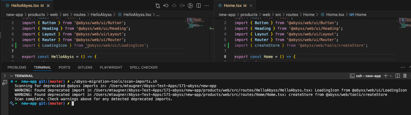 ```
After identifying deprecated imports, refer to the [Deprecation Table](#component-deprecations) above for specific migration advice for each component or utility. For example, the table shows that `createStore` should be replaced with Zustand directly.
---
id: v1-to-v2-guide
title: V1 to V2 Guide
isHidden: true
---
```jsx render
```
After identifying deprecated imports, refer to the [Deprecation Table](#component-deprecations) above for specific migration advice for each component or utility. For example, the table shows that `createStore` should be replaced with Zustand directly.
---
id: v1-to-v2-guide
title: V1 to V2 Guide
isHidden: true
---
```jsx render

 {' '}
{' '}
 {' '}
{' '}
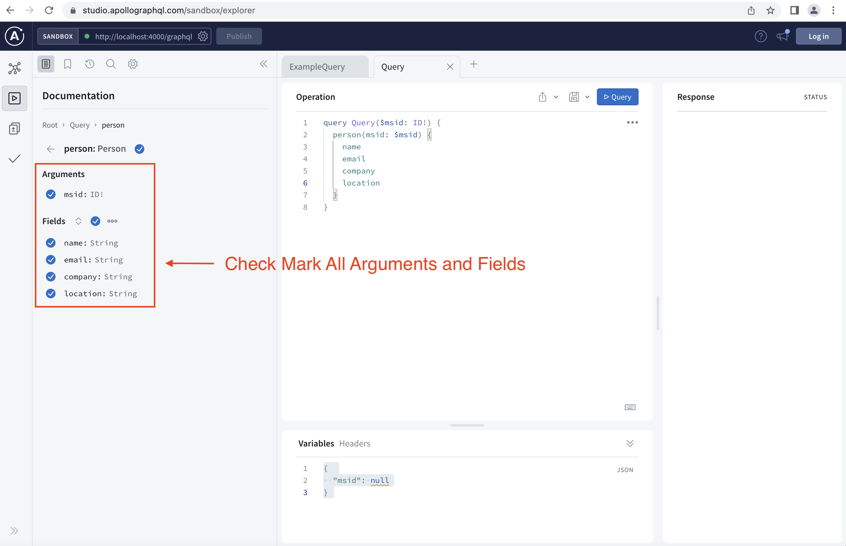 {' '}
{' '}
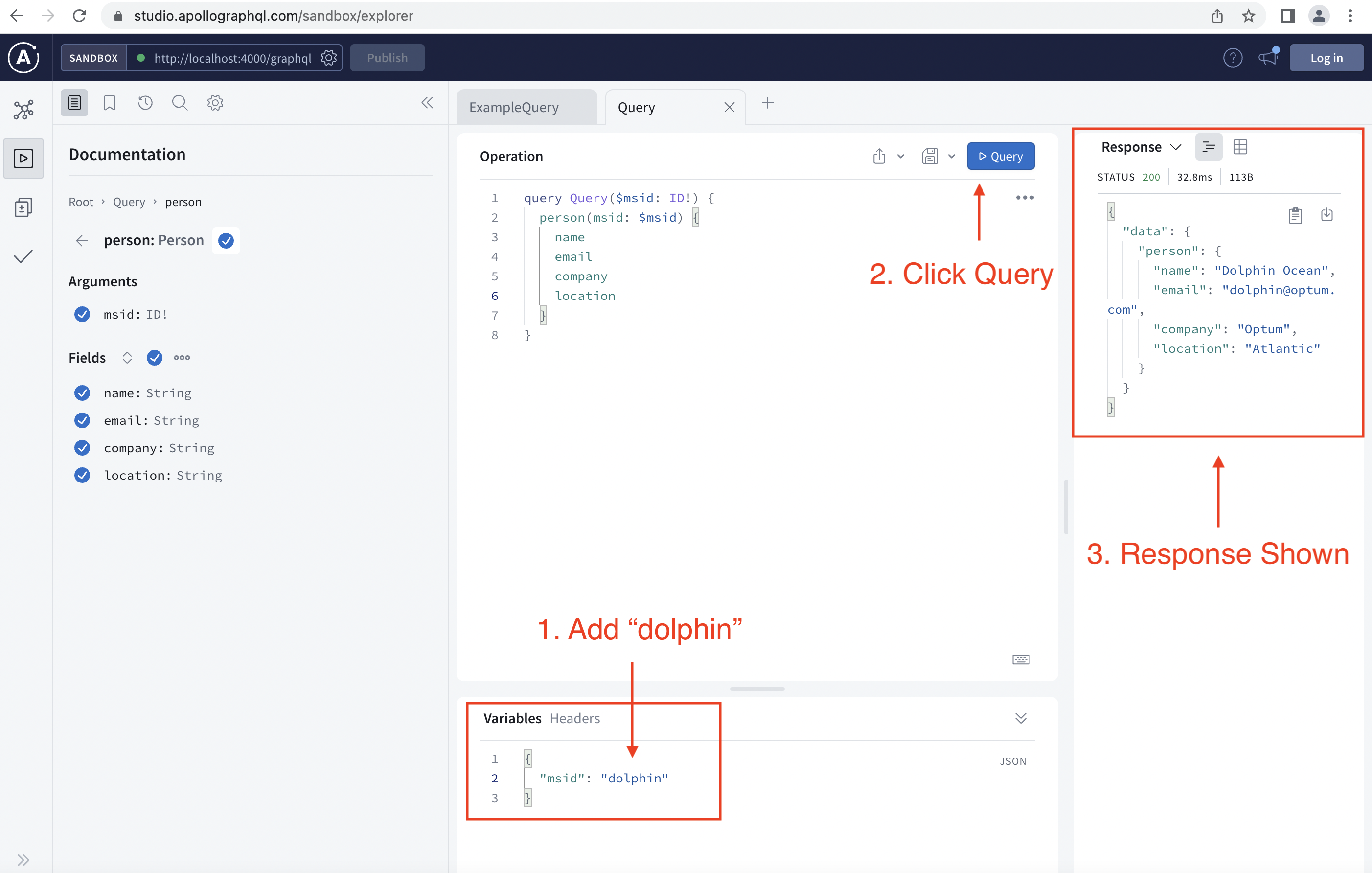 {' '}
{' '}
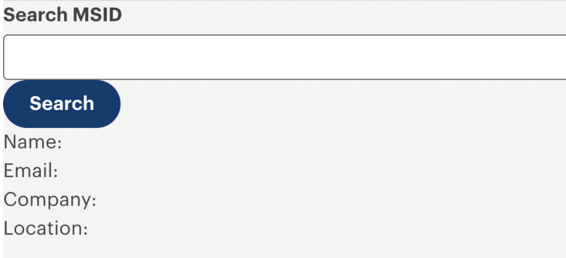 {' '}
{' '}