This is an advanced integration that touches navigation, native modules, and your build config. The file names and paths below are suggestions — adapt them to wherever the equivalent lives in your app. If you get stuck, reach out on our GitHub Discussions board.
What you'll build
A bottom tab bar that renders the native iOS 26 Liquid Glass tab bar on iOS while keeping Abyss' design‑system (JS‑drawn) tab bar on Android — both driven by a single React Navigation v7 install.
- iOS →
createNativeBottomTabNavigator(React Navigation's/unstablenative tabs, backed byreact-native-screens). On the iOS 26 SDK this is automatically a Liquid Glass bar, including the isolated search button. - Android → Abyss'
createBottomTabNavigator(the JS‑drawn DS tab bar), which is unchanged.
Why split? The native bar gives you the real platform look (Liquid Glass, SF Symbols, the search pill) that can't be reproduced in JS, while Android keeps the Abyss‑branded bar your users already know.
Because the bar is the platform's own, it inherits native VoiceOver / TalkBack semantics, Dynamic Type, and reduce‑transparency / contrast handling automatically — no extra work on your side.
This is an advanced integration. Before you start you must be on React Navigation v7 (see Step 1), react-native-screens 4.25+, and — for the Liquid Glass appearance specifically — building against the iOS 26 SDK (Xcode 17+). On older SDKs the native bar still works, it just renders as the standard (non‑glass) UITabBar.
Step 1: Move to React Navigation v7
The native tabs API only exists on v7, so the whole app must be on a single v7 install (mixing v6 and v7 is not supported). Below are the changes that affect Abyss usage specifically — see the React Navigation upgrade guide for the full list.
Use the v7‑compatible navigator factories
Abyss' createBottomTabNavigator and createStackNavigator were typed for v6. v7 changed TypedNavigator to take a single type‑bag argument, so the v6 types no longer satisfy it. Abyss ships drop‑in v7 casts — switch your imports:
- import { createBottomTabNavigator } from '@uhg-abyss/mobile';- import { createStackNavigator } from '@uhg-abyss/mobile';+ import { createBottomTabNavigatorV7 } from '@uhg-abyss/mobile';+ import { createStackNavigatorV7 } from '@uhg-abyss/mobile';- const Tab = createBottomTabNavigator<TabParamList>();- const Stack = createStackNavigator<StackParamList>();+ const Tab = createBottomTabNavigatorV7<TabParamList>();+ const Stack = createStackNavigatorV7<StackParamList>();These are runtime‑identical to the v6 factories (same component, same options) — only the types change, so the navigator's screen options and tabBarIcon/header callbacks type‑check correctly under v7.
Step 2: Install dependencies
The native tabs live in @react-navigation/bottom-tabs/unstable and are backed by react-native-screens' native Tabs host, which requires 4.25+.
npm install @react-navigation/native@7.3.3 \ @react-navigation/native-stack@7.17.5 \ @react-navigation/bottom-tabs@7.18.2 \ react-native-screens@4.25.2 \ react-native-safe-area-context@5.8.0cd ios && pod installBecause the native tabs are an unstable API, pin to exact versions rather than ranges — a minor or patch bump can change the native contract (e.g. renaming a Fabric view manager, which surfaces as a Can't find ViewManager crash after a JS-only update). These are the tested versions:
| Package | Version |
|---|---|
react-native | 0.86.0 |
@react-navigation/native | 7.3.3 |
@react-navigation/native-stack | 7.17.5 |
@react-navigation/bottom-tabs | 7.18.2 |
react-native-screens | 4.25.2 |
react-native-safe-area-context | 5.8.0 |
/unstable subpath@react-navigation/bottom-tabs/unstable ships its types through the package exports map, which many React Native TS setups don't read. If you get a "Cannot find module" error on the import, add an ambient declaration (e.g. in global.d.ts) that re‑exports the real types:
declare module '@react-navigation/bottom-tabs/unstable' { export * from '@react-navigation/bottom-tabs/lib/typescript/src/unstable';}Step 3: Split the navigator by platform
Create two tab navigators from one param list — the native one for iOS and the Abyss one for Android — and pick between them at render time.
import { Platform } from 'react-native';import { createBottomTabNavigatorV7 } from '@uhg-abyss/mobile';import { createNativeBottomTabNavigator } from '@react-navigation/bottom-tabs/unstable';
const isIOS = Platform.OS === 'ios';
type TabParamList = {  Home: undefined;  Activity: undefined;  Profile: undefined;  Settings: undefined;};
// iOS -> native UITabBar (React Navigation v7 /unstable), Liquid Glass on iOS 26.// Android -> Abyss' JS-drawn createBottomTabNavigator (design-system tab bar).const NativeTab = createNativeBottomTabNavigator<TabParamList>();const AbyssTab = createBottomTabNavigatorV7<TabParamList>();Render the right one. Because both navigators read the same param list and the same screen components, the only difference is the bar itself:
function Tabs() { return isIOS ? <NativeGlassTabs /> : <AbyssJsTabs />;}The native navigator is plain React Navigation — declare your screens as usual (icons come in Step 4):
function NativeGlassTabs() { return ( <NativeTab.Navigator> <NativeTab.Screen name="Home" component={HomeScreen} options={{ title: 'Home' }} /> <NativeTab.Screen name="Activity" component={ActivityScreen} options={{ title: 'Activity' }} /> <NativeTab.Screen name="Profile" component={ProfileScreen} options={{ title: 'Profile' }} /> <NativeTab.Screen name="Settings" component={SettingsScreen} options={{ title: 'Settings' }} /> </NativeTab.Navigator> );}The Android navigator is your existing Abyss tab bar, unchanged apart from the V7 factory:
function AbyssJsTabs() { return ( <AbyssTab.Navigator screenOptions={{ headerShown: false }}> <AbyssTab.Screen name="Home" component={HomeScreen} options={ { /* tabBarIcon, etc. */ } } /> {/* ...the rest of your Abyss tabs */} </AbyssTab.Navigator> );}Step 4: Icons, styling, and badges
The native navigator doesn't take a React element for tabBarIcon — it takes an icon descriptor: an SF Symbol (iOS) or an image (both platforms). A common setup gives iOS an SF Symbol and Android an image via Platform.select:
<NativeTab.Screen name="Home" component={HomeScreen} options={{ title: 'Home', tabBarIcon: Platform.select({ ios: { type: 'sfSymbol', name: 'house.fill' }, android: { type: 'image', source: require('./assets/tab-icons/home.png'), }, }), }}/>sfSymbol(iOS only) —{ type: 'sfSymbol', name }, any name from Apple's SF Symbols catalog.image(iOS + Android) —{ type: 'image', source }. Provide the icon at multiple densities (icon.png,icon@2x.png,icon@3x.png) since native icons aren't auto‑scaled on iOS. You can also point at a platform asset withsource: { uri: 'icon_name' }(an Android drawable / iOS image set).
Tinting
By default the image is tinted with the active/inactive color. On Android the image is always tinted (the tinted flag is ignored), so a transparent single‑color glyph works best — a flat icon with its own background will tint to a solid block. On iOS, pass tinted: false to preserve a multi‑color icon's own colors:
tabBarIcon: { type: 'image', source: require('./assets/tab-icons/home.png'), tinted: false, // iOS: keep the icon's own colors}Different icons per state
tabBarIcon also accepts a function of { focused, color, size } that returns a descriptor — handy for filled/outline variants:
tabBarIcon: ({ focused }) => ({ type: 'sfSymbol', name: focused ? 'heart.fill' : 'heart',}),This is iOS‑only; on Android the inactive icon is used for both states.
Styling the bar
Native tab bars are intentionally far less able to be styled than the Abyss JS bar — you're getting the platform's own bar, so the OS owns most of the appearance. What you can set per screen:
tabBarActiveTintColor/tabBarInactiveTintColor— icon and label colors.tabBarStyle.display: 'none'— hide the bar.tabBarStyle.backgroundColor/shadowColor— Android and iOS ≤ 18 only. The iOS 26 Liquid Glass bar manages its own background and ignores these.
There's no equivalent to the JS bar's full style surface (custom item styles, label weights, and so on). If a design needs that level of control, that's a signal to keep the JS bar on that platform.
Badges
Set tabBarBadge (a number or string) in a screen's options; tabBarBadgeStyle tweaks its appearance:
<NativeTab.Screen name="Activity" component={ActivityScreen} options={{ title: 'Activity', tabBarBadge: 3 }}/>Step 5: The iOS 26 search tab
iOS 26 offers two search affordances. Both are iOS‑only, so gate them with Platform.select.
Isolated search button
tabBarSystemItem: 'search' renders the search tab as a separate pill on the right of the bar. Android has no equivalent, so fall back to a normal icon + label:
<NativeTab.Screen name="Search" component={SearchScreen} options={Platform.select({ ios: { tabBarSystemItem: 'search' }, android: { title: 'Search', tabBarIcon: { type: 'image', source: require('./assets/tab-icons/search.png'), }, }, })}/>Search‑field transform
When the search tab is selected, the bar can morph into a search field. This happens only when:
- the search tab renders a nested native stack, and
- the focused screen of that stack sets
headerSearchBarOptions.
It does not work if headerSearchBarOptions is set on the tab screen itself. Nest a stack instead:
import { createNativeStackNavigator } from '@react-navigation/native-stack';
const SearchStack = createNativeStackNavigator<{ SearchHome: undefined }>();
function SearchScreen() { return ( <SearchStack.Navigator> <SearchStack.Screen name="SearchHome" component={SearchHomeScreen} options={{ title: 'Search' }} /> </SearchStack.Navigator> );}…and set the search options from the focused screen:
function SearchHomeScreen() {  const navigation = useNavigation();  const [query, setQuery] = useState('');
  useLayoutEffect(() => {    navigation.setOptions({      headerSearchBarOptions: {        placeholder: 'Search',        hideWhenScrolling: false,        onChangeText: (e) => setQuery(e.nativeEvent.text),      },    });  }, [navigation]);
// ...render filtered results, navigate on selection}Older iOS (≤ 18) and pre‑iOS‑26 SDK builds
Liquid Glass is an iOS 26 feature, opt‑in via the iOS 26 SDK (Xcode 17+). On older OS versions — or when building against an earlier SDK — the same code renders the standard opaque UITabBar: fully functional, just not glass. No code changes are needed; the fallback is automatic. A few specifics:
- The bar is opaque and part of the layout, so content sits above it normally — the bottom‑inset handling in Step 6 becomes a no‑op.
tabBarSystemItem: 'search'renders an inline system search tab (magnifying glass + label) instead of the iOS‑26 isolated pill.- SF Symbol icons still render.
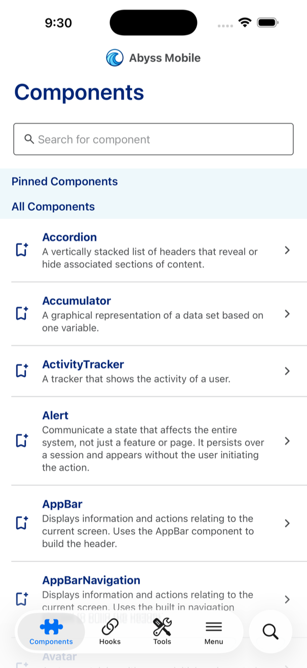
iOS 26 — Liquid Glass, isolated search pill
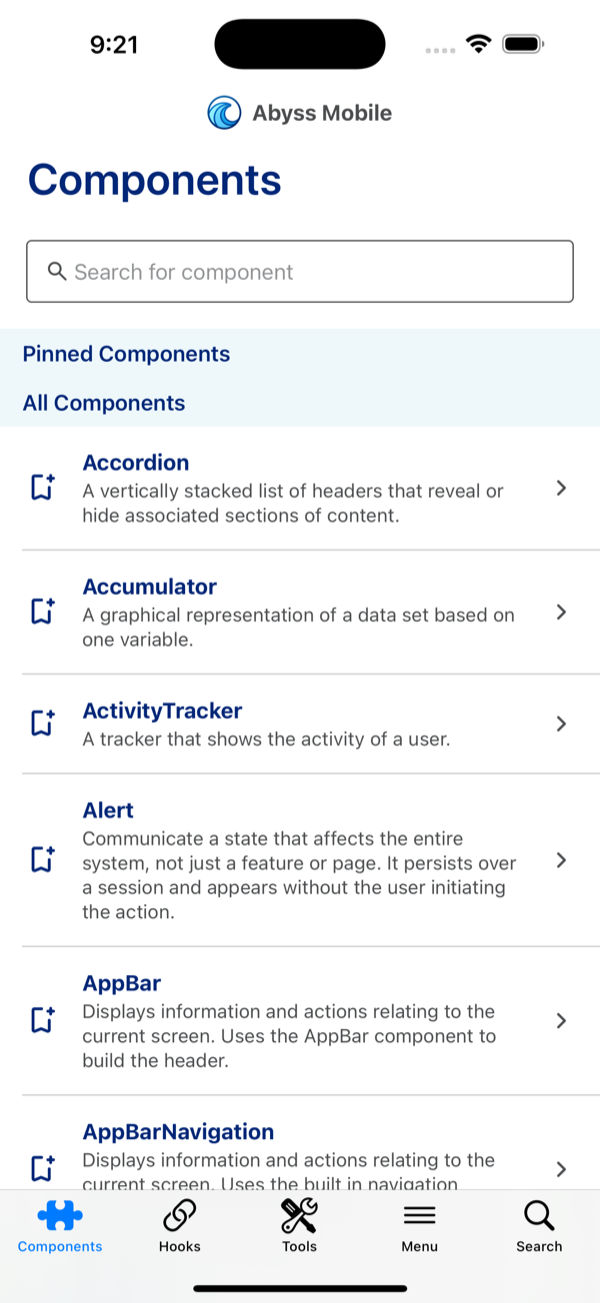
iOS 18 — standard UITabBar, inline search
Step 6: Keep content clear of the tab bar
This is the part teams most often miss. The native bar overlays the screen — it isn't part of the JS layout, and the JS side can't read its height (react-native-screens#3627). On iOS that's intentional (content scrolls under the translucent glass); the problem is when content gets clipped at the bottom.
Scrollable content
- iOS — the native tabs automatically set the content inset on the first
ScrollViewfound in a screen (theoverrideScrollViewContentInsetAdjustmentBehavioroption, on by default). Usually you do nothing. If your scrollable isn't the first one found, setcontentInsetAdjustmentBehavior="automatic"on it. - Android — there's no auto‑inset, and
contentInsetAdjustmentBehavioris iOS‑only. Inset each tab's whole content area above the bar once, usingreact-native-screensexperimentalSafeAreaViewwithinsetType="interface", wired through the navigator'sscreenLayout.
Create a small wrapper (e.g. src/components/NativeTabContent.tsx):
import React from 'react';import { Platform } from 'react-native';import { SafeAreaView } from 'react-native-screens/experimental';
const isIOS = Platform.OS === 'ios';
export const NativeTabContent = ({ children,}: { children: React.ReactNode,}) => { // iOS scrolls under the glass bar (handled above); Android needs the content inset by the // bar's measured "interface" inset so nothing is clipped. if (isIOS) return <>{children}</>; return ( <SafeAreaView edges={{ bottom: true }} insetType="interface" style={{ flex: 1 }} > {children} </SafeAreaView> );};Apply it once on the native navigator — screenLayout wraps every screen, so every tab is covered:
<NativeTab.Navigator screenLayout={({ children }) => ( <NativeTabContent>{children}</NativeTabContent> )}> {/* ...screens */}</NativeTab.Navigator>react-native-screens/experimental is explicitly unstable and may change without a major version bump. It's the only way to read the native bar's inset today; pin your react-native-screens version, track react-native-screens#3627, and swap to a stable useBottomTabBarHeight() for native tabs when it lands.
Absolute / bottom‑anchored content
Content that isn't scrollable — a floating button, a flex-end button stack — doesn't get the iOS auto‑inset either, so it sits under the glass bar. Wrap it in a small helper:
import React from 'react';import { Platform, StyleProp, ViewStyle } from 'react-native';import { SafeAreaView } from 'react-native-screens/experimental';
const isIOS = Platform.OS === 'ios';
export const TabBarInset = ({ children, style,}: { children: React.ReactNode, style?: StyleProp<ViewStyle>,}) => { // On iOS, lift content above the native bar. On Android the screen is already inset by // `screenLayout` (above), so this is a no-op there. return ( <SafeAreaView edges={{ bottom: isIOS }} insetType="interface" style={style}> {children} </SafeAreaView> );};Two usage shapes:
// 1. Wrap an already-positioned overlay (e.g. an absolute floating-button container):<FloatingButtonContainer>  <TabBarInset>    <Button>Action</Button>  </TabBarInset></FloatingButtonContainer>
// 2. Let it BE the bottom-anchoring container// (replaces a height:'100%' + justifyContent:'flex-end' view):<TabBarInset style={{ flex: 1, justifyContent: 'flex-end', padding: 8 }}> <Button>Action</Button></TabBarInset>Step 7: Fix your test & build config for v7 ESM
React Navigation v7 ships as ESM with extension-less imports. Anything not told to transpile/relax it will fail on @react-navigation/*. Metro handles it out of the box, but TypeScript, Jest, and webpack each need a nudge.
TypeScript — if your tsconfig.json uses a Node‑style moduleResolution (node, node16, or nodenext), importing the v7 ESM packages throws TS1479 (the referenced file "is an ECMAScript module … cannot be imported with require"). Switch to bundler resolution — the correct setting for a Metro project anyway:
{ "compilerOptions": { "module": "esnext", "moduleResolution": "bundler" }}Jest — add the navigation packages to the transformIgnorePatterns allow‑list (the (?!…) negative lookahead) in your Jest config (jest.config.js, or the jest key in package.json):
transformIgnorePatterns: [ 'node_modules/(?!((jest-)?react-native|@react-native(-community)?|@react-navigation|react-native-screens|react-native-safe-area-context)/)',],Without it you'll see SyntaxError: Cannot use import statement outside a module (or "unexpected token") pointing at @react-navigation/native/lib/module/index.js.
webpack (Storybook, a docs site, etc.) — relax fully‑specified resolution:
module: { rules: [{ test: /\.m?js$/, resolve: { fullySpecified: false } }],},Gotchas & known limitations
- Experimental inset dependency.
TabBarInset/NativeTabContentrely onreact-native-screens/experimental— acceptable, but pinreact-native-screensand track #3627. - The native tabs API is
/unstable. It's still maturing; review the open native bottom-tab issues (Android especially) before shipping. - Liquid Glass needs the iOS 26 SDK (Xcode 17+). On older SDKs the bar renders as a standard
UITabBar— functional, just not glass. - You must be fully on v7. Mixing React Navigation v6 and v7 in one app is unsupported.